Reading the excerpt from the Psychology of Everyday Things raises some interesting points about the design of everyday objects and how people interact with them. It mainly discusses how increasingly difficulty it is to interact with such objects. For example a household appliance shouldn’t resemble a Hollywood interpretation of a futuristic spaceship; something as vital and dangerous as a cooking stove should not bewilder folks in an attempt to fry some eggs. Something as simple as open a door should be obvious but in many cases it isn’t. For example some of the doors have handles on them so when you walk to them you think “OK, I have to pull this door open” but then you’re met with the reality that you need to push the door open instead of pulling it open so the door does a good job of making an ass out of you. Another issue brought up in the excerpt was the case of the materials implying what a particular object does or what’s for and what people do with it regardless of intent. An example brought it was vandals interacting with wood and class shelters; fans would write or carve into the wood and shatter the glass. An object I encountered that confused me was my the water faucet, like right should mean cold and left should mean hot but it’s not the case everywhere.
Monthly Archives: September 2012
HW#1 PSYCHOPATHOLOGY OF EVERYDAY THINGS
The article takes aim at the understanding of abnormal behavior in relation to the everyday objects from a design standpoint. One view of why people buy products and don’t take the time to learn their functionality. For example the article touches on the washer and dryer, microwaves, etc. The author stress the importance of a good design in correlation to the human minds ability to rationalize its functionality, and vice verses for a bad design. As well as how the mind utilizes the principle of mapping out the functionality of an object. This is illustrated by the example of his friend trapped between revolving doors in another country. Signs of operation should be clearly visible by which is another principle for its design. basically the designer should convey signals in the design for the door natural operation.
My example of a bad design would be subway turnstiles and walk a bouts. I cant tell you how many times I’ve gotten myself or belongings stuck in them to the point of receiving instructions from the token booth clerk on how to alleviate my situation. The embarrassment that ensued my turnstile situation was intellectually insulting.
HW#1 PSYCHOPATHOLOGY OF EVERYDAY THINGS
This article does a good job of showing a common trend in product design, and that trend seems to be that most products are designed with its aesthetics in mind as opposed to its functionality. That is where we run into problems because we wind up with products that have no intuitive flow to it. The average user doesn’t read a products manual and those that do are not reading them anymore because the less intuitive a product is the bigger or longer the manual will be. This causes frustrations for the user and they wind up only really ever using a portion of what a product is capable of.
One product I can relate such an issue with is my friend’s Mercedes Benz. He spent so much money on a car that looks very appealing and has the ability to tune itself for more performance from inside the car itself all it takes is the push of several buttons. The problem is that unlike previous models its no longer just as simple as hitting the sport setting, It now has adjustments for his suspension, His rev limit. This is fine if your going for a track day, but not something you want to deal if you just want to switch it to sport mode real quick as your ridding around town.
Justin Seda – Psychopathology of Everyday Things
I found the reading kind of strange that people get confused and need help using everyday items. Some people expect that mostly all the technology they use in their life require no thinking at all. That’s just silly and you should always think before you act when it comes to technology usage. This reading reminds me of the time when I was just a little kid and i got a Nintendo entertainment system. When my parents got it out of the box and handed me the controller, my little mind couldn’t comprehend all the buttons on the controller, and it only had two buttons! All i had to do was think for a second and start the use the controller, then i got use to it. Fast forward to when the Nintendo Gamecube came out and to my surprisel, i was at that point again where i didn’t have no idea how to use the controller. Comparing the original NES controller to a Gamecube controller, the NES controller had 2 buttons and a directional pad while the gamecube controller had 8 buttons that were all over the place. You would have an easier time understanding a controller with 2 buttons compared to 8 buttons. Even today i still have trouble using a gamecube controller because of the bad organization of the buttons on the controller, but it is a good thing that i don’t use the gamecube anymore. Today’s controllers are much simplier; not 2 button controllers, but more organized and easier to understand.
Gabby – Homework 1 – The Psychopathology of Everyday Things
The Psychopathology of Everyday Things goes into a brief overview of the various design issues of everyday objects. The text takes a humorous spin on the various design issues, from a wall of doors, to a watch, to phone systems. It offered a perspective most don’t usually take towards these items existing in all of our lives that could cause such severe, utter frustration. It got me thinking about my own belongings and the frustration that they can cause me. For example, I wish that my iPod had a power button instead of having to push down the play button for a long time and then hope it turned off correctly. Another issue is something that had existed in my old clamshell dumbphone that doesn’t exist in my smartphone: the fake phonecall function. On my old phone, if you were to hit the speaker button three times, it would make the phone act as if it was receiving a phonecall – a number would appear, the phone would ring, you could answer it. It was a great thing for walking around alone at night if you felt like you were being watched or followed. Unfortunately, smartphones – specifically mine! – lack this.
These design issues are not from a lack of careful planning or poor design, but the lack of anticipation for what other uses or issues an average user may have with the product. It’s a problem that arises not just with engineered goods, but all products or services where the creator is not the direct or intended user, but the general public. This aftereffect can be reduced by plenty of QA and alpha/beta testers of your product or service. These design issues also arise from the creators of products and services weighing the pros and cons of aesthetics and functionality. This text is a clear showing of functionality being sacrificed for aesthetics.
Design Problems – 09/05/12
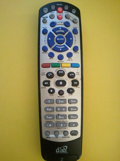
<pic 1 – Dish Network TV remote>
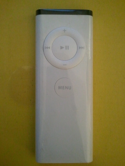
It is interesting that the reading this article reminds me of two remote controllers in my room. The one is for TV, and another one is for iMac.
The first moment I saw this long-colorful-53 buttons remote (pic 1), I did not know what should I do with this thing. There were too many buttons and letters, so I was not able to figure out which is which. I just thought like, ‘oh, this TV has a lot of function! Cool!’ but in fact, after three months later, I realized that I am using only three to four buttons out of 53 buttons on this remote in everyday life.
In this article, there are many examples of ‘frustrating’ design such as microwave, watch, door, projector and new phone system. I was wondering, why these ‘hard-working’ designers tend to design things so complicated? I guess one of the reasons is, designers want to show how many cool functions the product got. And people buy them. Just because it is brand new product. And things continue as usual.
The article says : “The user needs help. Just the right things have to be visible – to indicate what parts operate and how, to indicate how the user is to interact with the device.”
I remember the time when people was talking about the iPhone a few years ago. People got fascinated with its one-button design. I was also surprised. One button is enough! If it is clearly indicated and informed to users. That is why I think this small remote (pic 2) is much much better than (pic 1) even (pic 1) has 47 more buttons.
<pic 2 – Remote for iMac>
HW #1 – The Psychopathology of Everyday Things
After reading “The Psychopathology of Everyday Things”, it made me realize that a product designer can design a beautiful product, but in the eye of everyday people, that product maybe confusing and hard to use. Sometimes I feel like designers care more about the look of a product than how easy the product can be used. Even though the reading was a bit funny, for example the guy being stuck in the revolving door, the author was right about how year after year, we see the appliance or electronic come out, but with more features. For example, the iPhone, since its release in 2007, every year since then a new one has come out. Even though there have been changes to the physical phone and software each year, sometimes I feel like Apple does this because no matter what they put out, people would buy it.
One usability problem I recently encountered, is turning on the stove in my girlfriend’s apt. At home, all I do is click a button, then press another button to the desired temperature I want to pre-heat the oven to. But at my girlfriend’s apt, apparently to turn the stove on, you have to push the dial in, while holding it down, turn to the desired temperature, hold it there for a few seconds then release. The only way I figured this out was by Googling for the manual. I don’t think anyone would have expected it to be this complicated to turn on the stove.
Remy’s 8/29 homework | step count : 2387
The reading was a good reminder for me how much a pain technology is for a lot of people. I remember thinking to myself a few times before, “If many of the tasks we accomplish with technology have not changed since years ago (e-mail, word processing, making a phone call), then why has it become harder/slower to accomplish these tasks?” The reading makes me realize that as we’ve found more (theoretically) efficient ways of doing things and more freedom in the design of what devices do them, (elecronics have gotten a lot smaller), more and more complexity has been introduced in the mix.
HW#1 09.02.2012
Captain’s Log:
So I finished reading “The Psychopathology of Everyday Things” by Donald Norman and it’s basically an article about how certain designs meant for interaction between people can be confusing to use. While I read, I had mixed feelings of understanding and belief. I could believe about the story of the woman how couldn’t figure out her high-tech washing machine but the guy that got stuck in revolving doors is ridiculous. Anyway, I could see the point of the reading was that some designs’ functions might not be so obvious to some people rather than others. As for times where I found it hard for me to use a certain machine or use some sort of software, nothing really good comes to mind. I could write about how my family can be incompetent when it comes to tech in general like how my grandmother can’t figure out how to open her contacts on her cellphone even though there’s a shiny button for it but that’s not what I think could be a good answer since I ‘m supposed to tell of a time where an interface was confusing.
Assignment #1
In this week’s reading, “The Psychopathology of Everyday Things” I can come to an honest conclusion that some designers get carried away designing. They forget about one of the important things in design which is how the end user will interact with the product. Donald Norman, list several examples in his writing of product that can be improved upon if they would have just taken the way humans naturally interact with the objects that we use. One such example was the way the slide projector control would work, the fact that it had only one button to move the slides forward and backwards was a bad way for a user to interact with a device.
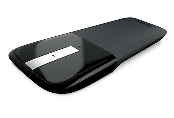
One device that I believe should be made better has to be slightly improved upon is the scroll wheel for my mouse. It uses a touch pad type system and it is not able to do horizontal scrolling. It also doesn’t have the middle mouse button which is common in a lot of mice. Instead you have to tap on the touch pad. Its works but it take a little too much practice.


