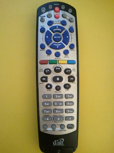
<pic 1 – Dish Network TV remote>
It is interesting that the reading this article reminds me of two remote controllers in my room. The one is for TV, and another one is for iMac.
The first moment I saw this long-colorful-53 buttons remote (pic 1), I did not know what should I do with this thing. There were too many buttons and letters, so I was not able to figure out which is which. I just thought like, ‘oh, this TV has a lot of function! Cool!’ but in fact, after three months later, I realized that I am using only three to four buttons out of 53 buttons on this remote in everyday life.
In this article, there are many examples of ‘frustrating’ design such as microwave, watch, door, projector and new phone system. I was wondering, why these ‘hard-working’ designers tend to design things so complicated? I guess one of the reasons is, designers want to show how many cool functions the product got. And people buy them. Just because it is brand new product. And things continue as usual.
The article says : “The user needs help. Just the right things have to be visible – to indicate what parts operate and how, to indicate how the user is to interact with the device.”
I remember the time when people was talking about the iPhone a few years ago. People got fascinated with its one-button design. I was also surprised. One button is enough! If it is clearly indicated and informed to users. That is why I think this small remote (pic 2) is much much better than (pic 1) even (pic 1) has 47 more buttons.
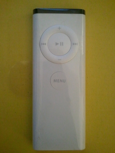
<pic 2 – Remote for iMac>

