Learning Log #12

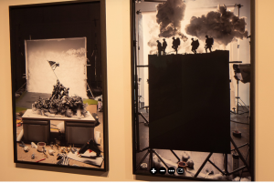
After exploring the virtual tour with my partner Sasha we were both amazed by not only the 3D virtual navigation tool used but the beautiful thought provoking artwork displayed in the museum. We went through different artworks that used materials to create a scene of 3 dimensional models to bring a history back to life. During the tour, we noticed the 3D and surreal concept theme throughout some of the art work. What also caught our eye was the capture of a brutal execution in the middle east that also used models in different positions and shadows that symbolized a strong message. Lastly, we enjoyed the tour of the museum, it was every bit interesting.


Learning Log #11

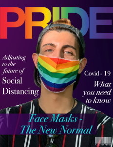
Making this Magazine Cover was really exciting. I took my time creating this cover page with a photo I took of a guy I captured last week wearing this colorful mask. I wanted this cover to reflect todays trend and current events, hence the topics I chose. I tried to play with colors and hues. I think it all ties together quite well.

Learning Log #9

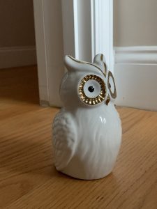
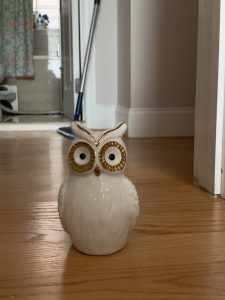
This time we had to work on natural light photos with a person. Unfortunetly, I do not have another person to work with so I took pictures of a figurine. Instead of placing my object near the window, I decided to place it on the floor of my room so that my photos rendered a broader reflection of the natural light from my windows on the object. I managed to capture three angles here. I think all in all it turned out ok. Though there is definitely room for improvement.

Learning Log #8


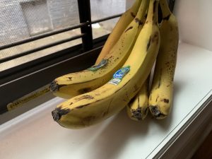
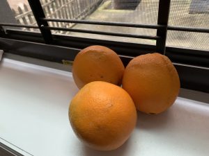
It was interesting capturing fruits with natural light near my the window. I tried to capture angles that reflected more light given it was barely any sun outside. Though it was a rainy day, I think I did the best I could. I could improve my angles more and of course I wish I had more to work with in terms of background and lighting. Either way, I had just enough light exposure to snap a few photos of the stack of bananas and oranges.

Learning log #9


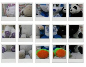
for this learning, We had to do a David Hockney Inspired Portrait. I decided to take a picture of my stuff animals and put them in a polaroid frame. it was pretty easy putting them in the polaroid frame. However, it was just a little difficult having to put it all together into one collage. but I still managed to make it somewhat good.

Learning log 9

In this learning log we were taught to play around with natural lightings. In my house I have the most lighting coming in from the windows. So I took the pictures near the window where the sunlight is coming in.

David Hockney Collage

For my Hockney inspired collage, I used a picture of myself from about a year ago. I wanted to put my own twist on a Hockney collage and use just myself and not the background this picture is from. The steps involved in making this collage were to first delete the background of this picture and just leave myself. Then I made a series of squares and created a clipping mask so I would be inside the squares. Then I moved the squares around to create this collage.

Learn Log 12

My partner and I decided to view the exhibit When Images Collide. Upon entering the room, (virtually) what I saw immediately struck a chord with me. We were greeted with a wall mixed with portraits and just visually pleasing images. They were very up my alley on the images I personally like to capture so I was excited to look at the rest.

Out of everything I saw, the the art that stood out to me the most was John Stezaker’s collection. The collages he made were really cool, and it actually inspired me a little. Being in quarantine, all I really can do is edit old photos so this is something along the lines of what I’ve been doing, but I was intrigued to try something similar to what Stezaker is doing in his collection. Out of the 10 he had showcased, my favorite is DE / EN Goddess, 2018 Collage, 29,5×23,6cm. I love the idea of titling it Goddess and the imagery that is presented is different that the rest. I love the pattern used in the silhouette.

Overall, I thought this experience was fun and different. I liked how we could get really close to the work because you can’t go pasta  certain point in a real museum or gallery. It was nice, but nothing beats actually going to gallery and viewing work. There’s something about the atmosphere you can’t get virtually.

Learning Log 12

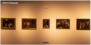
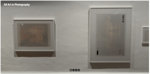
My partner and I checked out the ” All Art is Photography” exhibition. I enjoy the Virtual tour, it was like going into google maps and getting to your destination. The images above are two things I liked about this exhibition. The first art is from Antonio Perez Rio and the second is from Nick Waplington. This exhibit has a big opening space for many people to come and visit. The main lights where mostly from the art on the walls which create a good focus on the art.

What I found interesting from Antonio Perez Rio’s art was that they all had phones taking a picture of another art. This reminded me of today’s society, we all take pictures of everything in our phones now. Back then to get a good quality picture we needed a good camera like a DSLR or a point and shoot. What I found interesting from Nick Waplington’s art was that he had this light coming from the window and it created art on the wall. He captures this art with a large format camera. They all had some kind of color which made this an interesting photo.

Overall this was a cool experience trying a new way of exploring an exhibition. In my other class, we did something this but we created advertising for a Virtual Museum. Being able to use this virtual tour made me realize how this can be useful.

Learning Log #12

My partner and I decided to look over the gallery “All Art is Photography.” The gallery is interesting from the start based on the title. Once you step inside the virtual gallery, there’s a variety of images from the gallery. Some of the pieces show off early eras and current images. However, there’s a twist to them.

For starters, they show off famous paintings from 1700s or 1800s. Some were edited with hands taking photographs with their cell phones. It’s depicting how we, in modern society, take photos in everyday events. Now with phones, we have the habit of taking photos of everything without hesitating.

Overall, the gallery is fun to go through. The Virtual Tour for “All Art is Photography” has display a small view of how we take moments through our phones. The lighting of the gallery can be questionable based on the different tones. The older paintings are shown with warmer lighting while the newer covered with transparency film with the whitest settings. Not sure if it’s to reflect a purpose, but the lighting can have be kept in the same settings.