Week Three
One of the next assignments we were given was creating cover art for the podcast. We were in a sense going back to what we discussed during week one- what works and what doesn’t work when it comes to cover art.
This is also a very important part of the podcast since this would be the first thing viewers see when they click to listen to the podcast of the week. This picture would be the image to represent the podcast so it’s important that the picture not only attracts the listener but also plays on what the podcast is about.
I initially had a lot of ideas when the assignment first came up. I wanted to, of course, focus on the fact that this was a podcast made by women for women. It was always important to me to depict a woman on the cover so the listener could know exactly what the podcast they would listen to was about.
Like many of my other designs, I wanted it to be a simple yet effective cover. With a logo still being designed, I wasn’t sure how the placement of that would be but I knew I wanted the image to resonate with the initial ideas I’ve had for the logo. In this cover art, for example, There is an image of the woman who runs the podcast with a simple white background and equally simple font choices for the text.

There was also the option of using vectors of women instead of actual photographs of women. This idea was appealing to me because I had already played with the use of a silhouette of a women in the logos I initially designed for the podcast name. I figured with the cover art, I have a bigger canvas to work with instead of being limited to a simple logo design.
In the end, I decided to use photographs instead. With notes from the supervisor and what she specifically wanted for the cover art, I think I came up with some solid ideas that can be integrated with the other interns’ ideas so we can create the perfect cover art with all our ideas combined.
Week Two
During week two of our internship, we were tasked to create logos.
This was an important job considering this logo would be what the viewers would see first when it came to the podcast.
While we did discuss what we thought the brand colors should be and threw a couple of ideas off of each other, when it came to submitting our first logo ideas, we all worked separately to create our own work.
When I was creating the logos, I wanted them to have a simple yet effective feel to them. I didn’t want it to be too crazy and I wanted to get right to the point in order for it be able to fit across different media channels.
The colors I chose to use for the logo are purple and pink.
I chose pink to represent that this would be a woman’s podcast. While the gender norms are becoming less strict in today’s world, many people still associate the color pink with women.
Purple combines the calm stability of blue and the fierce energy of red.
I wanted there to be a sense of a calming color with the lighter pink to play on the actual title of the podcast: Bent not Broken. I feel like the purple and pink work well together.
I drew inspiration from many different places when it came to actually designing logos.

I wanted to create a logo like this one- something that used a face in the actual logo design itself. I liked the idea of a silhouette of a woman or a simple drawing of one itself with lines only rather than adding the actual skin color or other specific details.

When choosing the font for the logo, I decided to go for a sans-serif font. I just felt like it flowed nicely. With a sans-serif font, I was able to connect the text more easily than I would with a serif font.

Since the title of the podcast has two B’s in it, I wanted to focus on the letter B itself. I felt like I would be able to play on the fact that two words were sharing the same letter. That would also be another point for me to be able to make the logo flow nicely.
While we are still deciding on a final logo design for the podcast, I was very happy with how my logos turned out I cannot wait to work with the other interns to come up with a final logo design for the podcast.
Week One
Bent Not Broken is a new podcast that is expected to launch later this year. The podcast focuses on women’s issues like the Me Too movement, body image issues, infertility, etc. That was why I was personally so interested in working for this podcast. It was created by Juanita Kelly, who once said
I wanted all women to be represented in the world of fashion and in pages of magazines.
She used her experience in the fashion industry to try to reach a broader audience in podcasts. In this all woman team, it was made clear to me during the interview process that this internship would be completely remote. Using Slack, I would be connected to my supervisor and fellow interns online which I found interesting since we were all from different areas of the United States. One intern, for example, was from Tennessee.
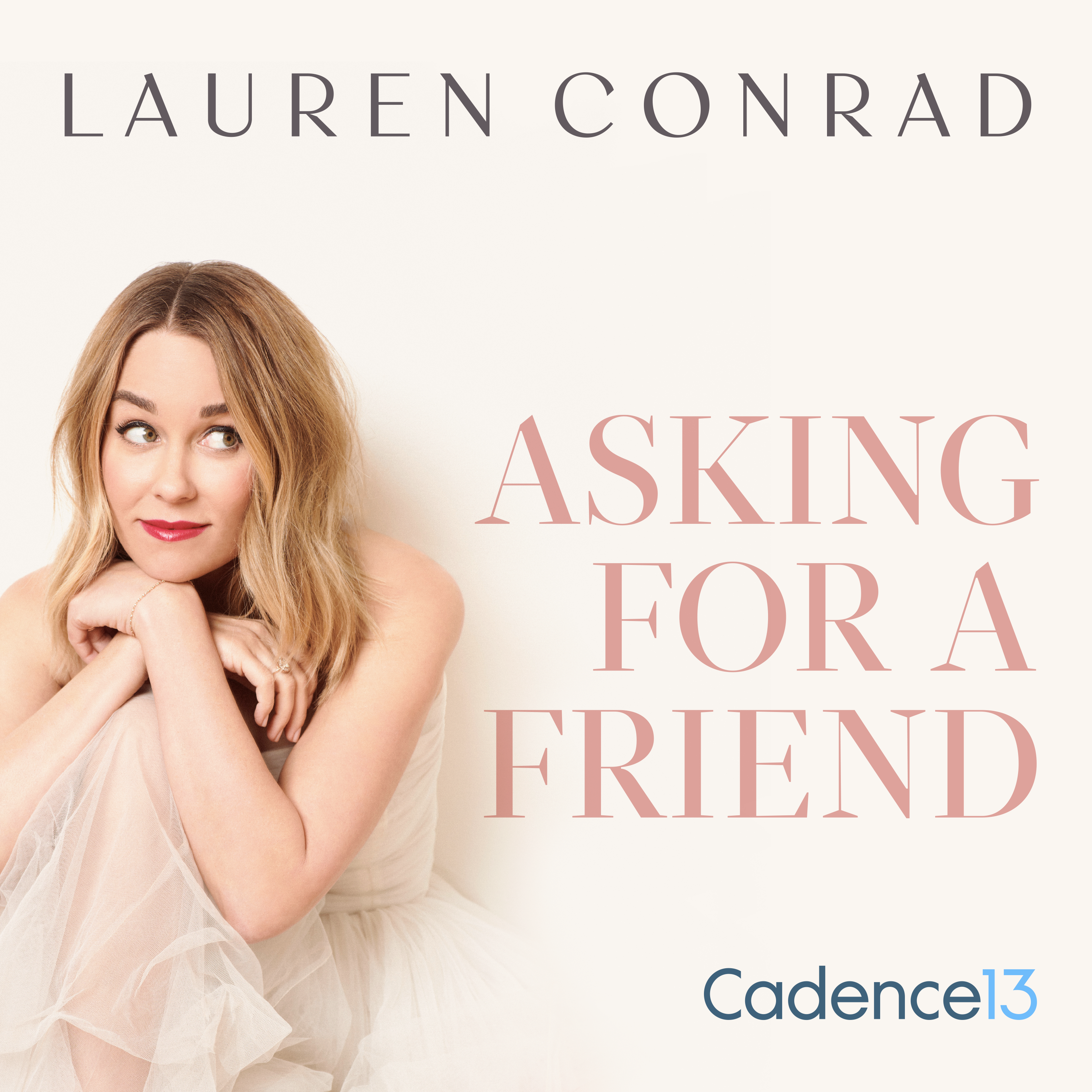
As a way to throw ideas off of each other and build a sense of relationship, we were tasked to talk to each other following different questions given to use from our supervisor. One of the questions was regarding other podcasts. We were asked based on our design style, which of the cover arts we liked the most. I chose the following…
![]()
I chose this podcast because, not only am I familiar and a fan of the podcast, but I appreciated the fact that they went for a simple yet effective way to show what their podcast was about without giving away too much either. Any true crime fan would know that using cutouts of letters like that represents crime. The font they used to show their names was also an homage to crime.
Looking through all the different podcast cover arts gave us ideas on how we can represent the podcast with our own touch and which way to not go in regards to artwork. We also got to know the podcast world a little more getting to see all the different genres they had to offer. I also personally saw how unique the Bent Not Broken podcast really was and grew excited to be able to build the brand from what we were learning.
So, the first week of the internship mainly focused on building relationships with my fellow interns and supervisor and getting to know this brand new company a little better.

