Monthly Archives: March 2020
Sketch
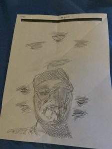
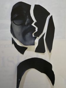
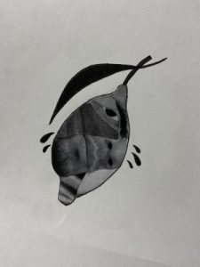
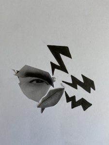
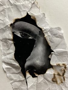
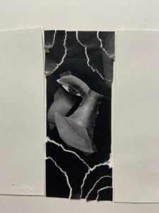
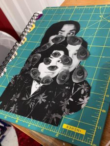
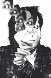
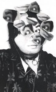
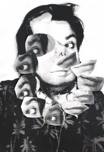
Jorge Buenabad – s3 Collage
The mood I chose was anger. Usually, slanted eyebrows are the main sign when someone is angry, so I decided to make them my focal point. Also, people seem to contort their face when angry, like a lemon when squeezed. This contortion is the movement I will try to achieve. From these three collage sketches, I know the clarity of some collages has to be improved in the future.
Extra Sketches
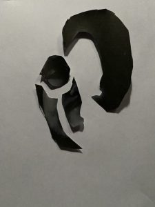
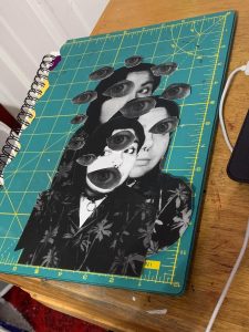
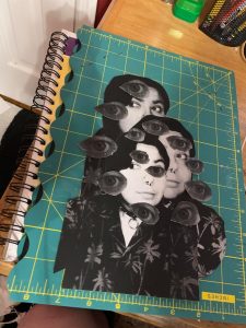
Steph Balloqui / Greyscale and Collage “Sketches”
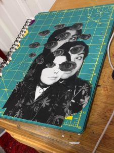
4/3/20: EXTRA SKETCHES! Note that these are photographs, not scanned in, and not on a white background so the intention is not as clear. ALSO- there are some finishing touches that I want to do that I feel would ruin the cutouts I currently have so I’ll try out those finishing touches when I cut out more eyes/faces!
3/26/20: Hey! This is the filled in greyscale!
These are my collage “sketches” for potential deliveries for my emotion, FEAR- I decided in the end to portray it as something that makes you spiral out of control, and makes you spiral out of sanity if your fears control you long enough. Fear can eat you alive and make you spiral. I feel the last one definitely portrays this!
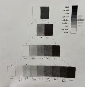
Jorge Buenabad – s3 Pencil Gray Scale
Project 2 – Texture and Pattern (Jordan Stanley)
Project 2- Line and Texture-Eduardo Cortes Martinez


Within my project I tried to make my project look real as the rocks and towards the words drawing for the darker rocks instead of make it lighter unlike the lighter and soother rocks. But overall I feel like I’ve accomplished the whole setting and tone for the rocks and fence for both texture and line works for this project. 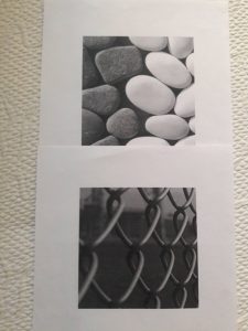
Project 2 – Texture and Pattern
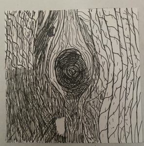
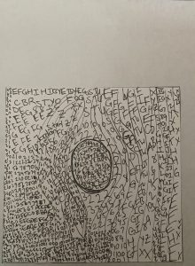
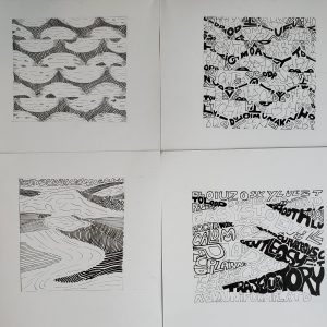
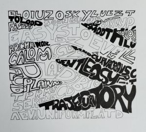
In my opinion, the lines were easier to do than the words, as it was somewhat challenging to decipher how to make one part “darker” in a sense compared to another. I ended up using the same strategy as the line one, which was making letters or numbers closer to each other to represent the darks/grays, as I did with the lines.
The project, though difficult, was fun to do, would I do this again? Ehhh, but was it a learning process? Definitely.
Line
Project 2- Txture & Pattern Deliver (Angel Cuevas)
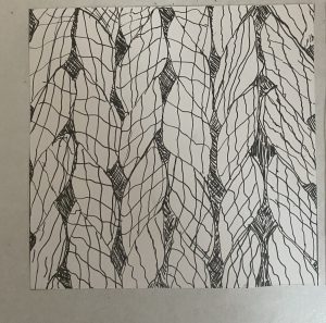
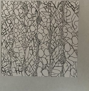
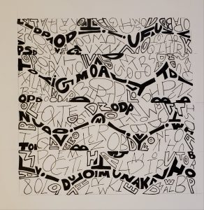
I honestly enjoyed this project, however, I would not like to do it again. I learned how different pieces of lines, letters, and Thickness of these two, can create an image. It really forced me to think and look for other options. Something I would apply to my next projects is more time, and do more sketches and apply more ideas and variety to them.
IMAGE#1 – TEXTURE
LINE/TEXTURE
TYPE/TEXTURE
At first, I did not know how to make the darkest part, black since all the letters are together, Our eyes would not be able to differentiate the letters from one another. Which is why I left a tiny white line around each letter. That makes it easier for us to see which letter is which.
IMAGE #2 – PATTERN
LINE/PATTERN
TYPE/PATTERN


