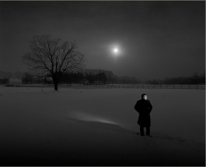
 This photograph that Gregory Heisler took got my attention because I mostly enjoy looking and taking great black and white photos. While examing it the visual hierarchy drew attention to the man wearing all black, even though the background is present. The negative space is what makes this piece intriguing, as the land filled with snow resembles the reflection of the sky along with a spec of light coming out from behind the gloomy clouds. The expression I get from looking at this photograph is sadness because the man standing outside by himself is in isolation with the model own thoughts, And the only tree in plain sight is dead.
Author Archives: Jamar Callender
Michael Paul Smith
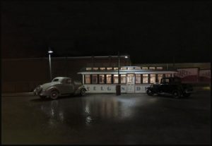
While taking a look at Michael Paul Smith I was amazed of how detailed his work is. Michael mostly take pictures of classic 1950s to 1960s cars in a natural environment. The process of photo retouching must be endless as the realistic quality is seamless.There was plenty of his works that caught my attention because he was able to set the mood with lighting on the makeshift environment he hand made himself, but the two works that is displayed below are the one’s that tells a mysterious story without actually trying to figure out the whole scenario. As you can see it sets a very moody vibe that can only work during the night which he capture so well.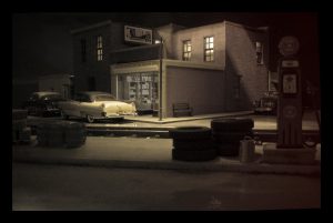
Final project proposal
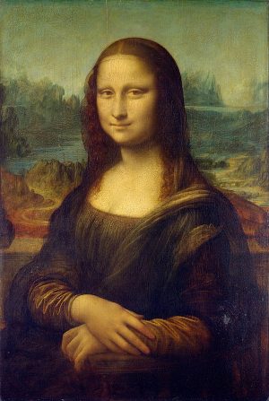
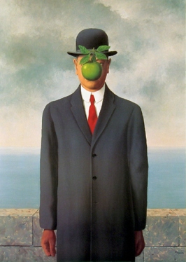
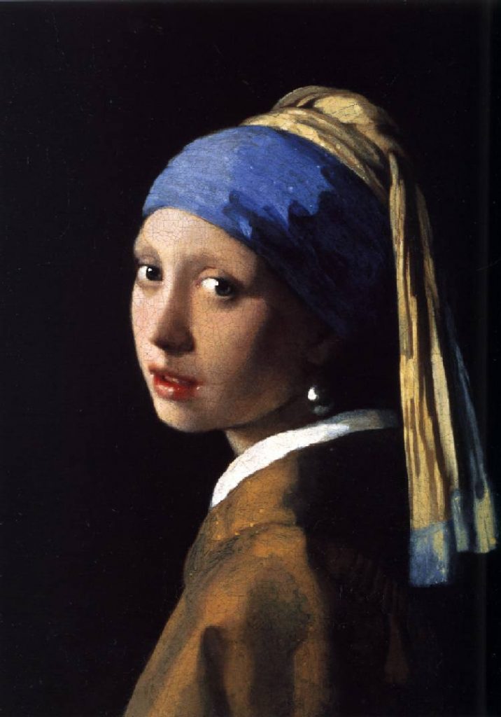
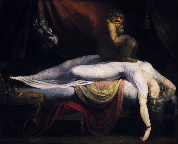
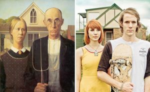
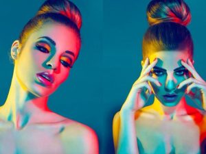
For my final project, I wanted to do something different, fresh, vibrant and unusual with my pieces. My foundation as an artist led me to be a graphic designer transitioning into advertising and design. I wanted to pay homage to my first love which is art. I conducted some research to see what I wanted to do with the idea of art and came across an article that has 20 modern remakes of famous paintings. From this, it sparked an idea of “Art redefined in your image today.” This means that I’ll gather subjects to reenact how these famous subjects would pose today in 2018 using my subject’s personality of how they pose. Below I will include some visual inspiration that I will include in my shoot day1-day3.
The famous paintings I’ll use.
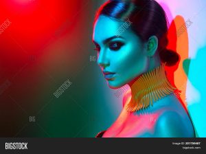
The color’s I’ll use on my subjects which is bold and vivid and will be lighted with gel fills will an already colored background.
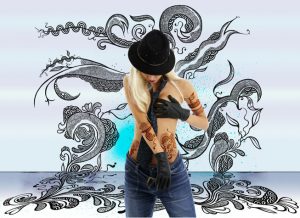
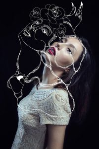
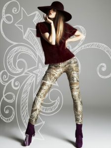
The last thing that I would want to do is to make my subject draw doodles of images and words that describe who they’re as a person. this will be placed behind the subjects once I’ve digitalized it.
Here are some examples:
Marcel & Gregg
Marcel Christ and Gregg sschapps has two different taste when it comes to photography. As any other photographer you have your distinct style that no one else could copy. Marcel & Gregg took the approach to photography glass with a difference in lighting. Marcel took his approach of photographing glass that seems to be more of a natural light, the reflection is subtle and isn’t harsh, but soft. However, even though the picture of the milk pouring into the glass was manipulated to be a tree it’s disturbing to look at. Greggs, approach was subtle, but bold with color, prompts and the lighting of the glass. You can tell that this image was extremely photo retouched. The cast shadow is pitch dark. And the rubrics cube made everything thing look sharp,but fun. All in all I would try to merge their style into one photograph
Gallery adventures
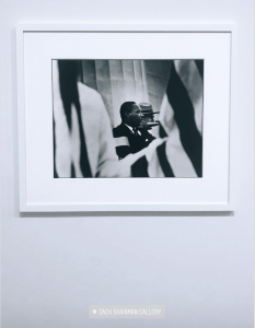
This photo at the Jack Shainman gallery caught my attention because it showed MLK at his prime. The was be geared towards him at his strongest without him even knowing. the black and white photo is what makes it clear that it’s only him that carries out the message of honored power amongst people who want equal right and to be treated as humans.
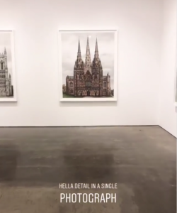
At this exhibit it didn’t interest me at all when I first, took a glimpse at it.That’s until the guy actually explained what was happening in this photo. the church itself was composed of thousands of pictures to create such vivid details in this photograph. It slightly got me intrigued by the other exhibit photo after hearing the background story of what i’m seeing.
Take me to church
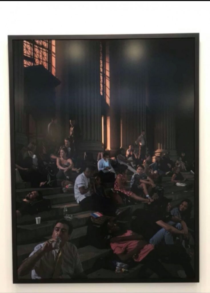 This photo immediately caught my attention when I walked into the exhibit. I had originally thought that this piece was a painting. when i gazed at it, it took me back the major black out of 2003 in NYC. It was hot dark, the crime rate was high, but in the end it somewhat what brought us closer together as a city that never sleeps. This photograph embodies camaraderie and survival.
Philip-Lorca DiCorcia
Philip-Lorca diCorcia is a photographer that take these honest shots of men expressing themselves in true light . The style of photography that he shoots is honest and is some what cinematic for some images taken .One of the photos from Phillip-Lorca diCorcia that captured my attention was the image of the man sitting down on the motel hallway with his chin and hands placed against the railing of the top floor complex. What also got my attention was the calm color contrast between the greenish- blue street lights in the back ground and the warm red/ brown tone in the foreground of the building wall. For some reason this picture represents isolation amongst the rest of the world which i believe Dicorcia was trying to convey.
Pop those little suckers out!
Maternity photos are captivating and sweet, but celebrity maternity photoshoot people go crazy looking at it because to the audience it’s like it’s your own child. Their favorite celebrity gave birth to a 2.0 version of themselves.
These two photos of famous celebrities carrying their little ones had a huge impact through media channels to get to us audience that take in this content as something as a special moment. Anne Lebowitz who photograph Demi Moore’s maternity photo wanted to simply show off the baby bump while naked to make people aware that yes, she’s going to be a mom, but she’s still rebellious with an exceptional toned body figure. They’re little details that was incorporated in this shoot like how her hand were position so that Demi, could show off her “$$$$$$$” wedding ring. showing that she’s with child and a protector. To understand how Annie photographed Demie is not over the top but also dramatic in a sense; here’s why I say this. Demi, is standing up with the light source coming from the right giving her face a broad lighting. The media channel outlet is a magazine cover ad for vanity fair that mostly targets woman.
Awol Erizku who photograph Beyonce maternity photo wanted to show off the flowers as a concept of fertility and growth . They’re little details that was incorporated in this shoot like how there was a vail over her face to either show her purity, that she’s a virgo “The human nurturer” or just maybe to show that it’s not all about her and the main focus is her belly . To understand how Awol photographed beyonce is not over the top but also a breath of freshness ; here’s why I say this. beyonce, sitting down surrounded by various flowers and green matter that depicts that she’s one with nature and she carries two human beings inside of her, this maybe telling us that beyonce see’s her self as mother nature in the flesh. The lighting of her is fairly hard to say but, The media channel outlet was through social media since beyonce is known to secretly keep whats going one and then, spontaneously share amazing news that immediately creates this buzz all around. and it works for her..in media and marketing people don’t want to be enticed, or anticipation/ tease they want to see the product in the lime lights.
Richard Avedon and Jonathan Mannion
Richard Avedon style is of course the infamous black and white photograph. He try’s to push these concepts of free human behavior in his photographs as well as fashion. Avedon, captures these weird moments of expression on his subjects they stare into the camera. Everything seems to be about the eyes and then, the motion.
Jonathan Mannion was inspired by style to Avedon by contrast with black and white . his style of using natural background. Mannion has adopted the ways from most of Avedon’s work; which he then uses the idea of how an influence can make one mimic someones work. In the portrait of JayZ, he borrowed Avedon’s black background and most likely one more addition I would love to try out both techniques high and low key lighting to see which one has a better outcome.
Old and the new
Yousef Karsh, was a Canadian photographer best known for his portraits of famous individuals. He has been described as one of the greatest portrait photographers of the 20th century. Karsh lived in Ottawa and opened his first studio in 1932 named Karsh of Ottawa. During his time there his taste in how he envision his composition of these models are dramatized and sets the scene for his models. One photograph that immediately caught my attention is the one he took of Betty Low, 1936 the reason why is because it’s black and white and i’m a huge fan of it. The second, reason why it caught my attention is because of how here face is composed in the most simple way, just by looking at it you’ll see that her eyes are wondering off into the distance which give us the viewer the curiosity of what she’s looking at. Karsh, has a way of telling a story in his photos in such a cinematic style and I want to emulate how the cloth around her head carries the eyes down onto the subject neck. Form follows function.
Nadav Kandar, was born in Israel on December 1st 1961. When he was 13 Kandar, started taking pictures on a Pentax camera that he had bought with own money from his Bar Mitzvah. He, began to look deeply at the work of Strand, Stieglitz, Weston and Atget, all of which the feeling that each artist was exploring their respective lives. So being that him and his family came along way to start a new path with photography the influences that he gained rubbed off on him and made him form his own style today. As I was looking through his work I stumbled across two of his work that made me feel excited to emulated I couldn’t pick one of his work so maybe ill try to combine it somehow. The first photo that Kandar, produced was named Sadiq Khan, 2017 even though this picture is recent it still gives you that nostalgic black and white movie feel to it and he invoked it really well. What I admire what he did was bring attention just only on the subjects eyes. the light source is coming the right of the picture. The movie theme photo might be a theme for me. The second piece was the double expose photo of Eddie redmayne and nature taken in 2016. The reason why it draws my attention is because it has the mysterious emotion going on with the mixture of blue and green, but now that i think about it I realized that the double exposer photo isn’t what it seems. It’s a photo project on the subject face to make it seem like it.
Jamar Callender
Dawoud Bey, has an exceptional use of lighting and creating the scene for his models which were high school student. The way he uses his models to make his vision become a reality is by using what the models already has to offer. Dawoud, makes absolutely sure that the lighting of the subject face isn’t completely harsh and that it has an almost naturally look to it, given the fact that the natural feature each subject has is brought to light. He, also tries to incorporate their hand gestures to further enhance their poses and facial features to make it someone more intriguing. I see that simplicity goes a long way in photography and I personally can relate to his style because we have a somewhat complementary taste in photo, but i’m more into black and white photos. What I also see in his work is how each subject more in focused than, the background and their eyes immediately gazes into the camera which makes it that much more intimate for the viewer looking this photography.
Todays, class I will be using this inspiration to replicate his work while also incorporating my style in the photoshoot session. My subjects will use their eyes as a way to make it special feeling when viewer look at my piece.

