Health Care

When I researched health care photos I found that they are very generic. A lot of white and shades of blue. Most health care companies try to seem diverse so theres a lot of group photos of doctors and patients. Then theres photos of doctors treating patients like checking their blood pressure or measuring them. For elderly health care there are a lot of photos from nursing homes.

I think the biggest problem with these photos is how staged they are. Medical assistants with the perfect hair and a wide smile while they write on a clip board.

I think that making these photos a bit more spontaneous will definitely suit the companies better. Like maybe catching someone off guard while they’re writing.

Topic Two: Health Care for All

Health care Photography

While researching Health Care Photography, I found one that stood out the most of what I would like photoshoot to consist of. United Healthcare shows diversity in all their photographs, not only do they show different lightings to display clean, professional, and organic visuals. There shots varied from family and individuals. While observing their images, I got a sense of support and concern with their clients. Knowing that this company is a professional health care that will take care of you. While others like Coventry Health or Assuring Health that didn’t make me feel a sense of security.

Communication Problem
I feel like it is important to show support and originality in the photographs. But with Health Cares like Coventry Health or Assuring Health they are just repeating the same things and mixing random images that have no concept to tie all together. For Coventry Health it shows parents and kids smiling, which shows its family based. But it still lacks diversity and is not as strong as United Healthcare. While Assuring Health displays images of family and random visuals like a  doctor writing on something or a close up of a hand touching the screen of a phone. This doesn’t grab my attention, it doesn’t seem personal but more formal.

Image Ideas
I think something that is important is to show that the Health Care actually cares! The images should be lively, fun, and also show diversity. It should show things that don’t seem stage. For instance, by working with colors and the correct diverse models we can have that consistency and show more of what a health care really does, who is it targeting and demonstrating the importance of the clientele. The lighting should be vibrant, clean, and also show emotional happiness. In result, shooting was harder than I thought. My group had a lot of problems with the lighting and especially since our background was gray. We wanted to depict a more active and natural images. Our photographs did turn out to be fun and lively, but as repeated it was the shadows and the lighting that made it a difficulty to produce a cleaner image.

Topic Three: Health Care for All


The three companies I looked up were AbbVie, Abbott, and American Addiction Centers, while focusing on their choice of photography I noticed some striking similarities. First of all, majority of the photographs had people, and some focused on environments. The photographs of people were well lit, giving the subjects a very warm and inviting look and most of the shots were either head shots or 3/4 shots. Also when the health care companies used photographs of people they used very energetic images, any image that had a multitude of people were quite engaging and looked very natural and full of life. If scenery was used, it was used in to ways, by itself or with people. The scenery would be something very peaceful to look at, being very easy on the eyes, when used with people, the people are usually in focus while the background scenery would be soft and blurred.

For a company trying to promote themselves as a health care company, certain key elements should be incorporated within each photograph. Each photograph should invoke a warm and inviting feeling, so that people would not feel, for whatever reason threatened or hostility to your company. Each image should also flow with energy and not be static or boring, to be able to catch people’s attention.

I would like my photographs to be a mix of some breathtaking scenery and some positively inviting looking photographs of individual. This blend would not only make costumer feel invited but I believe it will also leave them with a very tranquil feeling.

Topic 3: Health Care for All

1. Health care photography
Looking at the websites of health care companies United Healthcare, Aetna and Northwell Health, I found that there are two trends for types of photos used. The first category is photos of health care professionals, such as doctors working (doctors with a stethoscope, doctors looking at x-rays etc) nurses, and EMS personell. The other, more widely used category is photos of regular people, the people who would be considered patients. These photos typically show people being active, out in nature, exercising, giving an idea of a healthy lifestyle. The subjects are especially older, retired couples or families. There’s also photos showing happy people in nursing homes. Typically, the lightning is bright and gives you a feeling of positivity. The photos seem to usually have natural lightning.

2. Communication Problem
With the company being called Health Care for All, the images should ideally communicate diversity  – kids, families, young adults and older people, people from different backgrounds – everyone needs health care.

3. Image Ideas
With the studio setting, I think it will be important to use lights to make the photos bright and vibrant. The photos should show happy, healthy people living a healthy lifestyle. Props could be work out clothes, sports equipment (such as a football) or a healthy drink. People in the photos should look happy and full of energy. An idea could be for someone to jump in the photo.
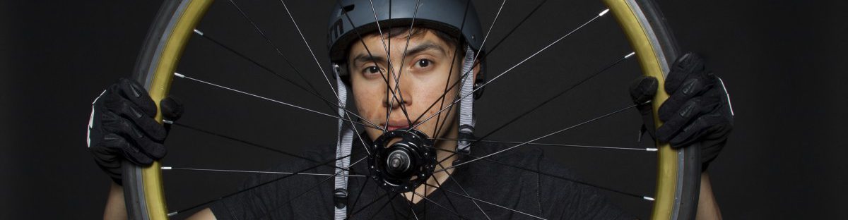
4. Results
During the photo shoot, we focused on getting images of healthy, active people. We used props to help illustrate this, and bright lights to make a vibrant, happy, energized setting. I think we were successful in following our ideas and getting good and well lighted results.

Ad here 
Album with 20 photos here

Topic 3: Health Care for All

  1. The photographs of people look very happy, excited, and in a good mood. I have noticed by looking at three different websites; Aetna.com, UnitedHealthGroup.com, and Anthem.com that they mostly have photographs of people outdoors, or next to windows, usually using natural light. A lot of the images are very bright and clear.
  2. It should be communicated that people are very happy with the company and products. Family, children, adults, etc are able to use it and be satisfied.
  3. The photographs will look bright and clear. People being vibrant, excited, happy. The props I would be using will depend on my target. But, if I focus on Adults I would most liekly use books, glasses, ipads, notebooks, etc.

Results: Since I was unable to attend class when photographs were taken, I photographed a friend outside in daylight. The photo came out  clear and bright and my friend was smiling and happy. Overall I am happy with the results of this billboard campaign ad.

I ended up changing my image after reading professors comment. I had taken many images of my sister outside so I ended up using one of those. I feel like it came out much better than the other one I had posted previously. The reason why i chose the image I had before was because I didnt want to have a different image from everyone else. But, after your explanation it made more sense. Thank you.

Healthcare For All Summary

Photography: In researching images used by healthcare providers, I noticed that in terms of color schemes, there were a lot of whites and blues, and very rarely were reds involved unless they were part of a banner or icon invoking the imagery of “healing”, such as crosses and bandages. People, when they were involved in the layouts, were overwhelmingly positive and upbeat, and only ads serving as PSAs showed anything in a negative light to dissuade certain practices. On the subject of lighting, there were never harsh highlights or glaring light sources in the ads I saw, instead they used diffused lighting to create a calm, inviting image that was easy on the eyes.

Communication Problem: Health Care For All New York’s mission statement , to me, conveys a sense that the company is a stern benefactor for people under its protection. While on one hand, it’s a priority to show the calm, inviting side of a healthcare provider, it is also a priority to showcase the uncompromising service of HCFANY.


Image Ideas:
Smiling patrons with HCFANY’s added to the composition in post.

Results: The warm, happy and inviting aspect of healthcare ads got through a lot more than “uncompromising”, I would think. The photographs taken were all complimentary portrait shots, and some were even lit in classic photo studio styles such as Rembrandt and butterfly lighting. Even then I am pleased with the results of this week’s shoot, and I believe the group produced enough material for their HCFA ad. My subject having a band-aid on during the shoot was very fortuitous for me, because it went very well with the topic.


Topic 3: Health Care for All

Kinds of Photography: Health Care companies use a lot of individual and group portraits, full body shots. People look happy enjoining spending time with families, friends, doing excises or just walking in a park. Usually image shows simple things of everyday’s life which can be impossible with illnesses or injures. We can see a lot of natural light on photos and usually an outdoor environment.  Age groups: senior people,  young people, families.

Communication Problem: Taking a photo for Health Care for All in photo studio can be challenging because it is more common to use natural light and an outdoor location. The goal is to show happiness and positive emotions.

Image Ideas: Group shots, showing relationships between members in a group.  Using a lot of studio lights to make it look closer to the natural light.  I might change the background image to more fitting image.

Results: The final image has a different approach from my image ideas. I have decided not to use group shots and not to change the background. However the chosen  image communicates in a clear way. The face expression shows confidence and  it fits the AD. The ball in hands,  which is also was used like a graphic element  emphasizes the name of the insurance company  and brings the attention. All and all the design looks clear,  interesting and it can deliver the message clearly.

The Lower Manhattan Revival

1. Summary
The texts talks about the revival of Lower Manhattan throughout the decade and more following 9/11. It talks about the controversy surrounding the construction of a new World Trade Center and how the new One World Trade Center and other new construction of condos and offices has given the area a rebirth, Lower Manhattan is no longer just for finance and business people, it has become more urban and diverse. People now come here to live, work, eat, shop and enjoy the nightlife. The article also reflects on how we have to remember the tragic event that took place 15 years ago, before the revival happened, and how the construction has made One World Trade Center perhaps the most secure office building in America.

2. Communication Problem
The images should show how Lower Manhattan is now a blooming area in many aspects – more diversity among the people who live there, the new businesses and apartment buildings.

3. Image Ideas
Places that should be covered in the article is the 9/11 memorial with the reflecting pools, the One World Trade Center, the PATH Oculus station. The images should show the contrast between new and old buildings of Lower Manhattan and the diversity of different types of people going about their everyday business in the area – office workers on lunch, a mom with a stroller, kids going to school, tourists, older New Yorkers chatting in the park, people on their commute. The images should be bright and encourage reflections, while giving the viewer a sense of positivity and hope.


4. Results
I think I captured a lot of the new architecture in Lower Manhattan well, but I wanted to also capture more of the diversity of people and I wasn’t as successful in creating images of people that came out well enough.

The album with my 20+ photos can be viewed here, and my 2 photos for the article is uploaded to the Flickr group: Main image, additional image.

The Lower Manhattan Revival

This article talks about the blossoming of the One World Trade Center, what they hoped to accomplish for New Yorkers to rebirth the history and give the urban neighborhood a new vibrant vision. There were many political battles after the violent attack that made officials and developers battle over the details of the reconstruction. The memories still being so raw made them realize they need to rebuild, but knowing there was so much fear in that location that the neighborhoods where largely left or either rents were dropped. After the rebuilding, the population actually tripled and made Lower Manhattan a vibrant business district with diversity of people and creative workers.  I believe the communication problem should show the vibrancy of this business district and show creative people that live here and commute here daily. For my image ideas, I want to make an emphasis on colors and people, do a lot of possible reflection shots and try to show in my work the wonderful thing that occurred. The uplifting of strength showing that they created something so beautiful in result of the sad moments in history for New Yorkers. In result, I think it looked better than I expected. The colors and the people were sown and also it shows the reflection of everything that is growing there.

Lower Manhattan Revival

After the Twin Towers fell, our world was torn apart but our country was brought together in a very different, strong and beautiful way. This article describes the look and feel about One World Trade Center, as well as what’s being built in the neighborhood of “the tallest building and most expensive building in the Western Hemisphere.” Jonathan O’Connell describes how they made the building safer by building a stronger foundation and reenforced building structure. He also explains how it’s going to be used and what the neighborhood should be expected to encompass. With apartments in and around the building, restaurants and stores by famous people, and a memorial museum, it’s expected to have a welcoming and lively feel. The images that should accompany the article should show how the area has come alive. It should have One Trade Center Rising from the ground up to show how our city stands tall. Or maybe it can have people coming together in love and remembrance.

Results: