Author Archives: clyde

Final Project Brief

Article: http://www.thedailybeast.com/articles/2011/10/25/why-our-brains-love-horror-movies-fear-catharsis-a-sense-of-doom.html

1: Summary: The article mainly illustrates the correlation between our brain and the fear that is emitted from horror movies. It conveys the idea that people like to be scared, as it is akin to a rollercoaster about to go down a huge drop. It is that rush, that excitement that stimulates people’s minds, and they can not get enough of it, even if they hate horror.

2: My audience would be teenagers to adults both male and female who like horror movies.

3: My approach would not be as metaphorical, so some shots may be, objects, while others may include models

4: Mainly still life, and some models as an alternative.

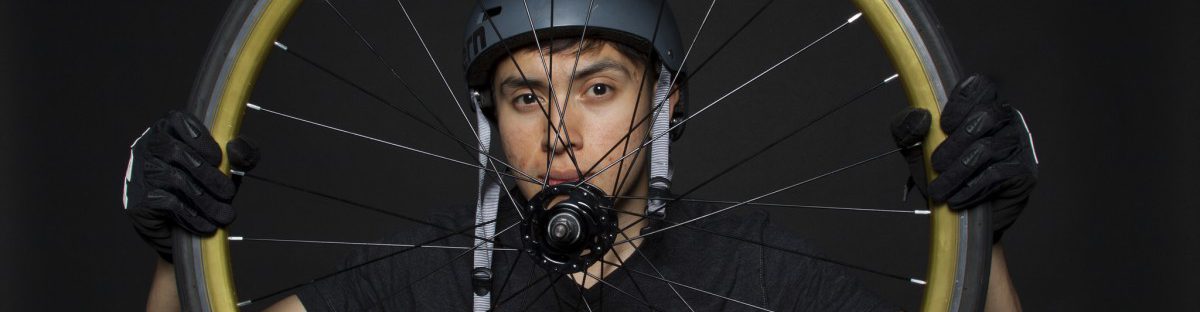
5: Models both male and female

6: My props would consist of objects

7: I’ll be using strobe lights to have high contrast.

8: This technique will allow me to get high contrast on my photos, dark shadows, ect.

Toy Car

“she being Brand” by e.e cummings, was a great poem, that evoked some interesting imagery. From reading the poem I get a sense of adventure, a bit of thrill, awkwardness, and a sense of a bit of lust, as the overall feeling of the poem. So in terms of photographs, my pictures would try to capture the strong feeling emitted from that poem. I would try to get little contrast in my images, as I want the photos to be well lit and a big close up shot of the toy car. Or if possible a close up of the inside of the toy car as it was mentioned numerous times within the poem.

“Coming Home, Detroit 1968” by Phillip Levine, was a more serious poem, but still quite interesting to read. This poem gave a sense of, coldness, grungy feeling, harsh, dark, and ruggedness. In terms of photography, my photos will have a lot of contrast, really dark shadows to show the mood. I may have some close ups but, I would also like to explore having a lot of negative space to give a feeling of emptiness.

Headphones

The headphone brand I will be using is called WESC, it is a very youthful and overall stylish company. The NYC public service campaign, basically talks hearing loss and how it affects a lot more of us than most people would think. Especially the younger generation who seem to think their ears “invincible” and just blast away their music, permanently damaging their ear drums. My target audience for the headphone ad will be teens and adults that are into fashion and style.  While my target for hearing loss will be for adults, who understand the dangers of constantly blasting music. One of my images i hope to convey that the headphones are stylish and fashionable, while my other image I hope to show the seriousness of hearing loss. In terms of lighting I want the headphones ad to be well lit, to convey a sense of vibrancy and energy, while the hearing loss image I want some nice shadows to illustrate the seriousness of the matter.

The Lower Manhattan revival

The article “The Lower Manhattan revival, now featuring One World Trade Center” is quite an interesting read. The basic gist of the article talks about Lower Manhattan, before 9/11 and post 9/11 and how Manhattan is slowly getting back it’s vibrancy. So the focus of the images I am going to take should focus on the positives of Lower Manhattan, such ass people interacting with each other, everyday activities,  and even just the beauty of the city itself. I will try to avoid depressing type of images or images that could invoke depressing feelings.

Social Media

According to the article, social media is getting a bit out of control. The iron grip it has upon it’s various users are quite powerful, to the point where people are addicted. Some people may not view it as a problem, indicating it’s a way to communicate with people. But Its actually quite the opposite, as social media is corrupting our face to face communication with others. Corrupting and infecting our communication skills like an airborne virus that has become a pandemic.

I feel like social media should be controlled more, so images with a bit of humor should be use, as it will appeal more to social media junkies.

Topic Three: Health Care for All


The three companies I looked up were AbbVie, Abbott, and American Addiction Centers, while focusing on their choice of photography I noticed some striking similarities. First of all, majority of the photographs had people, and some focused on environments. The photographs of people were well lit, giving the subjects a very warm and inviting look and most of the shots were either head shots or 3/4 shots. Also when the health care companies used photographs of people they used very energetic images, any image that had a multitude of people were quite engaging and looked very natural and full of life. If scenery was used, it was used in to ways, by itself or with people. The scenery would be something very peaceful to look at, being very easy on the eyes, when used with people, the people are usually in focus while the background scenery would be soft and blurred.

For a company trying to promote themselves as a health care company, certain key elements should be incorporated within each photograph. Each photograph should invoke a warm and inviting feeling, so that people would not feel, for whatever reason threatened or hostility to your company. Each image should also flow with energy and not be static or boring, to be able to catch people’s attention.

I would like my photographs to be a mix of some breathtaking scenery and some positively inviting looking photographs of individual. This blend would not only make costumer feel invited but I believe it will also leave them with a very tranquil feeling.