Author Archives: Jessica

About Jessica

I look for a different challenge every day. To me, everything I see is full of wonder. Visual is the reason why I am who I am; it brings everything to life and it’s the reason why art is so valuable in today’s society. I am experienced with Layout Design, Interactive, Photography, and Packaging Design. With these categories, I tend to evoke publication to life, with color-intention and typography to make the work appealing. I believe in simplicity and clean design that gets the message across. I have a great love for magazines, books, photography and environmental issues.

Final Project – What works VS What doesn’t

Below is the a image that doesn’t work.  The reason is because working with a lot of plastic is very challenging !!! . The shiny plastic makes the image look ugly. Here i tryed used card board but noting. The lighting was horrible everything just didn’t want to work nicely so sad. Below this image is another image that works. not only is it better than the first one we can see the eye, nice. I do need to fix it up and all but overall it hit close to perfect with the glare._MG_1343_MG_1304

Final Project

My final Project is about Ocean Plastic Pollution and how it effects Marine Life, weather they are fish, turtles, or even mammals. The ocean is huge and its true, Plastic doesn’t go away, we are surrounded by plastic and these animals are getting effected by it.  We use plastic everyday its everywhere so we don’t understand where it goes once its gone. It ends up in the ocean and the problem here is that affects our economy, costing us untold dollars spent in beach cleanups, tourism losses and damages to fishing and aquaculture industries, which at the end of the day isn’t fair. This article also tells us more about how to solve this problem but i am putting attention more to the section called “A HEAVY TOLL ON WILDLIFE”

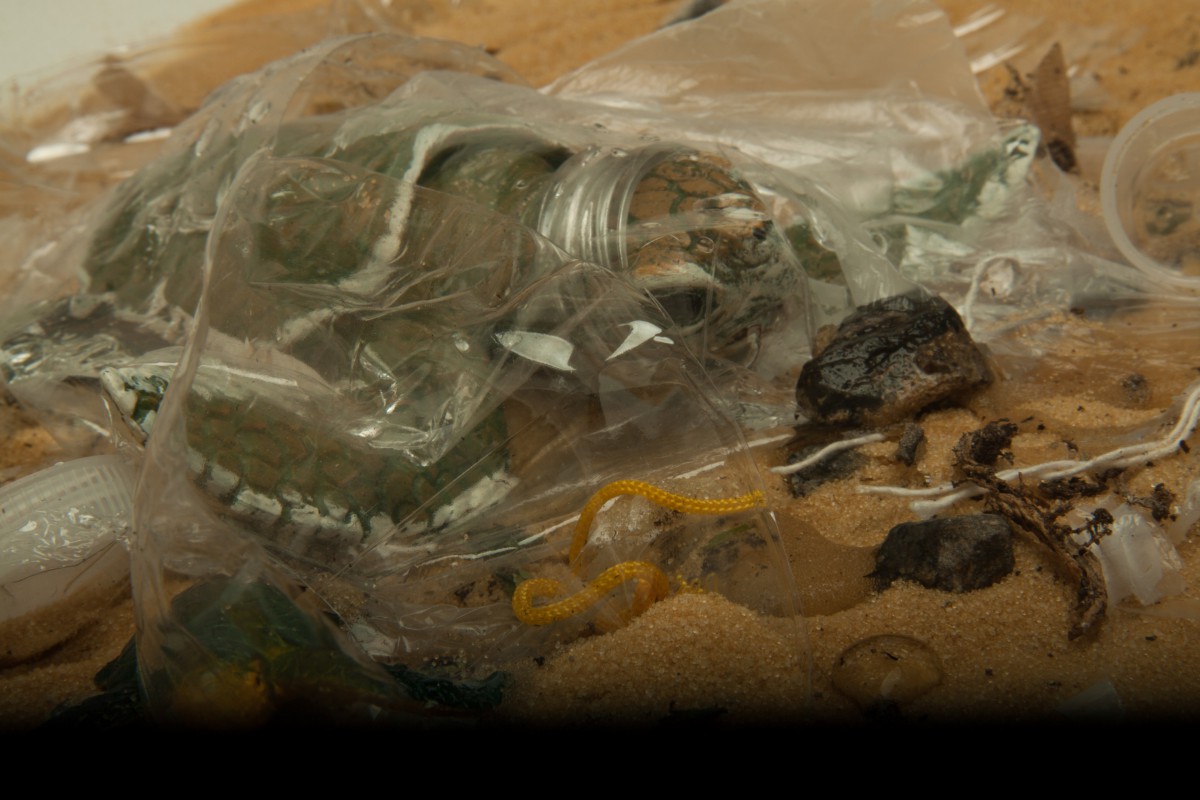
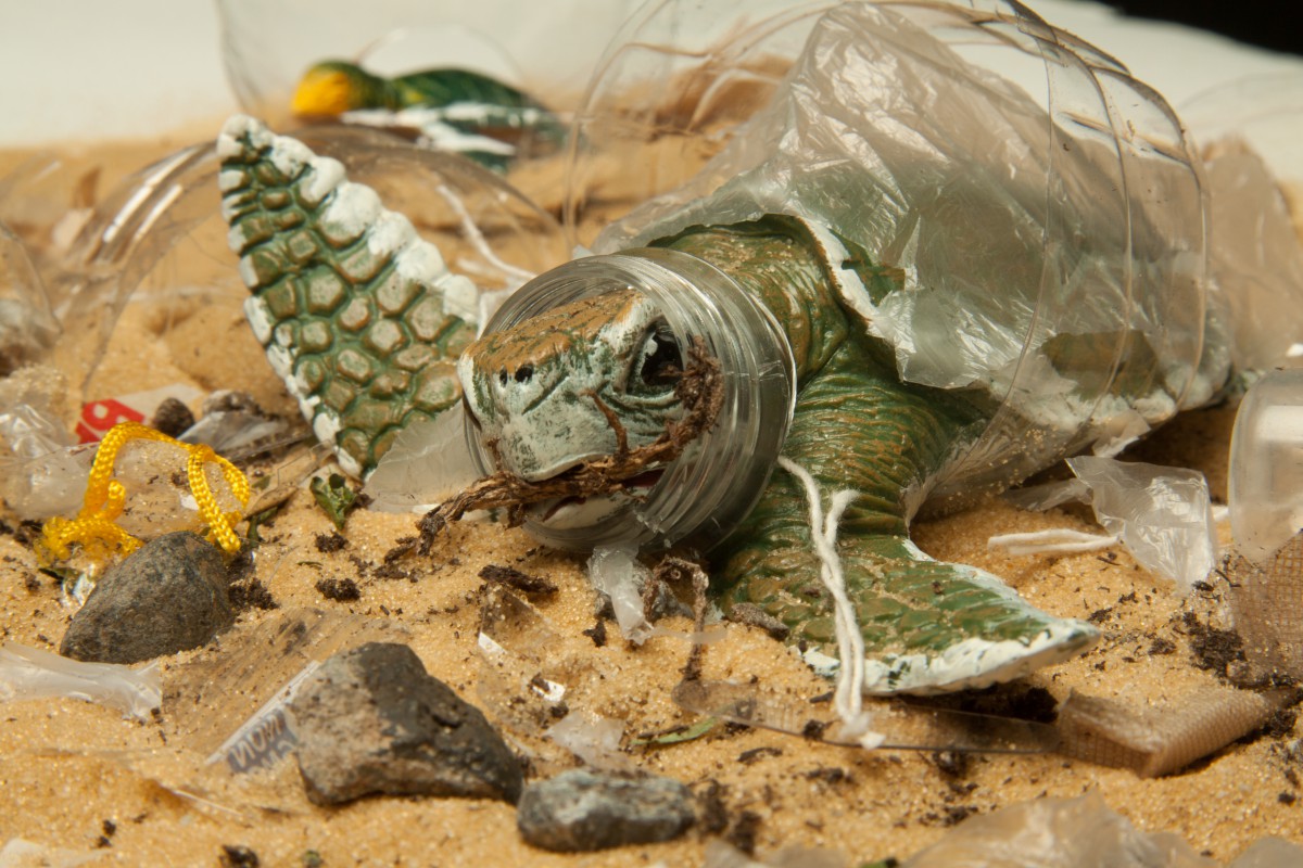
My intention for my shoot is to use a turtle and a couple more sea animals to represent what happens to them. I am going to place a turtle in a sand with plastic and stuff around it, having the turtle have plastic on himself showing how its tangled and how it effects him, he seems to be stuck. Another image is going to show a water bottle and inside the bottle will be sand dirt rocks and many different types of plastic with different Sea animals inside of it to show that plastic is taking away the life of these animals because they are stuck, nowhere to go and no one cans save them once they plastic inside of them, eating it or around them. Another image will have that the turtle will have plastic on its shell and its suppose to show that everywhere he goes plastic is going with him and he is in danger. Another image will show the turtle inside the water of bottle but a half bottle of water how he is inside of it with plastic surrounding him and on his mouth. Many images will be shot up close or over head.


Article Link : http://www.biologicaldiversity.org/campaigns/ocean_plastics/

Final Project

My final project will be based on the issue about how Plastic effect marine sea animals. How it kills them and how its is destroying not only the lives of sea animals but in addition is adding to our pollution in our own ocean. Water is very important to our lives, so does sea animals. I care a lot of about this situation. Plastic is harming animals and it should be stopped because lives are getting lost.

Cindy Crawford Omega

What she is saying about her piece is about the  over all ad and how she is putting herself as the center piece, she is the focused towards the camera with a very sexual way with her mouth open and the way the light is directly at her. She is wearing the watch and in the first paragraph it states “time together”. To me this means that her and the watch have a relationship, which is a part of her personality as a person. This image of her is a bit dramatic because of the lighting position straight at her but in a very soft and gentle way. The second paragraph she is telling us how we don’t care how the product is made, but we just want the product that is being stole. We don’t look at who or what makes the, we just know that it is appealing and we want it because we already made a relationship with the product that in a way we are selfish to not even care about what happens before the product is even being advertised.

I disagree with her. The reason is because an AD and the way the product is made,  depending on the ad business statement are two different way of looking at it. By this i mean that an ad is suppose to be appealing and the public should have a relationship and because they have a relationship the target audience will keep buying your product over others. If we decide to tell the public ho wit was made, weather works were treated well or not, than everyone can say bye bye to things that the enjoy. In reality almost everything is made in ways people might not like but its just the way things just have to be. There was this saying “there are certain things better not said “. In general i think that everyone should be told the truth about anything but its the way the business goes.

Poetry

After reading both poems about a guy riding a car we can tell the difference in tones and how they used metaphors to communicate us a message about what is going on. In the poem by e.e Cummings, its all about excitement , thrill and being happy. The emotion he is having with this woman in the car and being the fact that it is her first time. We can tell this poem is very sexual because in the poem we see metaphors such as “Slipped the clutch” meaning that there is something going on in the car and boy is he happy about it and very aroused. This poem has very positive and good thoughts going in this scene. However the poem by Phillip Levine, the tone of this poem is quite opposite. Very harsh, cold, dark and just a devastated tone and feel to it. In his poem the guy is going to work in his car and thinking how life is and why it is the way it is. An example from the poem that shows this, is “Near the freeway you stop and wonder what came off, recall the snowstorm where you lost it all”. You have a feeling of something unpleasant. We can picture it in our minds that he isn’t happy or excited but the opposite of it. The difference in these poems, is that one shows happiness and having a great time with a partner, while the other is very cold and dark where the feeling is down and this guy is thinking about why his life has to be the way it is. Although they both using a car we can easily see the difference between them, and the way the poem is written.

Vanitas

To me the  Dutch 17th and 18th Century still life painting had a lot of color harmonies. i believe that this is key and also having something that shows birth and the process of death in some sort of way.  This painting shown to us, give us a clear message that was created to be mortality, because in this painting we saw a bunch of things, such as the baby seeming it was running away, we saw a birds nest and eggs on it and we saw insects a butterfly and flowers on the photo of Jan van Huysum that might represent not only the good but also that at one point they died out, that flowers and all these beautiful fruits and vegetables aren’t going to last forever .

Hector Rene Membreno-Canales uses  the style of Dutch still life painting and the idea of Vanitas in his series Hegemony or Survival, because he puts elements that describe what he has  went threw and the items such as the ticking bomb, the gas masks shows how he survived a hard time and also he’s color choose, were all very unsaturated and he’s back drops were all black  giving it a feel and focus on the items on the table. I say that the style he has used is very effective as mortality. The reason for this, is because he’s images were surrounded with not only violent items but with the color and how its focus on its theme .

Botany of Desire

A plant’s Eye View of the World, is about how a plant can even be consider to have tag. By this, i mean that in order to grow potatoes you need a licensed and a operating software wants to run these types of potatoes, like if they are some kind of tracker, wanting to know everything about them. In this article, they talk about a metaphor. To me this metaphor is that this new  potato, needs a O.S and to me this is kinda funny. Once human come in in contact with this type of food, what will happen to them? This is a new type of generation which can say what you can eat and what you can’t eat that because this one is better, but what is actually good for you when the food supply is now taken by someone very powerful. To me after reading this article the image that comes to mind is a Potato with a number tag on it. The reason, is because here it will show what this new generation of potatoes will look like. The lights will be dimmed, so it will be a high key image. All spot light to the potato but also the tag number which can represent the Microsoft metaphor about the operating system and getting information, off a plant.

Pantone

The central metaphor of this brand campaign for Pantone, is light being reflected as a set of  paint. The reason why the company  decided on  this metaphor, was because Sub Rose the AD/Branding Agency, had  pitched the idea of using light to paint the world and using lighting design, that could communicate “brilliant”. This message was very effective. The reason why, is because showing color in an aspect of light and incorporating that with technology they nailed it. It looks like they used paint but really its light.  What I learned from reading PSLN, about the process of making these images is that sometimes you have to work with what you have and by this I mean that in this campaign,  the team used continues lighting to capture all these wonderful images. What surprised me the most is that they didn’t have to retouch any photo at all. They used the photo they shot in their campaign. They captured what they wanted and more.

Mirrors and Windows

Szarkowski uses a metaphor of mirrors and windows, in the above images. Mirrors meaning it is planned and windows is reality. Crewdson photo is a mirror photo. The reason it is a mirror image, is because he was in control of taking this shot. Meaning that he planned it the lighting,the people, the setting, the fact that there groceries on the floor, mom wearing a coat yet daughter not as much clothes.This scene is a night scene we can see that the daughter is looking down at the mother, where there is no high contracts but low contracts making a very big impact in this images feeling and gives us a sense that this image was shot in a community area because of the houses next to each other. This image is an example of extensive depth of field, where everything is in sharp nothing is out of focus. However Winogrand images is a window photo. The reason for this, is because there was no planning. The feel of this images is kinda lonely, we see a child looks like he or she is about to run out, the background looks very dull empty. The garage is low key not enough light and outside we have direct light from the sun hitting the floor. This image to me has more emotion because it shows reality, I might not know the story but just looking at the baby walking out alone living in an area where there much people the only light is the sun and mountains are seen from afar. It has a range of lighting tones and it has a feeling of depth between the house and nature. The black and white pictures focus our attention to the baby because of the light directing to her.