COMD3504 - Section OL69 - Spring 2022

Author: Gloria Rosario (Page 2 of 3)

Week 8 Response

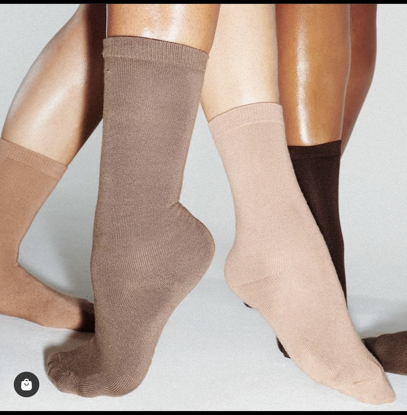
This is an image from instagram ads about skims.

One of thing that skims has been very consistent with is making sure that for every product they create different shades to go with skin tones.

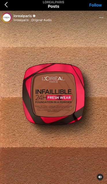
The is an integral ad from loreal

As makeup brand there has to be different shades of colors. I noticed most clothing and skin care product brands are focusing a lot on showcasing the fact that they create products for all skin types.

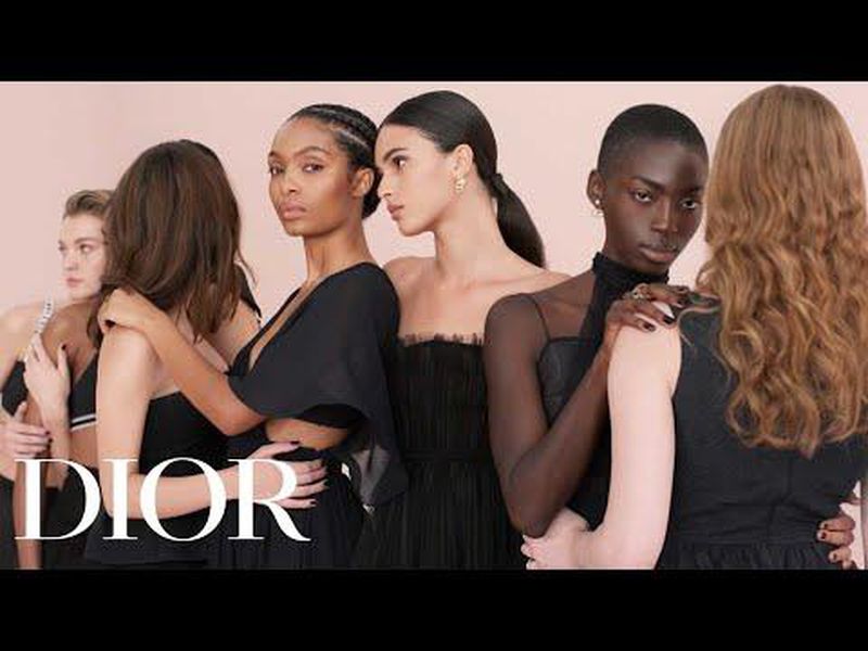
Dior ad campaign (Image from Pinterest)

This is the first time I see this ad and I understand it without any further explanation because I use Dior’s foundation and it is perfect for my complexion, they have a vast variety of shades.

Week 7 response

ā€œMedium is the messageā€ by McLuhan is a very interesting article and I am so glad that I have this opportunity to read it. The discussion at the beginning of the paragraph is about the way in which we are all changing and everything around us in a very fast and drastic way. Another interesting point is the way in which things are being communicated and how this information Is being absorb by society, specially children. 

A quote from the article that I found profound and relevant to what is going on in the world now reads ā€œ A new form of politics is emerging and in ways we havenā€™t yet noticed. The living room has become a voting booth.ā€ I think that this is a very powerful statement because depending on the issues that are happening in the world is what we perceive form the television programming and it becomes part of us and part of a daily discussion in our most intimate places and moments. New information is being presented to us all the time, for different platforms and different point of views and depending on who is giving this new information and there is new things to know and learn about all the time. 

I like the way he touched every aspect of what make up a society and what makes us. For example, when discusses ā€œ your job,ā€ ā€œYour government,ā€ ā€œYour Family.ā€ This are of all the things that makes us and a society.  I think that for a designer it is so much easier to reach an audience now but this is both good and bad because the information is not always good or correct and is a constant flow of information to the point that peopleā€™s lives are being consume by all of this. 

Week 6 Response

I think that when designing, it is important to consider who the audience is, what is the message or goal. It is important to have a deep understanding on the cause and what the deliverables will be. In Designing programmers by Karl Gerstner readsā€ The creative process is to be reduced to an act of selection. Designing mean to pick out determining elements and combine them.ā€ I think that this is a very important point because determining what what will be the main focus when and combining the most important elements is a great approach. 

Moreover, I think the ā€œProgram as Gridā€ is an interesting concept worth mentioning  because it focuses on balancing and accommodating each item to deliver a well organize message. Looking at the grid on page 61 ā€œDesigning programmers by Karl Gerstnerā€ it is complicated to understand what is going unless there is an explanation. Designing can be complex and it takes time to decide where we want each item to go and how to display this in an organize, concrete way. 

In Grid and Design philosophy by Josef Muller-Brockmann. He explains the importance of grid for designing and math is an important tool in design. The elements used in design, typegrophy, color, shapes, logo etc. these elements need to be position perfectly to fit the template that is being used to showcase the design. The use of a grid is essential in order to organize, make some elements stand out, clarify what the message is. 

Discussion 5b

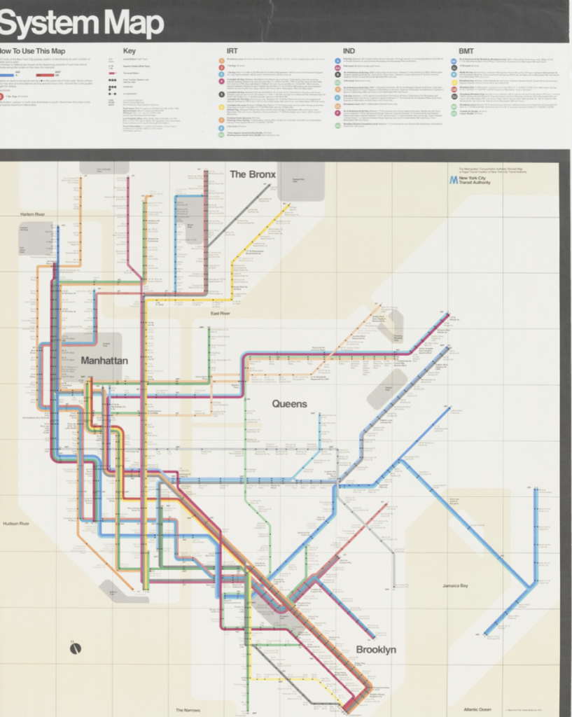
The poster I chose for my paper is “New York Subway Map” by Massimo Vignelli from 1970-1972. This is the design of the subway system map in New York City. The readings that I will be using are: Our Book by El Lissitzky and Who We Are by Aleksandr Rodchenko, Varvara St epanova, and Aleksei Gan.

Type: poster

Medium: Litograph

Department: Architecture and Design.

Dimensions: .1: 59 x 46 3/4″ (149.9 x 118.7 cm) .2: 58 7/8 x 45 3/4″ (149.5 x 116.2 cm)

Week 4 response

I really enjoyed reading these articles, Specially Typophoto by Laszlo Moholy- Nagy. I am fascinated by typography because I think that it is such a big part of design and a lot of times typography alone is art. I think the concept of ā€œtypophotoā€ is very interesting, the combination of photo and typography is a powerful tool of communication. A strong typography illustrated through photography is beautiful and a simple way of communication.Ā 

On Typography by Herbert Bayer, he starts off by explaining that we need new styles of typography which helps designers get more creativity and excited. I think that there is some truth to this, seeing a new typography is exciting for me and I havenā€™t done any big work so I can image for someone that has been designing for a while. I recently attended a workshop about typography and I did not know how difficult it is to come up with a new typeface and the hard work that goes into brining it to life. 

One interesting topic is ā€œprinting,ā€ Nowadays some material still gets printed but it has change so much and most work these days never gets printed. I have a printer and I forgot when was the last time I used it, this is a digitalized age and printing has been a huge part of design for a very long time and it seems like it is staying behind. Therefore, some typography design may never get printed but will be shared and admired through imagery and film. 

Discussion 4a

Manifesto for designer’s in today’s society look very different due to the boom of technology. Nowadays, designers can showcase their works through many different platforms. For example, they can make a pdf, an illustration, paint, architecture, film. There are many different ways in which a manifesto can be presented and all of this options can be printed, mail, share, airdrop and many more. As oppose to the way that manifesto’s were created in 1910, these days a poster can be share everywhere. I think that we can say that the future of design is changing a lot and is easier nowadays to share your work and present it in many different ways. A manifesto from these times that I think is a great representation of where designing is heading is; “The image object post-internet” by Artie Vierkant and it shows how much the internet has change the way things are shared, stored and everything becomes copies and images. I think 3 ways that design will probably go are:

1. I think that is going to be more digital.

2. NFT’s, metaverse.

3. Design that is pleasing to the eye because people are more inclined to share and like things by the way they look.

Week 3 response

These articles were very interesting and I think that they share the same thought that the way that art and design is changing and will continue to change with the advance in technology. I think that issues with the way that technology is advancing so rapidly is that it forces designers to consider the way they design their work and I think that this takes away a lot of freedom from designers. Same with any issues that are happening in society, especially nowadays with all the different movements and people protesting and I think that people expect designers to project this in their work. Designers have to adapt with the times, wether thatā€™s technology or whatever issues the world is facing. For this reason, I think that art and design have been and will always be a big part of history, 

In the story ā€œwho we areā€ manifesto of the constructive group by Alexander Rodchenko, there is a line that says ā€œ Technology is the-mortal enemy of artā€ like I mentioned above technology forces at to change and adapt and move at their speed. Technology advancement is difficult to ignore. In order to reach the audience, the work needs to presented in platforms that everybody can reach. Another line I found interesting from ā€œOur Bookā€ by El Lissitzky reads ā€œ The cinema and the illustrated weekly magazine triumphed. We rejoice at the new media that technology has placed at our disposal.ā€ I think that this is very interesting because we do rely on the weekly magazine to tell us what is going on in the world, etc and we are accustomed to it by now, we like it and look forward to it. 

Discussion 3b

An ad that interested me from the super bowl is the Budweiser commercial “Clydesdale’s journey.” I chose this ad because is very touching and the visuals are great. There was no verbal communication, just visuals and sounds, gestures from the animals and humans that described what is happening. I actually closed my eyes the second time I played the commercial and just from sounds I was able to paint a story in my head of what could be happening and it is not far off from what is actually happening. They did such a great job with sounds, you can hear the wind that gives us an idea about location, the horse when it got hurted, the sounds it made, the dog’s concerned sound and the horse running again at the end that tell us that he was healed from whatever wound he had. They showed the beers for a few seconds which I thought was very smart because they kept the focused on the story and not so much the product and the message at at the end was very powerful ” In the home of the brave, down never means out.”

Assignment 2

Both of these lectures were very interesting and refreshing. I personally Never think about language, how much it has  change over time and the way we communicate today so it is very inspiring to read these articles, and stop and think about language. Nowadays, we donā€™t even appreciate the way we communicate as much. We can easily go all day without talking to someone and just texting on the phone or even worse, some people stopped using a pen to write altogether since everything is electronic these days. Every semester for school, I purchase a notebook for each class because I like to write down my notes, when I am studying I put my phone away and write my thoughts. I learn better this way and I enjoy it. These readings really made me think about the evolutions of words, symbols, etc. 

A part that stood out me from Lupton Millerā€™s design writing research is the part about ā€œkeeping scoreā€, the way that symbols or a word can have different meaning. I grew up in a farm, my grandfather didnā€™t go to school and I remember that when he ordered stuff or he needed to write something that was number related. For example, he would make 3parallel lines III and a line across to group them. So fascinating that this symbols meant numbers. 

Also, another example that stood out is the use of the letter X. It could mean different things and we all use it for those things constantly and the majority of people know the meaning for each scenario. Another important point is the use of hands and and how is use by humans to do math and the meaning for the numbers in each culture. This is also something I never thought about, I never knew that I count to 10 with my hands but my feet make up another 10 and how we can use our body to represent numbers. As well as, Signs that we see everyday and guide us to where we need to go or what we need. Symbols are a huge part of design and part of our daily communication and how we move in the world. 
« Older posts Newer posts »