https://drive.google.com/file/d/1JJd-7aprea-gr2fBLT4i7A9ge0Ontnxj/view?usp=sharing
Author: Ebony Derrick (Page 1 of 3)
Bibliography
Minioudaki, Kalliopi. “Neo-Pop Anti-Product.” Afterimage, vol. 34, no. 1-2, University of California Press, 2006, p. 82–.
N, A. “Pop, Neo-Pop and Post-Pop.” STAIR Galleries, 13 July 2018, https://www.stairgalleries.com/news-insights/insights/pop-neo-pop-and-post-pop/. “Top Three of the Most Famous Neo Pop Artists in Art?” Www.carredartistes.com, 2 Aug. 2022, https://www.carredartistes.com/en-us/blog/the-kings-of-neo-pop.
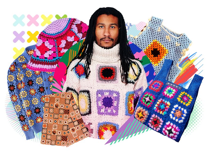
While I was researching fashion that may start to mainstream, I remembered seeing a lot of people start to wear crochet clothings such as tops and dresses on social media platforms. It started to show up more as a mainstream in 2021 but was created in the early 1800s in Europe by Mile Riego de la Branchardiere. Crochet clothing was also seen as [a possible] mainstream in the early 1970s but there isn’t much information to prove it. With many people in our society today willing to be as eco-friendly and environment friendly as possible, crochet clothing will possibly become a mainstream [again].
“The Underground Mainstream” by Steven Heller the scribes how the underground and mainstream concept works. In the reading, it describes and explains that the ideas from underground trends are used to create mainstream commercials and advertisements. This is done by taking the ideas or using the underground trends as “inspiration” with slight changes to “create a new idea or trend.” The world of commercials and advertisements rely and is dependent on theft from the underground mainstream to create “lively” advertisements and commercials. In the reading, it states “all it takes is the followers of followers to cut a clear path to the mainstream.” This quote describes that even if there’s no design or a new form of art or design movement is created, People will take interest in it to create their own version of the “example” that they see.
Both Cubism and pointillism can we connect it back to the mainstream versus the underground difference. Cubism was created to show entire structure, object, or story in paintings without the use of specific techniques such as perspectives or use of shadings to create a realistic piece. It uses a wide variety of geometric forms and decomposes the realistic subjects with the geometric shapes to give a distinct impression and a unique perspective. It was used to create the development of abstract modern art movements. Pointillism was created as a reaction against the popular or trending of impressionism. it can be used to represent landscapes, portraits, and seascapes. The motive of pointillism was to create paintings that soothes the scene, especially those with opened areas. Pointillism focuses more on applying “raw” colors of different shades and dots of different sizes without mixing colors onto the pallet. The creation of pointillism wasn’t in the original or new idea which makes it a “stolen idea” with slight changes, the original movement or idea was impressionism art.
Many artists and people have mainstreamed Cubism and the different art forms while pointillism was a stolen or mainstream idea. With some thoughts while writing reading and doing the research on this paper, I realized that both pointillism and Cubism can we create created into a new design theory or design/art movement. both have various similarities to the point where they can be combined at any given point. For example, since Cubism focuses more on geometry and pointillism focuses on various dots in different sizes, then the point where both design movements meet as we are pointillism is used throughout the entire piece especially where geometry will occur.
Sources
Apollinaire, Guillaume, and Dorothea Eimert. Cubism, Parkstone International, 2010. ProQuest Ebook Central, https://ebookcentral.proquest.com/lib/citytech-ebooks/detail.action?docID=886874.
Kalba, Laura Anne. Color in the Age of Impressionism : Commerce, Technology, and Art, Penn State University Press, 2017. ProQuest Ebook Central, https://ebookcentral.proquest.com/lib/citytech-ebooks/detail.action?docID=6224776.
Lifshitz, Mikhail. The Crisis of Ugliness: from Cubism to Pop-Art, BRILL, 2018. ProQuest Ebook Central, https://ebookcentral.proquest.com/lib/citytech-ebooks/detail.action?docID=5449578.
- I’m interested in cubism and pointillism and how it changed the role of art and graphic design.
- Cubism has been an interest I’ve had in art and design because of the use of abstract structures and shapes being put together to create a completely different and unique art piece. Pointillism has also interested me because it’s fascinating that out of small dots on different types of surfaces can create such wonderful art and designs.
- There were a few designs and trends that fits into both of my choices that I’m interested in, but to narrow down my choices I’ll be doing some more research.
- Both cubism and pointillism can relate to and can be separated and isolated like the readings “Rhetoric of the Image” by Roland Barthes, “TypoPhoto” by Laszlo Moholy-Nagy, and “On Typography” by Herbert Bayer have done and described in them.
- I believe that “TypoPhoto” is a great reading to compare to both cubism and pointillism, and can be used to be more in depth with both art and desifn movements.
- I believe I can create a new theory with the right amount of research.

The Three Messages of Panzani Advertisement was deconstructed by Roland Barthes, the messages consisted of the order of illustrating the rhetoric of images, in this case the image on the first page of the reading.
The Three Messages of Panzani Advertisement:
- Linguistic Message
- Consists of the caption, typography, and title
- The denoted message or the meaning behind the design or label for a company or person
- The attention that it grabs from its viewers though labeling or texts.
- The linguistic message for the image in the reading is that the ad is for an Italian food company.
- Iconic non-coded message:
- There needs to be a visible item, icon, or logo that represent what is being shown and signified to the world.
- The signifier and signified fall hand in hand with each other which provides the non-coded message.
- The realism of the image being used is what help to bring it together, creating a more natural look.
- In the case of the ad we see in the reading, there’s no form of decoding to do since the tomatoes and other products represent just that.
- Iconic coded message
- There are 4 main signs when analyzing the entire image as one.
- The scene can be used to have representation and used as a signified item. In this case the overall meaning is created by various signifiers.
- The half opened shopping bag/net with the grocery items starting to fall out is the connotation of a signifier. To be able to understand the sign, we need to understand the representation of the shopping bag/net and the cultural meaning of “local shopping.”
- The colors of red, white, and green are used to represent Italy, which is used to enforce the linguistic connotation of the logo Panzani.
- The closeness of the item or logo signifies that Pananzi provides a huge variety of culinary services and is a good way to have the opportunity to make a fresh home-made meal.
- There are 4 main signs when analyzing the entire image as one.
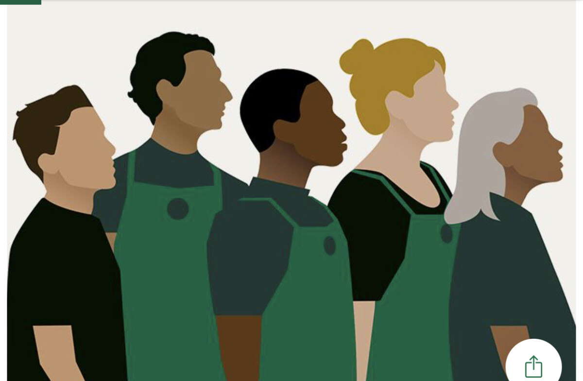
I chose an ad from Shayne’s previous post. This ad caught my attention because it’s illustrating a diverse group of Starbucks employees. It represents their high acknowledgment of people of different races and different backgrounds. The only thing that I was a little confused about with the ad is the male figure on the far left and the female figure in the far right not having on a “Starbucks apron” on. With some thought to it, I imagined them to be either Starbucks managers or a customer.


Recent Comments