Contents
Composition Review
Rule of Thirds – Instead of placing the main subject in the center of the frame, divide the frame into thirds horizontally and vertically and place the main subject at one of these intersections.

Diagonal Lines – lines that reach towards opposite corners of the photo

Photographer: Steve McCurry
Leading Lines – lines in the photograph that lead the eye to the main subject

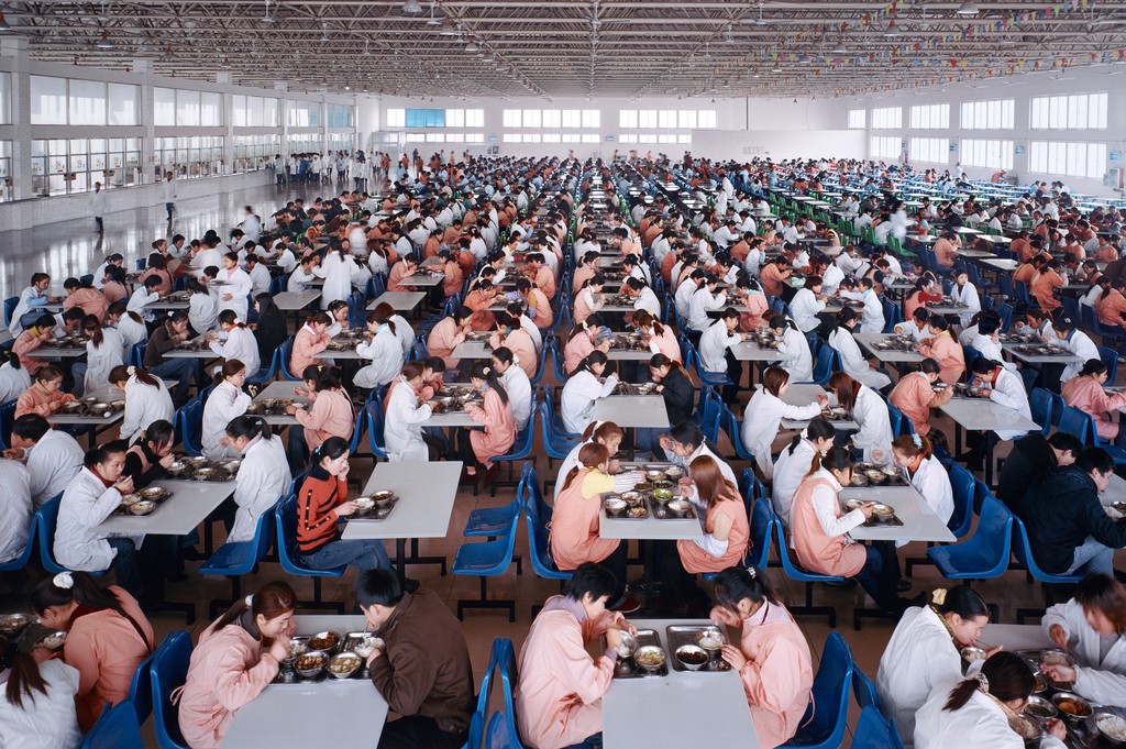
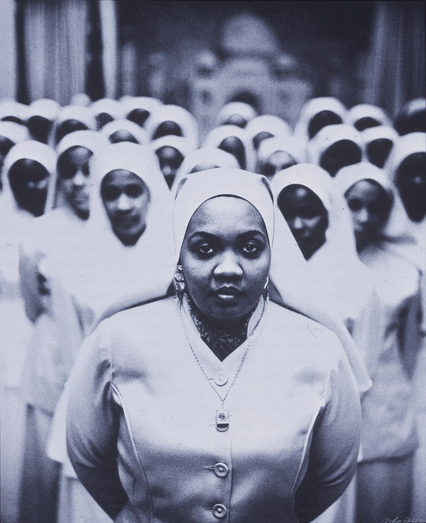
Patterns – repeated elements. Break the pattern for visual interest.

Symmetry – If you fold the image in half the two haves are very similar and have equal visual weight. Or make it asymmetrical to add tension to the composition.

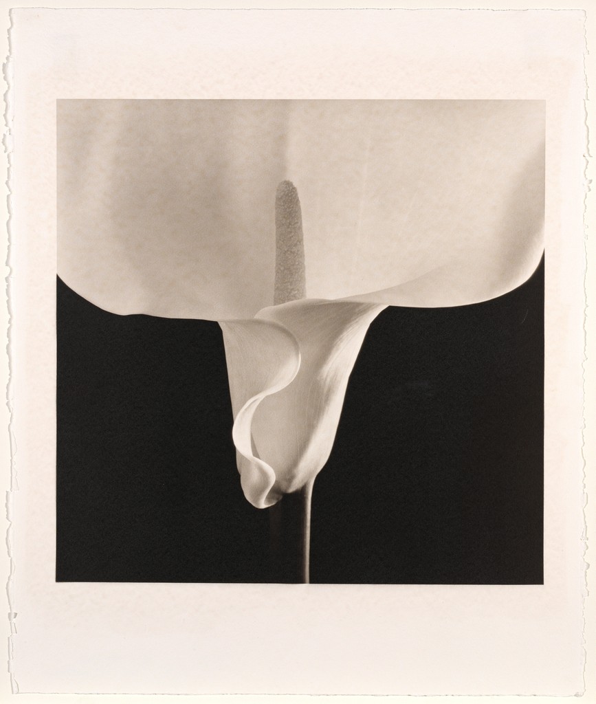
Figure to Ground -the relationship between the subject and the background sometimes described as negative and positive space.

Contrast of Light and Dark – The darks are close to black and the lights are close to white with few mid-tones.

A Frame within a Frame


Leave a Reply