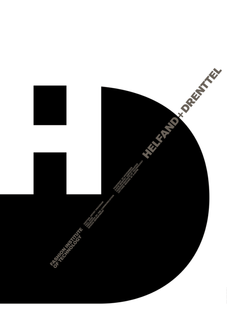
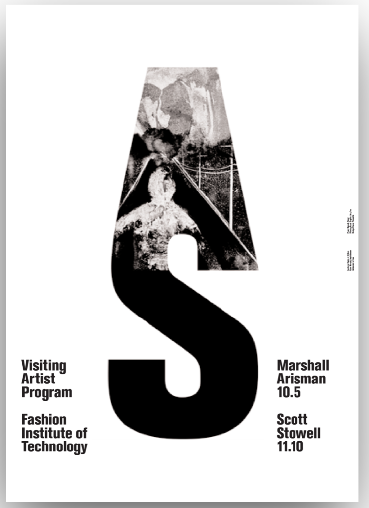
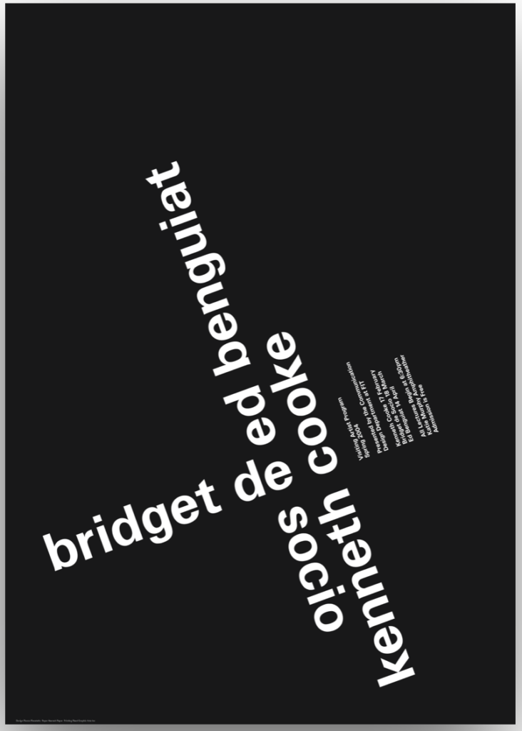
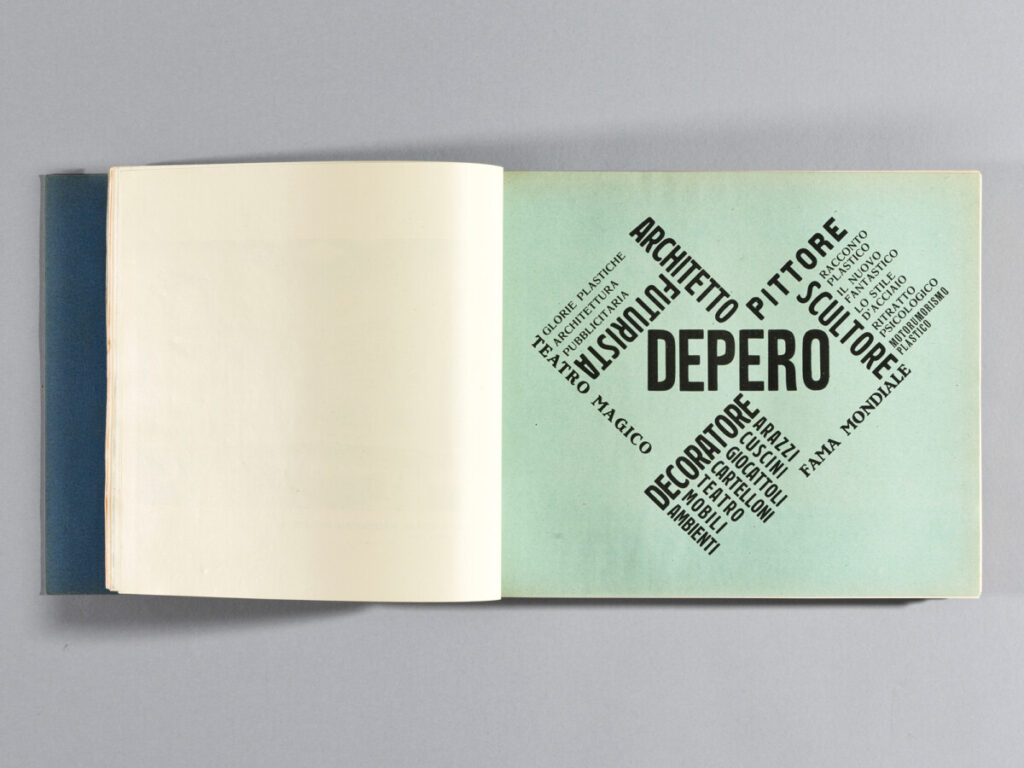
I choose these 2 pages because the use of the text to make a familiar shape instantly draws my attention to it and it is able to maintain my attention by having the text rotate in a way making a circular composition.
Category Archives: Student Post Type Talk
Garcia Michael_TT_RP
This poster doesn’t work because it is hard to read, with no clear area of attention that the designer wants the reader to look at. This seems like it might even frustrate some readers when trying to understand what the text is trying to say because of the lack of diversity in the text
Jiang Hailey_TT_RP
The one on the left works the least to me because the tracking between words and letters makes it hard to read. My eyes were tired to identify the meaning of the poster.
The one on the right works best to me because of the scale contrast between text form, it drags my attention. The information is also legible.
Chin_Nadia_ TT_RP
I think the poster on the left works the best. This is because there is a pretty good figure ground relationship. I also like how the grey is used for the smaller text, because it still stands out despite being a darker shade. The poster on the right works the least because of how empty it is. I can kind of understand the concept, though I feel as if it could have had a bit more detail.
Domena Jasmine_TT_RP
The one on the left I feel works the least because all the information feels too clustered into one spot making it feel very unbalanced and overwhelming at first glance. The one on the right is the one I feel works the best because all the information is displayed simply and clearly.
Hernandez-Garcia Yamileth_TT_RP
From both of these posters, the one that did not work for me was the one with the letter h blended in the colors of black and white and grey. The small words being expressed diagonally across the h are too small and the colors within the sentence are too light to read. Overall, with small size font and long sentence with a light grey color does not fit well with the overall design.
Williams Kayla_TT_RP. jpg
best does not work for me
For these posters, I felt the white background one worked best because the information is clear and easy to read. Most of his posters had tiny font sizes, but although the posters were probably big enough to see, the words were diagonal and in weird places. The black background one worked the lest for me because at first glance I don’t really understand the information, you really have to look and read for a bit to see what it’s trying to say.
De La Cruz Tommy_TT_RP
Ni Wei _Scher”
Ni Wei_TT_scher
Barshtein Andrew_Scher
Jiang Hailey_Scher
This design became a new moment for public theater. These posters are filled with words, it is urban, aggressive, and crazy, just like New York. Her works are powerful and influential, it became the standard in two to three years. What’s even more amazing about Paula Scher is that after the paradigm shift she keeps exploring a new style of design.
Garcia Michael_Scher
Rojas Jesus_Scher
Hernandez-Garcia Yamileth_Scher
Domena Jasmine _Scher
The way she used different widths to make different groups of people feel identify made me enjoy this one the best.
Cortes Martinez_Eduardo_Scher
This shows Paula development of her radical shifts and rewording of her designs.
Williams_Kayla_Scher
This was Paula’s expressive lettering designs for the Philadelphia Museum of Art. I like how she made the different types of A’s to represent Art. It’s kinda like changing it to a different art piece every time, or different type of Art.