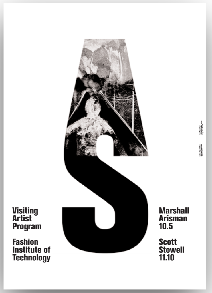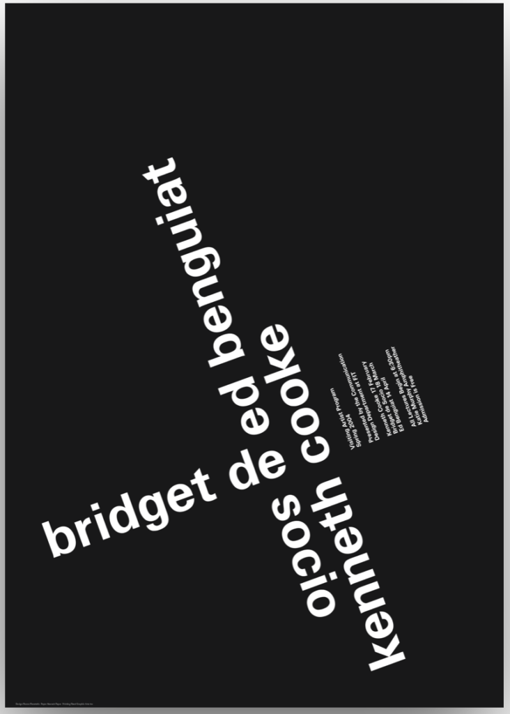
best 
does not work for me
For these posters, I felt the white background one worked best because the information is clear and easy to read. Most of his posters had tiny font sizes, but although the posters were probably big enough to see, the words were diagonal and in weird places. The black background one worked the lest for me because at first glance I don’t really understand the information, you really have to look and read for a bit to see what it’s trying to say.


