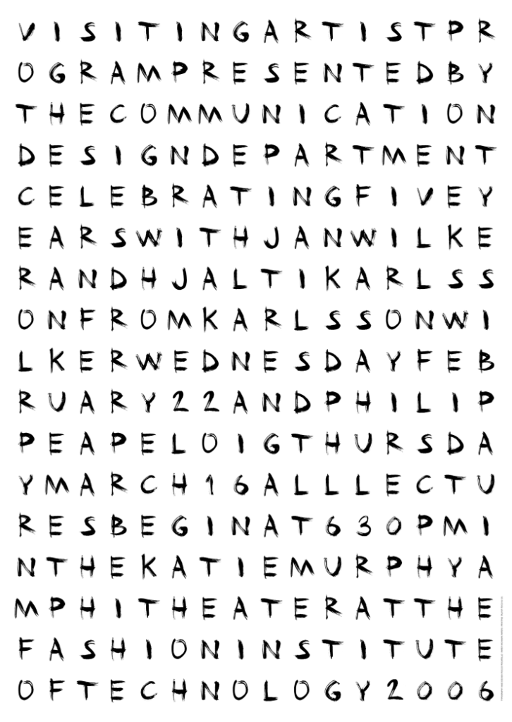
This poster doesn’t work because it is hard to read, with no clear area of attention that the designer wants the reader to look at. This seems like it might even frustrate some readers when trying to understand what the text is trying to say because of the lack of diversity in the text


