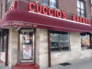
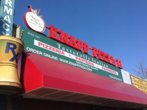
I’ve only lived in Gravesend for three and half years and one of the first things I’ve noticed about the typography being used is stores use a lot of sans serif. The stores have been here for a long time. The pizzeria seems to use three type families which seems a bit overkill. The bakery on the other hand uses sans serif for their signs. It’s interesting seeing newer type families on stores that have been here before I was born.


The OpenLab at City Tech:A place to learn, work, and share
Support
Help | Contact Us | Privacy Policy | Terms of Use | CreditsAccessibility
Our goal is to make the OpenLab accessible for all users.
top


Amanda, what do you feel the fonts say about the neighborhood?