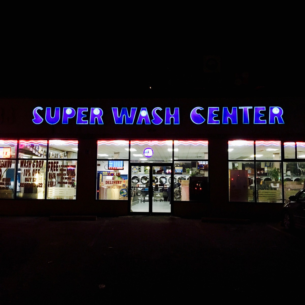
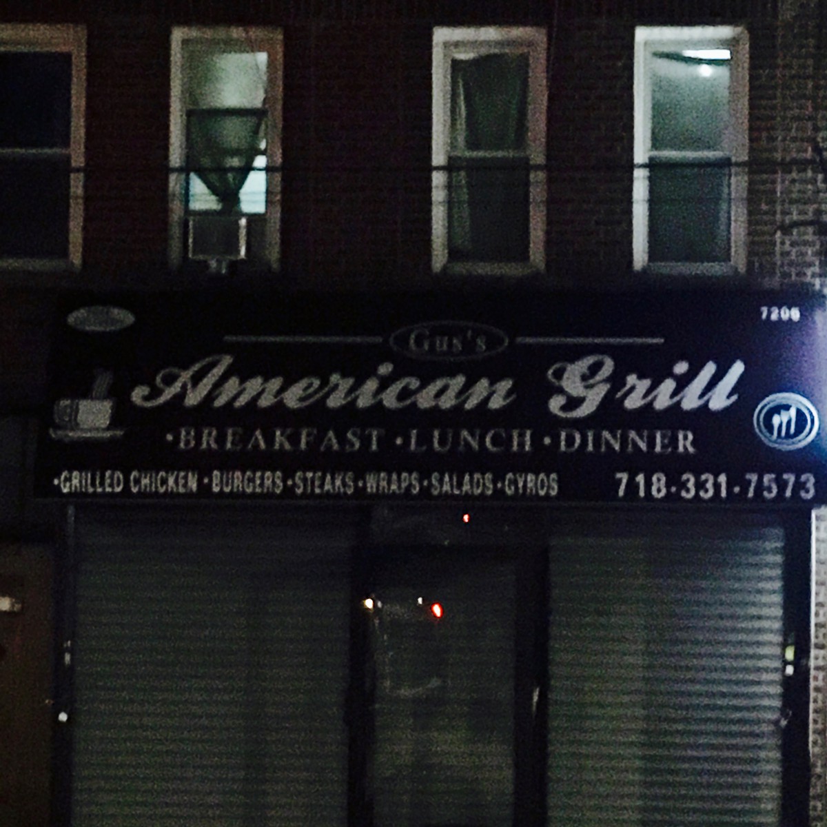
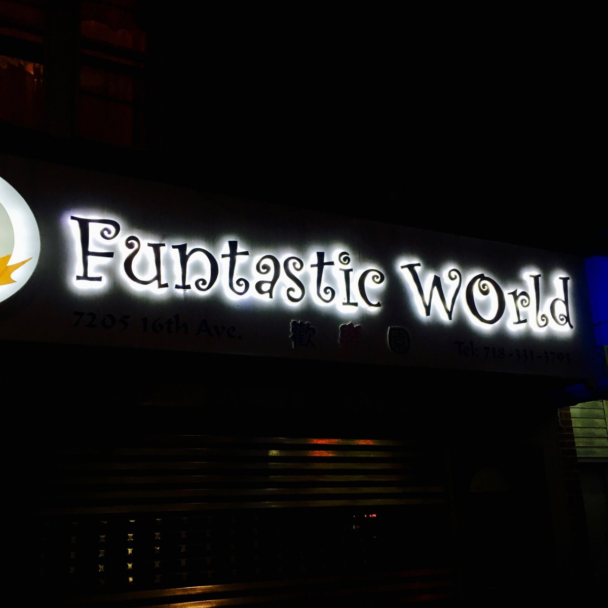
I live on 74th Street, near New Utrecht Avenue in Brooklyn. I moved there last year and I didn’t have a good feeling about this neighborhood at first. However, the more time I spent, the more satisfied I felt. This is a very peaceful neighborhood. I prefer to live in a quiet environment. Now I have a very great opportunity to show my neighborhood. I usually go outside and walk around in this neighborhood, because I like to see something interesting that will inspire my “art” life. When I look at the signs of different kinds of businesses, I see colorful typefaces based on the owner’s cultural background. For example, the Chinese restaurant uses more neat and warm color font, while the Jewish liquor store uses the Hebrew style font to enrich the beauty of Jewish art. I think that different kinds  of typefaces can enhance our understanding of different cultures, and this is one of the great connotations in typography. I took some pictures in my neighborhood at night. I hope you can enjoy the beauty of typography in a different culture. 🙂
Updates from Smash Magazine
- The Impact Of Humanoid Robots On HumanityWe have officially moved past the era of humanoid robots as mere public relations stunts. As they become increasingly lifelike, society may soon face profound social, psychological, and ethical challenges. What happens when the boundary between humans and machines becomes almost impossible to distinguish?
- The Benefits Of Cognitive Inclusion In UX ResearchFindings from an exploratory user research study highlighting the unique insights and practical UX recommendations shared by participants with cognitive disabilities.
- How To Make Your Design System AI-ReadyPractical guide on how to reduce drifts, minimize mistakes, maintain context, and improve the quality of AI-generated prototypes. Brought to you by Design Patterns For AI Interfaces, **friendly video course on UX** and design patterns by Vitaly.
- June Is For Exploring (2026 Wallpapers Edition)Let’s kick off June — and the beginning of summer — with some fresh inspiration! Artists and designers from across the globe once again tickled their creativity to welcome the new month with a new collection of desktop wallpapers. Enjoy!
- Algorithmic Theming Engines: Building Self-Correcting Color Systems With `contrast-color()`Seventy percent of websites still fail basic WCAG contrast checks in 2025. After years of design system tooling, accessibility linters, and JavaScript libraries, nothing moved the needle. We didn’t need better libraries. We needed better CSS. `contrast-color()` is that better CSS.
- Your Prototype Is Not Being Honest With Your Users (And Here’s How To Fix It)There’s a moment in almost every usability session where a participant pauses at the login screen, types something, and glances up: checking whether they’re “doing it right.” That pause is a clear sign. They’ve already clocked that this isn’t a real app, and every data point collected after that moment is filtered through that awareness.
How Design News
- An error has occurred, which probably means the feed is down. Try again later.


Bill, would you say that the various typefaces that you see in your neighborhood a reflection of the cultural diversity?