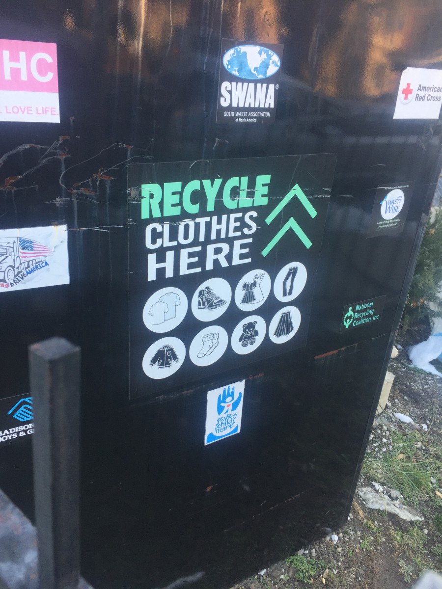
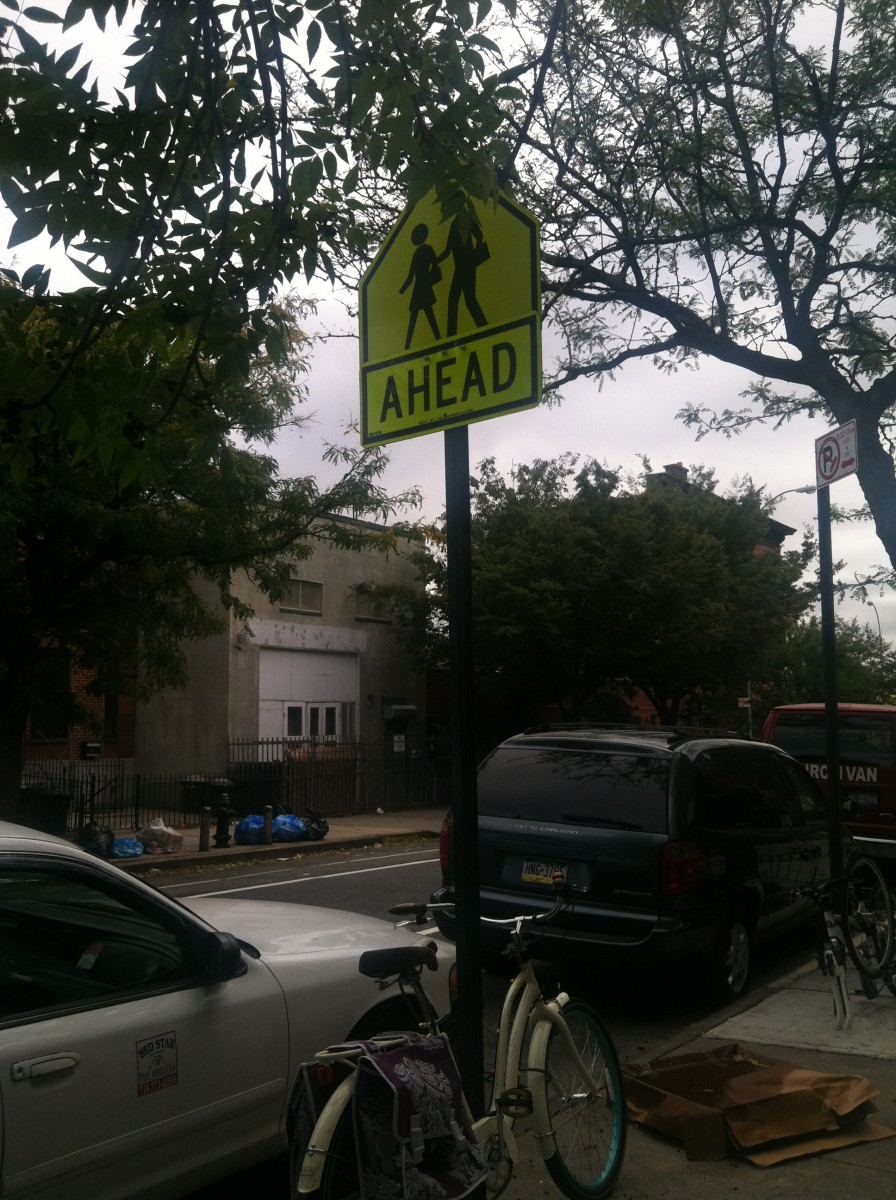
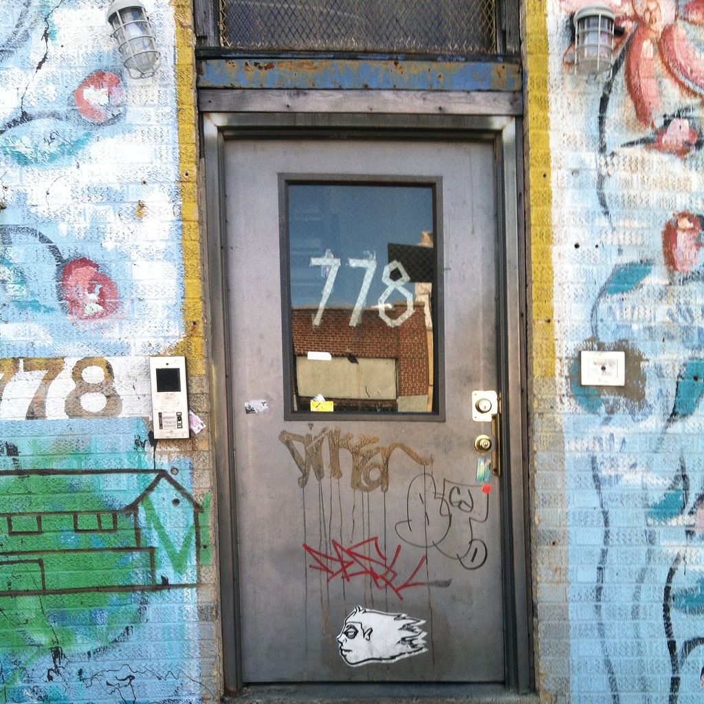
Before I get into depth about kerning in my neighborhood, some of the pictures here are from when I used to take a photography class in my last year of high school. Not once have I realized or notice the significance of kerning. Ever since I started taking this class i never realized how kerning and typography was all around me. Here are some photos from the neighborhoods i used to live in and the neighborhood i currently. In the first image about recycling clothes i never realized how perfectly spaced even the small words in the font of the text. The word “Recycle” itself took my attention the most, mostly because it’s written in caps and in my eyes its kerned better than all the other words written down below/ on top of it. The 2nd image is a common a sign that you can spot in multiple neighborhoods but i just like the fact that its in a yellow background that brings out the text/even better. The kerning of the text in this sign in my eyes i think is really important since the texts cant be too close nor to far mainly because if its too close it’ll be too difficult for anyone to read unless they are up close, and if its to spaced out the letters wouldn’t necessarily be comprehensible. With that being said i personally think kerning is a really important tool that can be used in pretty much anything in society. My last message is free writting words/graffiti that doesn’t necessarily have any kerning which proves to be difficult to understand. Not to mention that there isn’t any spacing between any of these multiple type faces. In conclusion Kerning is every where even the places we least expect as long as there is texts there. Kerning is important since it can bring out the depending how you space out the letters. Im personally grateful since because imagining not having kerning in our society everything would just be munched up together.
Updates from Smash Magazine
- Getting To The Bottom Of Minimum WCAG-Conformant Interactive Element SizeWCAG provides guidance for making interactive elements more accessible by specifying minimum size requirements. In this article, Eric Bailey discusses the nuances of interactive element sizes and clarifies what it looks like to provide accessible interactive experiences using WCAG-compliant target sizes.
- Build Design Systems With Penpot ComponentsIn today’s turbulent landscape of design, Penpot stands out with its commitment to open-source, free unlimited access, and its unique, robust features. An example could be its new components system that takes another leap forward in aligning design with code. Let's dive into how it empowers both designers and developers to create more maintainable and […]
- How To Design Effective Conversational AI Experiences: A Comprehensive GuideThis in-depth guide takes you through the three crucial phases of conversational search, revealing how users express their needs, explore results, and refine their queries. Learn how AI agents can overcome communication barriers, personalize the search experience, and adapt to evolving user intent.
- When Friction Is A Good Thing: Designing Sustainable E-Commerce ExperiencesToday, UX design contributes to the problem of excessive consumption through persuasive e-commerce practices and designing for companies with linear and exploitative business models. Anna Rátkai explores practical steps we can take to reduce material consumption and the massive environmental impact that comes along with it by designing mindful shopping experiences.
- Useful Customer Journey Maps (+ Figma & Miro Templates)Visualize the user experience with user journey maps. Here are some helpful templates, real-world applications, and insights on the importance of mapping both successful and unsuccessful touchpoints. Part of [Smart Interface Design Patterns](https://smart-interface-design-patterns.com) by yours truly.
- Tales Of An Eternal Summer (July 2024 Wallpapers Edition)Let’s welcome the new month with some fresh desktop wallpapers! Created by artists and designers from across the globe, they come in versions with and without a calendar for July 2024. Enjoy!
How Design News
- An error has occurred, which probably means the feed is down. Try again later.
Hi Brian, take a moment and correct the using the capital “I” for the pronoun. Also, this assignment wasn’t about, kerning so please revisit the post that has the assignment written out.