Contents
Variables
Experimental science looks at cause and effect types of relationships. Controlled experiments vary one of the factors or traits to observe the effect on another factor or trait. These factors are called variables. A dependent variable is something that is observed and expected to change as a result of modifying another factor in the experiment. That is to say, the outcome depends on another factor. The independent variable is the factor or condition that is changing or being changed by the experimenter. Sometimes waiting is the the condition that is changing, making the independent variable: time.
Graphing a line

A line can be described mathematically by the equation:
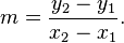
The slope of the line indicates the relationship between the two variables, x and y. The equation of the line y=mx+b indicates to us that “y” occurs as a function of changes to “x”. Sometimes this is represented by the equation f(x)=mx+b . Since “y” depends on “x”, “y is the dependent variable and “x” is the independent variable. As “x” changes, how does “y” change in response? This is what the slope reveals to us.
For more review, visit the following link.
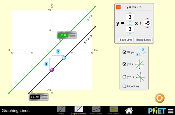
Slope activity
- http://phet-downloads.colorado.edu/files/activities/3914/Slope_ActivitySheet.pdf
- Download this activity and use it with the graphing simulation below .
Data Plotting Activity
- Use the following data from the USDA to plot a scatterplot and generate a trend-line.
- remember NOT to make a line graph
- Ensure that “Year” is the x-axis
- Ensure that “lbs. Mozzarella” is the y-axis
- Show the equation of the trend-line on the graph
| Year | lbs. Mozzarella |
| 2000 | 9.33 |
| 2001 | 9.70 |
| 2002 | 9.66 |
| 2003 | 9.65 |
| 2004 | 9.94 |
| 2005 | 10.19 |
| 2006 | 10.52 |
| 2007 | 11.02 |
| 2008 | 10.57 |
| 2009 | 10.63 |
What do we learn?
- What does this scatterplot tell us about the relationship between consumption of mozzarella in relationship to years?
- How would this graph influence the way you invest in a mozzarella cheese company? Can you predict anything about the future of cheese consumption?
- What does the slope of this line indicate to you?
- Use mathematics to illustrate this point.
- The slope has a unit related to “lbs.” and “year”, what is this unit?
Tags: quantitative reasoning, analysis, inquiry, visual communication

