Category Archives: Uncategorized

Andrew Scrivani

rasberries

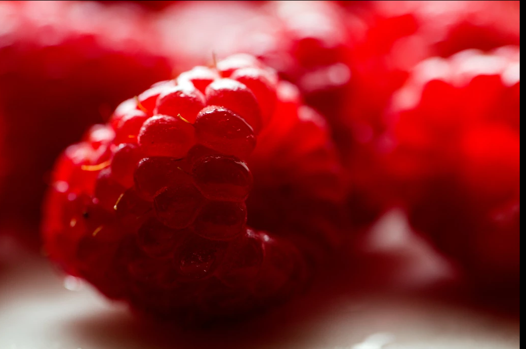
Andrew Scrivani’s work is intensely beautiful. My favorite of this photographs is the simple raseberry. I love the color consistency and attention to detail. You can see the deepest detail of the rasberry, only one is concentrated on and the raseberry is in sharp image while the rest is in blur or out of focus. This photograph has a simple day light with bounce and it works beautifully with this color and fruit as you can see with the light, a piece of the fruit looks a bit transparent hence works well with this kind of light. From the looks of it, the natural light was a back light because of how it appears behind the subject of photograph. There is a shadow underneath the fruits which leads me to also believe it can be a diffused light. Andrew’s work is so simple yet to pleasing to the eye because of the balance of the subject matter and lighting.

Quentin Bacon

Unlike other photographers we have discussed, Quentin Bacon is most known for the Photographs taken of food. His photographs allure the audience with the natural lighting and equisite detail set from the cheese in this dish. What sets this photograph well is the attention to detail, notice how the image of the food is sharp and the background is blurred out yet we are able to make do that it is some type of restaurant, wood chairs polished, it also sets a lovely ambiance to fill with the fine dinner show to us in the image. It’s also clever in that Bacon tried to keep a constant color scheme here with white brown and white and the color consistency also makes the photo all the more appeasing. Notice that the light is equally distributed there is a soft light, its not hard on the food and it doesn’t give it an over saturated look.

Quentin Bacon

  • depth of field
  • white background
  • not too busy
  • neutral to the subject

The photograph is appetizing because of the composition, the way it’s plated evenly on the to wooden board. The two separated sandwiches that creates depth of field, as we focus on the centered sandwich. The background is white and does not distract the audience from the subject, the cloth underneath the wooden bounces light onto the board and sandwiches. The use of natural/available light makes the sandwich refreshing, as it is a healthy looking sandwich. Moreover, the use of extra ingredients such as the herb and the tomato directs us to the sandwich. Plus, the angle that the photograph was taken compliments the sandwich because the bread is tilted slightly so we can view the ingredients but can still see the bread.
What I noticed about his style of food photography is that they make use of filling the frame or not, high angle, a few are at eye level.  As well as make us of his props and background, some props make the image feel more authentic and tells a story of the creation of said food. The background enhances the subject and the details.

Quentin Bacon

I feel that food photography is very important because it’s what will get people to go ahead and make the food purchase. The food has to look very delicious and Quentin Bacon does a wonderful job of showing food.

From looking at all of her photos, her pictures feel as if I’m at the table with the food as well. I love how she’s able to bring the food to life. My favorite picture on her page is the dish od Mac and cheese. This image shows how cheesy the meal is.

The Smith DC

I like how she was able to capture the moment. I feel that this brings it out more than just a regular close up of the dish. This was a smart image because it shows not only the outside of the dish but the inside and what to expect when they put their forks in the dish.  Another great thing about the image is the lighting, I think there’s only a key light because the dish is well lit and I don’t see any shadows. I feel broad lighting was used. The lighting makes the dish look really appealing and there’s a good amount of contrast or clarity which brings out the crispness on top of the dish.

Quentin Bacon

Quentin Bacon, uses his background to connect with the subject, which are the different kinds of foods and drinks. For example, he does not use a solid white background, as seen with other photographers, who make the food the only subject in the image. The background he uses includes cups, silverware, ingredients used, etc. The image below is of what seems like a bean stew with bread on the side. In this photograph the viewer can see that there is a variety of colors and contrast between the background and the main dish. The table cloth is a vibrant dark blue color that brings out the color of the food because of its orange color. Bacon did this intentionally because blue and orange are complementary colors. The photograph was taken on an overhead angle slanted a little to the right, since the image is not centered and not on eye level. When it comes to composition, I think the plates could’ve been organized differently because the far right hand plate is cropped out, therefore making the image distracting. I believe there was no need to add a third plate and if it was necessary then it could’ve been more towards the center and out of focus. The green parsley in the photo makes the orange beans have even more contrast between them. The crumbs on the left hand side give the image a more realistic mood because when food is being served, it can get messy at times. The lighting used does a good job at focusing primarily on the big pan with the bread pointing out. The details of the bread are crisp and clear. Overall, the photo was well taken and the viewer can tell that the main subject is the big pan towards the front since most of the surrounding items are out of focus.


Inspiration: Quentin Bacon

Bacon’s style of food photography is very unique and appealing. The background in a lot of these photos are very simple backgrounds like a wooden table or a marble table, a tablecloth, there are even some photos where the background is someone holding the food either the person eating it or the chef. One of the things I notice stands out about these simple backgrounds is that it provides a nice contrast to the food that is the main subject of the photo. I feel like the simplistic backgrounds bring out the detail and color and texture of the food more since there is nothing too heavy in the background that is distracting, and if there is like a person for example Bacon uses shallow depth of field so they are not the main focus of the photo. This photo I have chosen from Bacon is one that I really enjoy a lot.  I love the detailing of the squeezed blood oranges as well as the detailing of the freshly cut ones. Also the simple table top background really allows the colors to pop out more even from the juice on the table to the knife to pop out more. I also love the juice in the cup and the deep purple red color that shows there along with the dark orange coloring on the skin of the oranges.

Peter Hurley, Celeste Sloman

Peter Hurley, a New York City photographer specialized in headshots and portraits. At first glance the viewer can see that, even though there is three point lighting, he has a specific style for the most part, which is butterfly lighting. There is a lot of lighting coming from over the models’ heads, which is one of the most favorable styles when shooting portraits. The lighting just hits the skin and it fills the texture of it which lead to there being softness in his photographs. Also, the eyes are a significant point of attention in his photographs. The reflection of the lights create a depth into the models’ eyes. When it comes to composition, in his People Portraits, the models are centered and have more of a serious tone to them due to their facial expressions. Even though, there is a lot going on in the background, Hurley did a great job making sure the main focus was the model by putting more lights on them. There is contrast between their faces and the rest of the photographs.


Celeste Sloman, is also a photographer specialized in portraits. The difference between her and Peter Hurley, is that her photographs are mainly from the subjects’ shoulder, up, instead of full body or three quarters. The main focus is their facial expressions, which, for the most part, are subtle and calm. The background is a solid color, or very little movement going on, which brings out the subject more since there are no distracting objects in the way. I enjoy the way Sloman uses objects or sunlight to create shadows, that have become patterns, in the subjects’ faces. She has a minimalist and simple style which is why the viewer can tell that there is not an overuse of light.


Celeste Sloman

Celeste Sloman has a lot of great work. What I love most about Sloman’s work is how clean the shots are. As in clean I mean that the lighting is always perfect and the edits are not overbearing and works perfectly with the photo. The lightning in each picture always goes perfectly with the subjects expression.

From the Women of the 116th Congress album, this picture stood out to me the most. The first thing that I noticed about the photograph was the facial expression. I feel that the smile was genuine and was a candid shot. Her smile looks natural and it’s as if you can picture her laughing at that moment. Another observation that I subject isn’t looking in the camera, which makes the picture look even more candid.

The lighting that was used in this image was short light with a fill. I could tell it’s short light because the subject isn’t face directly at the camera and her one side of the face isn’t fully lit. Short light helped make the black and white look amazing. The side that isn’t lit helped bring more contrast in the black and white, making it feel more detailed.

Inspiration- Celeste Sloman

This photo was the one I chose out of a series representing the Women of the 116th Congress by Celeste Sloman. This portrait of Kirsten Gillibrand caught my attention. What I really liked about this photo as soon as I saw it I was really pulled in my the lightness and softness of this photo. From the lighting to the color to the positioning, this photo gives off a really soft and light feeling. The lighting in this photo is soft broad lighting and it seems that there was also a diffuser used since the lighting is so soft. The composition in this photo is good as well because her head and shoulders fill the frame so it is laid out well. There also seems to be a good amount of emotion in this photo as well. Gillibrand’s eyes in the photo look to be ‘hopeful’ or ‘looking forward to the future’. Gillibrand’s eyes also are well composed with the backdrop of the photo. Gillibrand is also posed with her chin up and at a 3/4 view which allows her jawline to be extenuated and makes her look powerful and confident. Her facial expression as well makes her seem confident giving off the calming smile and also making her look confident.

Gregory Heisler

inspo     Gregory Heisler uses short light to frame the person’s features and hair. The hair are in the front of the face framing his face and letting the lighting to only center around him and everything else is pitch black. The color of his eyes are give this sense of creepiness and the way the lighting hits only on his face also creates that feeling. The out of focus of the hair at the bottom also makes it seem that his hair is a creature coming out of the blackness that Heisler has created. That detail around his face makes the photo strange and creepy. Gregory Heisler does name the photo strange making sense due to the fact that it has the feeling. The way he composes the photo sort of center makes the photo feel that urge of being creep out and feeling uncomfortable. He brings out the subjects’s being a bit strange and out of the ordinary with the way he frames his hair which are dreads that not make choice to have and showcasing that. As well choosing to have the photo in black and white rather than in color which would defeat the purpose of the aura the shot is giving to the viewer.