
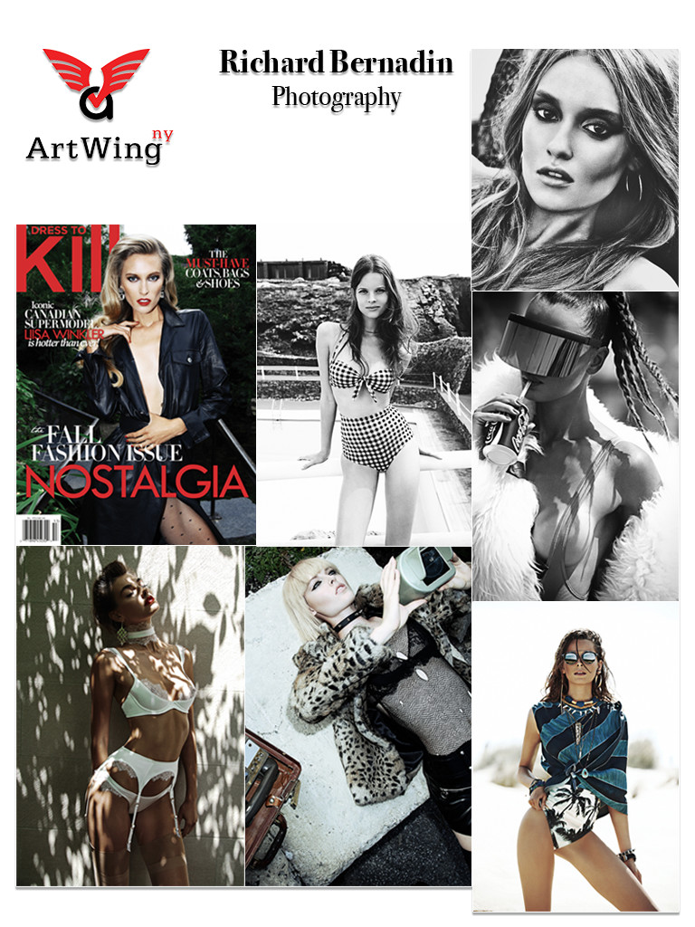
This week has been going pretty smooth; I received an email from Naeem that contained photos from photographer Richard Bernardin. Of course, the task was to create a promotional card by making a collage using the available photos. There were only seven photos presented for this piece; so I had to make the photos a little larger than usual and set the canvas to portrait. Four of pictures were low in saturation, two of them were monochromatic, and the seventh had an average level of saturation with red and white typography it was a magazine cover. There was not much difficulty in this task, so I completed it and emailed it back right away.
Naeem liked it, but Scott wanted me to nudge the typography’s position. In fact; Scott wanted me to make the change to any of the previous cards with similar alignment issues. I understood the direction he wanted to go, but I did not share the same views because I positioned the elements based on balance. I explained that shifting the position will disrupt the negative space and will throw off the composition. Scott understood, and we agreed that I should only change the ones I find fit. I converted five cards, which happen to be eleven percent of the cards at the time.

