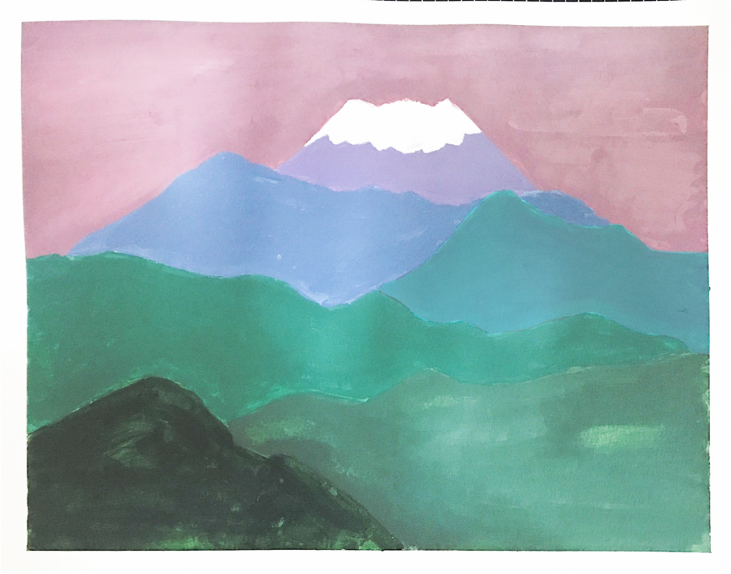
At first, I have to say I paint an ugly painting in Part 2.
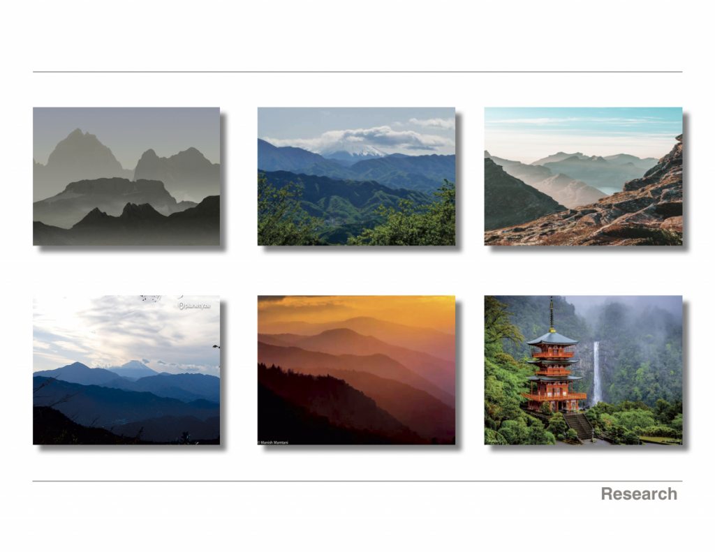
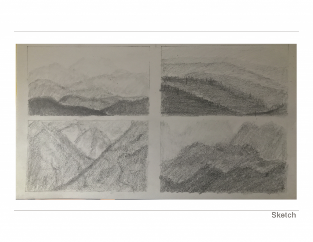
For part 2, I need to find images as a visual reference. So, I look for some landscapes photo and choose a few of them I like to sketch them out. (First step)
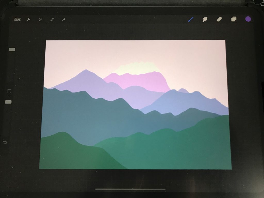
When I choose the one which I like from my sketches, I need to use warm, cool, or complementary colors to paint it. I try to make an example in iPad first to see how it looks like because I don’t want to waste my acrylic paint. However, It is difficult for me to mix the color which I want; the outcome is ugly T^T. I also need to consider and use visual hierarchy, rule of thirds, and focal point when I’m creating my work, but I think I have forgotten some of the rules when I’m doing it.