At the top of the post copy and paste the following: 80s Design is Alive, Well, and Living in 2019” by Nadja Sayej, published in PRINT, March 6, 2019
- How or where are the principles of “collage” and “mixed media” used today?
- In what ways do we see the 80’s aesthetic / ideologies in more recent “cyberculture, vaporwave or glitch art” trends?
- How was self-publishing in the Postmodern-era (“the use of the photocopies/zines became an alternative voice for communities who were not well represented in mainstream media”) similar to the use of today’s technologies?
- Find 1 example of work from a postmodern graphic designer from the 1980s and 1 example of work from a contemporary graphic designer from the last five years. Deconstruct the works and explain which visual and/or ideological elements are associated with Postmodernism of the 1980s and why
.
The principles of “collage” and “mixed media” are still implemented in very different channels such as contemporary art, paintings and even digital art. These techniques allow artists to combine different elements into their work such as images and textures to express complex ideas.
The influence of the 80’s aesthetic is still seen in recent cyberculture, vaporwave or glitch art trends through a variety of visual elements. For instance, the use of vibrant color palettes that are often seen in these trends as well as the use of geometric forms and patterns to create a symmetrical design. These elements are some characteristics of the 80’s aesthetic and also awaken a sense of nostalgia.
The self-publishing in the postmodern-era is very similar to the use of today’s technology because they both have the capacity of giving a voice to the community that have been excluded or overlooked from the mainstream media. Both eras have given the community a way to not only express themselves but also share their experience, stories, and perspectives.
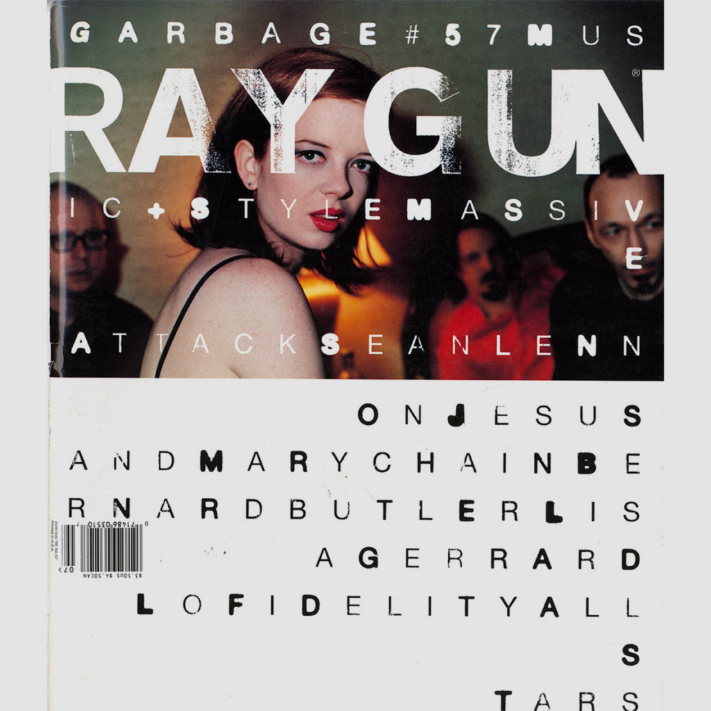
One example of work from one postmodernism graphic designer from the 1980s is David Carson Ray Gun magazine from 1995.

Here David Carson’s work shows the collage and layering is incorporated into his designs. We see multiple layers of text and graphic elements creating a very complex visual composition. The use of collage and layering in his work matches with the postmodernism method of juxtaposing.
One example of a postmodernism work of a graphic designer in the last five years is Shepard Fairey’s.

Shepard Fairey’s “Hope” Poster showcases a simple and bold design. The use of the bold colors and the geometric shapes as well as the minimalist composition portrays the postmodernism aesthetic of simplicity and visually impactful.
Sources:


Leave a Reply