80s Design is Alive, Well, and Living in 2019” by Nadja Sayej, published in PRINT, March 6, 2019
- How or where are the principles of “collage” and “mixed media” used today?
- In what ways do we see the 80’s aesthetic / ideologies in more the recent “cyberculture, vaporwave or glitch art” trends?
- How was self-publishing in the Postmodern-era (“the use of the photocopies/zines became an alternative voice for communities who were not well represented in mainstream media”) similar to the use of today’s technologies?
- Find 1 example of work from a postmodern graphic designer from the 1980s and 1 example of work from a contemporary graphic designer from the last five years. Deconstruct the works and explain which visual and/or ideological elements are associated with the Postmodernism of the 1980s and why
I think the 80s was the 3rd coolest decade to experience. The 70s and 90s are the other two on my list. The bright color clothes were a bit wild, but far from the depressive black and gray we see today which is labeled as modern and edgy, I call it depressing! However, you see evidence of the 80s design aesthetics in the design industry and media today. Just look at the Instagram logo to start. The toy commercials have never left that creative fun feel for kids. Spring collections in fashion and furniture always adopt bright playful colors. I do recall seeing music videos with 80’s nostalgia such as the two videos below. The melody of the music, the video sets, the playful expressiveness of their bodies to the music, and the filter of the vintage CRT tv pixels on the text. No one knew about LCD screens then. The Weekend’s video is a classic dark version of Miami Vice. The art deco club and neon night lights. They both scream 80s!
In today’s world, 80s design trend is perfect to run parallel to the liberal voices in society. Just say it loud and be proud. Speaking of liberal voices, the 80s birth the zine culture. In my opinion, miming that trend today is the movement of culture and Inclusion. Most employers and brands have a department or campaign that advertises and promote a little piece of everyone collectively. The Zine movement (which served as a voice for those underrepresented in mainstream media in the 80s) (Pickering, Megan, and step guide. “Themes/ Politics: zine culture | UAL.” University of the Arts London, 24 November 2018, https://www.arts.ac.uk/partnerships/outreach/insights/topics/themes/themespolitics-zine-culture. Accessed 30 April 2023.) is plastered all over social media. Today, whenever you hear of social unrest on a problematic issue, you tend to see a representation of it in social media with posts and memes, bringing light to the matter, and hopefully bringing about change.
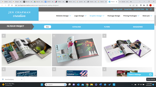
Below you can see the difference between postmodern design in a magazine layout in the 80s (top) and contemporary design today (bottom).
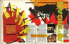
The top magazine layout was designed during the postmodern era by Neville Brody, Graphic Designer. Most of the text follows the same readable format of today, but the images are more expressive and raw versus what we see today in the screenshot of a modern-day designer’s work. There Is definitely more coded messaging in postmodern graphic design. The painterly images were left to the reader’s imagination, not giving a direct message but more subjective. The postmodern layout has the Collage and Dadaists effects, (Cheney, Danelle. “Postmodern Publication Design.” AEQAI, 25 January 2014, http://aeqai.com/main/2014/01/postmodern-publication-design/. Accessed 30 April 2023.) versus the layout below it.
The modern layout’s images are crisp and clean. You don’t have to think twice to figure out what the subject matter of the article is about. You can actually get a jest of it by either the image or title. The layouts definitely follow a grid and the characteristics of the Avant-Garde Swiss and Bauhaus styles. Simple, meaningful, clear, and concise. The feel of universality and non-ornamental. Communicating just the message and nothing further.
Annotation List.


Leave a Reply