Paul Rand “Good Design Is Good Will” 1987 from Graphic Design Theory: Readings From the Field page 64-69 and Steven Heller “Underground Mainstream” in Design Observer 2008.
- In your opinion, is there a difference between “underground” and “mainstream” today? Why?
- Heller identifies a few underground movements, like 1960s psychedelia, that turned mainstream; which ones does he identify? And can you think of any others?
- Provide a visual example (with citation) of culture jamming today. Describe why it would be considered culture jamming.
After reading this week’s passage, I started to get a sense that design trends and ideas outside of the avant-garde have been accepted, but it seems to be pushed when ideas out of the regular workflow get flat and, then an “underground” movement get taken off the shelf and highlighted in mainstream media. Almost in a convenient way, not appreciative or accepted but because the masses are following the trend. When money is involved, all hands on deck I guess. However, the interesting thing is that with underground movements, there is so much more substance than regular mainstream. Most mainstream advertisements definitley takes after the ideas of the avant-garde movement. No sense of emotion, just directly communicate the message. It has clear guidlines and easy to formulate and idea. However with a design plan that does not include characteristics of the avant garde, as a designer marketing any campaign with underground tactics, usually has some special social or policial event that shapes those design ideas. It has meaning and heart with it. It flows from a special place with the designer who feels this asthectic should be shared with the world. And to be honest it’s that sort of thinking that really creates emotional bonds within society, and make people want to be a part of something.
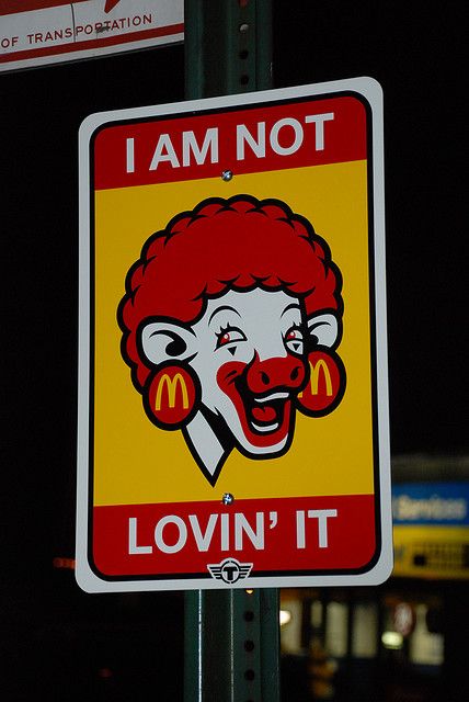
Heller talks about a few underground design movements such as punk and grunge,psychedelia, pronogrpahy, and cultural jamming. All speaking out against mainstream avant garde design and hold strong messages from it’s creators. Cultural Jamming seams to be the most sarcastic of them all. Recreating brand designs that are familiar to the masses but has an alternate message. Take a look at this McDonald’s cultural jamming ad from flicker.com done by a group of or one artist by the name TrustoCorp. You immediately identify that this branding belongs to McDonalds with the colors and the golden arch logos, but the message is not to grab a double stack, but more about where the double stack is coming from. McDonalds had a jingle slogan in their commercial advertisement “I’am lovin it!”. However the image of the cow states. “Not Lovin it”. Suggesting the killing of cows for human consumption is not supported by everyone. Extremely humorous, but also sending a strong message that people may not think about before grabbing a happy meal.

Links To Annotations


Leave a Reply