Aperture Foundation – Elijah Lugo

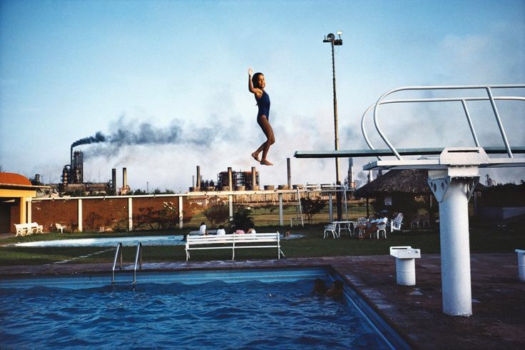
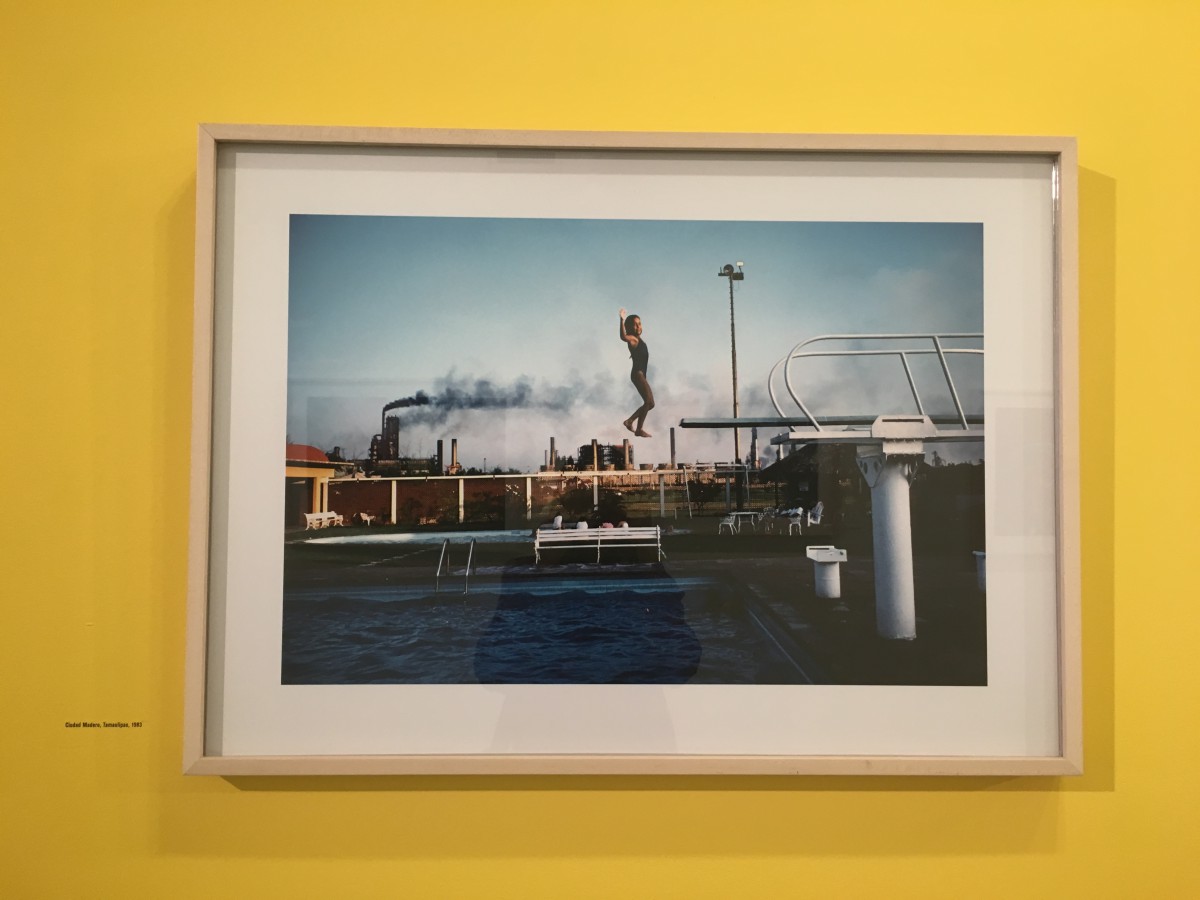
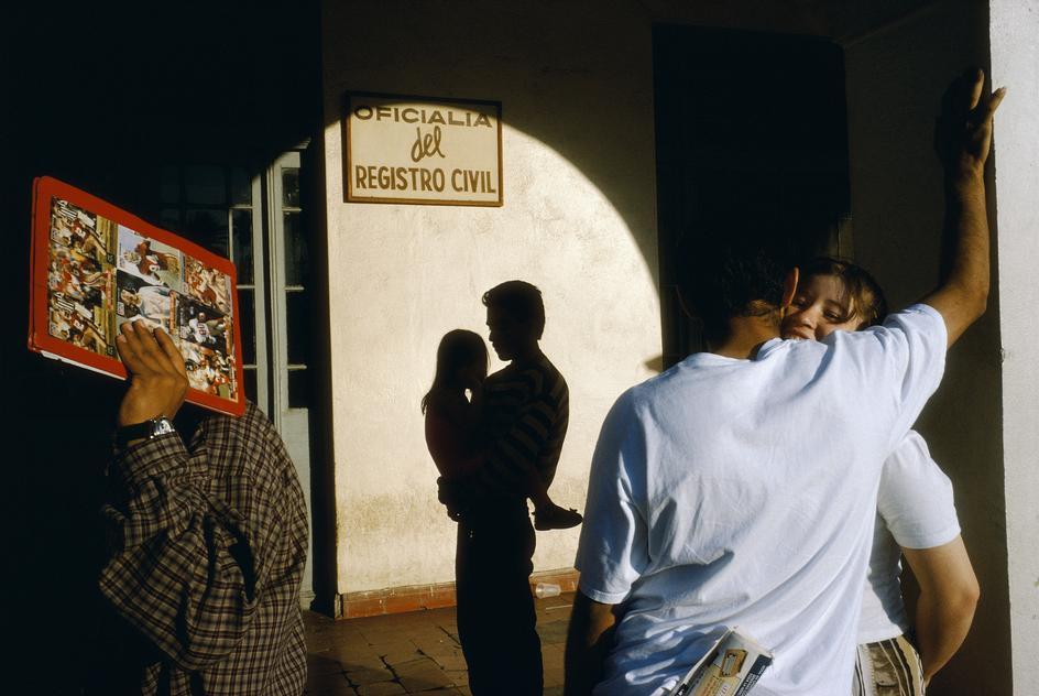
During my visit to the Chelsea district after passing over the Manhattan city streets while walking on the high line I visited the Aperture Foundation gallery. It was a photo exhibit that looked like a private gallery or very small museum and was mostly white walls but also different colored walls as well, one being yellow which was the wall that featured my favorite photograph. The walls all shined bright because of the lighting from the windows. After going up 4 flights in the elevator I exited and saw to my left was the reception desk or information/greeting desk, and to my right a hallway that included restrooms and led to another private room that didn’t seem like it was part of the gallery. The gallery is split into three different divisions, one being the lounge and educational area which is right by the greeting desk, the other areas both being photo galleries just divided by a wall which also had 3-4 photographs all in which were shot by Alex Webb, a photographer who shot all these fantastic photos in Mexico to describe and display the emotional connection and feelings of each photo with frames hun up o the walls as well as every other wall in the gallery sections. In the educational area which included the books I mentioned and also had a couch and two seats were the books were not only published by Aperture but can be purchased. One cool thing about Aperture is that they publish there own magazine every three to six months.

Alex Webb is a British photographer and displayed in the aperture gallery are photographs that he took year after year starting in 1970’s. In almost all of Alex’s photos he captures a moment in time but which also seems as though they were all very significant moments or decisive moments. As an observer or photographer you begin to see how he uses the elements of photography in a way which is either communicating a message of helplessness, hopelessness, fun, laughter, content, or even creative feelings and emotions. The photographs are different but some very similar. Most of the photographs expose the living conditions or hobbies in Mexico or at least those parts or Mexico maybe even during that time.

img_0329

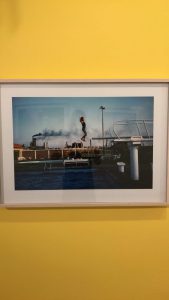
The photo that I love from the exhibit is Ciudad Madero, 1983 which shows a photo of a girl that looks between the ages of 7-12. She is jumping, not flipping or diving, but jumping backwards off of a diving board into a swimming pool. What speaks to me or what is so significant is that the photo seems as though it froze time. The lighting seems as if though a spotlight was put on the girl in broad daylight with the complement and contrast between the bright blue sky which features no clouds. The smoke from what looks to be an industrial factory in the background looks as though is is blowing a straight line towards the direction of the girl and the straight line from the side angle of the diving board which seems almost exactly aligned with the highest object in the city scape the girls facial expression doesn’t looked frightened or surprised, her expression shows relief or happiness as she has her arms in a 90 degree angle with her hands raised above her head in excitement or exhilaration. Her legs neither mangles but stiff, and her feet just falling below the line of the diving board to show she is falling from it  not unusually but freely.


Posted in Homework, HW-Exhibit Review | 1 Comment

Aperture Review: Alex Webb |Ciudad Madero, Tamaulipas, 1983

open_lab_post_alex_web_

From the moment you enter Aperture Foundation in Chelsea the walls are filled with contrasting bright colors and no map is required. The design of the interior is welcoming and provides a clear division of what’s what . Exiting the 4th Floor elevator, you turn to your right and your faced with a giant wall that divides the gallery in two. On your left hand side is the welcoming reception desk and further down the separation  are all the fantastically designed photobooks and magazines printed by Aperture available for purchase. On the left hand side of the wall was the intricate Alex Webb, La Calle Photographs from Mexico Exhibition. This Exhibition is cleverly divided among approximately 4 colored walls. There are 3-4 images framed on each wall, I believe it was designed to use the contrasting color of the images on the wall to better project the image. For example, on my shot below you can see the main color is blue in the photograph and the contrasting color yellow for the wall.

What I found very interesting about the  subject of the exhibition was that Alex Webb was a British photographer and he some how felt connected creatively on the other side of the world in Mexico. In addition, the fact that the photographs are based on a prolonged period of time like 40 years really says something about how he felt in Mexico returning year after year Beginning in the 70’s to capture his subject. In the images shot by Alex Webb I see images of people experiencing the same emotions that anyone can experience, because there not based on economical status. Alex Webb uses the unfamiliar environment to contrast the familiar emotions portrayed by the people photographed to demonstrate two things;

1. The conditions of the people in Mexico

and

2. The fact that everyone everywhere no matter what social class or environment experience the same emotions. He illustrates this by showing people from the happiest to the most devastated state of emotion. Alex Webb’s Mexico is a Mexico everyone can relate to.

The photograph that stuck out to me from La Calle exhibition is Ciudad Madero, Tamaulipas, 1983. The reason this image got my attention was because of the precise moment Webb hit the shutter button. The moment is so précised that any second more or less the image would of never been the same. The young girl is looking directly in the camera immediately after flipping over the diving board with a smile and the fact that he got that in one shot is incredible especially for the kind of technology available to photographer in 1983. The low exposure helps set the blue tone of the image, helping the sky and water blend into one. The image is divided into thirds, Medium shot with a strong horizontal line coming from the pool and diving board. Webb portrays deep space as it goes all the way back to the power plant, showing far beyond the swimming pool. He also uses the positive and negative space wisely having an even distribution of both. The top half of the image is blank sky and the bottom is busy, which emphasizes his subject in the middle the smiling girl. This image confirmed my theory of Alex Webb’s juxtaposition in order to have the viewer empathize with the people but also become aware of the environment. Because, although the young girl is unaware of where her happiness lives the viewer can see it lies a couple of block away from a dangerous power plant.


img_0809

Posted in Uncategorized | 1 Comment

Best Shot: Brooklyn Bridge Park | Pattern

IMG_6509

In order to create this pattern, I used the advice from the Adorama video to fill the frame in order to capture the whole essence of pattern of the faux grass. The reason I photographed this image is because I was curious to see if the pattern on the grass will be strong enough to stand on it own besides the spray paint. To my surprise it did and the low exposure helps the pattern stand out. I also believe the contrast of the complementary colors magenta and green adds more texture and make the viewer look for the pattern. It also helps separate the pattern of the grass and the continuous  fence.  I also enjoy the loss of vision as it blurs towards the top. This is my favorite image from the Brooklyn Bridge shoot that captures pattern and angle.

Posted in LL3-Composition-Pattern, Angle and the Rule of Thirds | Leave a comment

Review on Aperture Foundation: alex webb show

The Aperture exhibit (4th Floor, 547 W 27th St, New York, NY 10001) is a very nice exhibit that showcases photography and its importance. The exhibit is located on the fourth floor and there are many pictures on the wall. When you first walk in, there is a front desk, a small library or hangout spot located on the left. The exhibit is broken up in about three sections by walls and the walls are colored in yellow, and some orange from what I remember. The room is very spacious and all that is there to focus on are the big framed photographs placed on the walls which this time, was showcasing the work of alex webb: La Calle, Photographs from mexico, taken from 1978 to 2007.
Since the exhibit is showcasing Alex webb, all of his photographs were placed on the walls. In those photographs, webb was showing street, taken in a vibrant, colorful place which has undergone transformations since his first trips to Mexico—including natural disasters, financial resurgence, political corruption, and drug wars. He also showed many cultural photographs and citizens of mexico in their everyday life routines. His work had a lot of color which is not common by this photographer but he realized that he cannot show how mexico is in black and white and color is such an important thing in mexico’s culture.
One of my favorite photographs of the exhibition is called “nuevo laredo, tamaulipas 1996” taken by photographer alex webb. This photograph was the first photograph introduced to us in the tour around the exhibition.i saw many other photographs but i came back to that one photograph many times and i wanted to know what about the photograph that was so appealing to me. In the photograph, webb plays with shadows and figures as he catched the perfect picture. In the photo, there is a man and a woman, the man’s back is facing us, he looks like he is hugging the woman and you can see the woman’s face and she is smiling, where they seem to be a couple who is very happy together. Tis part of the photograph gave off the emotion of happiness when you look at it. There is also a silhouette of a man holding a little girl and it looks like a shadow. This is very interesting because its gives off the illusion that it is the shadow of the couple in the first layer. But is reality, due to the position of the silhouette, you know that it is another set of people who are hidden in shadows in the third layer. This silhouette also gives you a feel of love, because of the gesture of how the man is holding the girl, you get a feeling of compassion. There is also a man in the second layer, covering his face with a red book. He seems to not want to be a part of the photo. However, this man’s position and the position of the rest of the people in the photograph is very important and it makes the composition great. There is a rounded shadow framing the man holding the child, and all of the components of the photograph connect, giving it a balanced and rounded shape. I loved this photograph because it had so many good components and it was taken at the perfect time.
alex-webb-mexico-nuevo-laredo-tamaulipas-1996

Posted in Homework | 1 Comment

LL3 – Composition-Pattern, Angle and the Rule of Thirds

img_7210

This is an excellent and attractive photograph where we can see a perfect example of “Frame within a frame”. Also the light and bright yellow of the shape, make the subject more alive. Moreover, the bright yellow and the “O” shape force your eyes to just look at the main subject of the photograph; his black clothing also attract your eyes. His position on how he’s laying down around the “O”, creates a strong curved line within the subject.

Posted in LL3-Composition-Pattern, Angle and the Rule of Thirds | Leave a comment

Brooklyn Bridge Park

img_7900

This photo is very interesting to me because it is very expressive. I like the fact that the woman is just doing her own thing and enjoying the moment. Her surroundings are buildings and a bridge which implies that there is a lot activity going on around her. She doesn’t seem bothered by what is going on in her surroundings and she is just expressing her overall persona.

Posted in LL3-Composition-Pattern, Angle and the Rule of Thirds, Uncategorized | Leave a comment

6 x 6 Shoot

20160907_190234
20160907_190958 20160907_19124520160907_190340I took pictures of my son, Jayden, in a 6×6 area outside my favorite art supply store. These are some of my favorite shots. They are examples of ‘frame within a frame’, ‘low-ange’, and ‘leading lines’.

Posted in LL2-Composition and Camera Angle | Leave a comment

Brooklyn Bridge Shoot – Laura

20160908_09562520160908_095616I wish I had other than my phone with me this day however, I still think some of the pictures I took came out really well. These two are espcially nice to me. I like close up nature shots and the second one captures both the rocks, (nature), and the city behind, which I think is a great contrast.

Posted in LL3-Composition-Pattern, Angle and the Rule of Thirds | Leave a comment

Best Photo: Brooklyn Bridge Park

DSC_0593

Honestly, it was pretty difficult choosing my best photo from our class trip to the Brooklyn Bridge Park. Out of the 160 photos I took that day, this photo stood out to me the most. This photo was taken while we were walking to the Brooklyn Bridge Park. There was a children’s store (I believe it was) on the corner of the street that had these paper window decorations. I liked that the point of the triangles were going in a slanted direction to the left, the sharp pattern, the line running through the middle (close to the middle) of the triangles, the dark store background that makes the decorations pop, the close-up framing at which this photo was shot, and the details on each of the triangles. Also, I liked that the triangle all the way to the right was cut out in the shot because even if it’s not fully shown, it still demonstrates a pattern. Furthermore, there is one more part of this picture that I failed to mention. The triangle at the bottom left of the photo is curved and has lost its original shape. This was particularly interesting because it displays a disruption of pattern. It stands on its own, has a darker tone of color, and has its own depth to it.

Posted in LL3-Composition-Pattern, Angle and the Rule of Thirds | Leave a comment

Brooklyn Bridge Park

img_7161

I like this photo because it has a strong leading line and perspective. Also I like how the background and a bridge are blight and the other elements are dark.

Posted in LL3-Composition-Pattern, Angle and the Rule of Thirds, Uncategorized | Leave a comment