Please visit and explore the Gapminder website I showed in class yesterday:
- the homepage Gapminder.org has links to various features on the site
- the Tools page has the interactive scatterplot tool I demonstrated in class:
MATH 1372 – Ganguli – Spring 2020
Statistics and Probability
Please visit and explore the Gapminder website I showed in class yesterday:
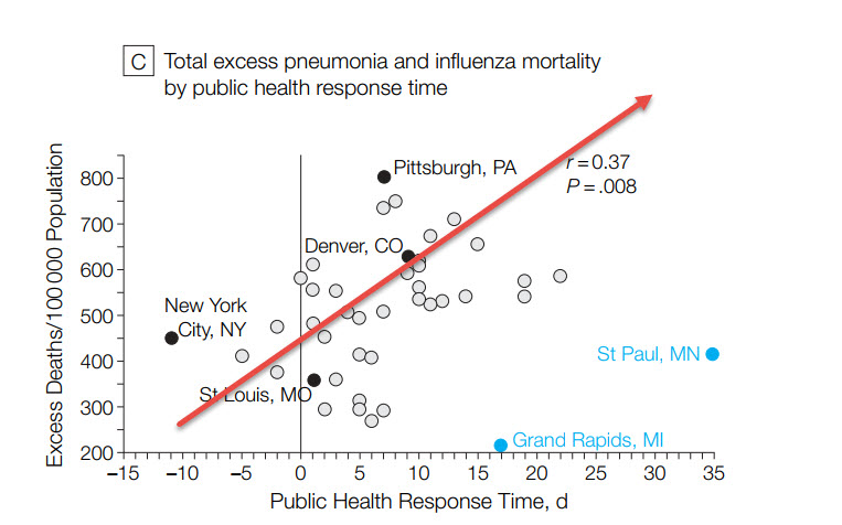
Here is a scatterplot from a March 7 blog post titled “What Worked in 1918-1919?“:

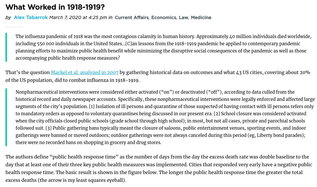
Here is the intro to this graph from the Marginal Revolution blog post:

Take a look at the 2007 paper (“Nonpharmaceutical Interventions Implemented by US Cities During the 1918-1919 Influenza Pandemic“) which contains a number of additional scatterplots!
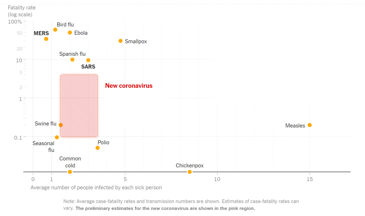
Here is a scatterplot (among a number of interesting graphs) contained in a NYT article headlined “How Bad Will the Coronavirus Outbreak Get? Here Are 6 Key Factors”

The article includes this text regarding the graph: “The chart above uses a logarithmic vertical scale: data near the top is compressed into a smaller space to make the variation between less-deadly diseases easier to see. Diseases near the top of the chart are much deadlier than those in the middle.”
(See also this link which includes a number of discussion questions regarding this graph: “What’s Going On in This Graph? | Coronavirus Outbreak“)
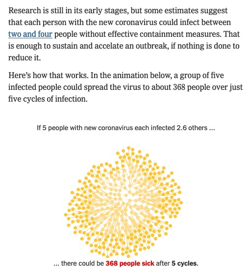
Note that the variable on the horizontal axis in the scatterplot above is “Average number of people infected by each sick person”. Also from that article is this discussion of that statistic:

(Click thru to the article to see the animation, which illustrates a form of exponential growth.)
In epidemiology, that number is called “the basic reproductive number” of an infection; see https://en.wikipedia.org/wiki/Basic_reproduction_number.
Here is the paper linked to in the excerpt above (published on Feb 13) that summarizes various estimates of the basic reproductive number for coronavirus: “The reproductive number of COVID-19 is higher compared to SARS coronavirus“