Author Archives: Huseyin

Huseyin Akis – Blog Entry # 15 (Self-Evaluation)

I’ve fulfilled my hours at City Tech Image & Visual Communications. It was my last day today. City Tech Image & Visual Communications was the right place for me to intern. It’s great my supervisor Mr. Vargas took me as an intern. He gave me the opportunity to learn, and to improve my skills in logo design, camera raw, masking and Photoshop. This was my first time to experience, working in an office with co-workers.

Working here has taught me, how to interact and communicate with co-workers. As an adult with special needs, it’s very important to communicate with people. There are times I need help from my co-workers. They helped me unpack and put on my jacket. My time here has motivated me to be less afraid of trying different things.

When a project took a while to complete. I happily continued working and figuring out ways to make my designs better. Timing is everything… I mean everything. Creating logos usually takes time. There is a lot of figuring out to do, which means constantly sketching and making comps. I constantly kept sketching, even during the comp stage. We sometimes take sketching for granted, but sketching happens to be more flexible, compared to working in Illustrator. Sketching allows us to try new things and let’s us conceptualize and solve problems.

If somebody offered me a job, I would take it because working here has boasted up my confidence. This internship was the right door I took to gain experience.

Huseyin Akis – Blog Entry #14

I can’t believe it’s my last week working here at City Tech Image & Visual Communications. It feels like just the other day, I started interning here. This past week at City Tech Image & Visual Communications, I made several PG4U (Professional Growth For You) logo comps. I brought the right ascender of the U’s points down, using the direct selection tool. So, this way I could place “Professional Growth” in the middle of the G and U.

On the last page, I changed the alignment of the letters. I placed an X shape in one of the logos. For the other logos, I created rhombuses around them. The rhombuses were placed between the letters and words of Professional Growth. These were the final logo comps, I created for the PG4U program.

HUSEYINAKIS_PG4U draft 10-01


HUSEYINAKIS_PG4U draft 11-01

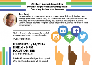
This week at City Tech Image & Visual Communications, I had to create a “5×7”e-mail flyer, for the City Tech Alumni Associations networking event. I created mock ups for the flyer. I created silhouettes of hands and the colors I used were peach, tan and brown, to show different ethnicities. The hands are pointing to a circle and inside the circle there are four logos, of major social media networks.

The idea of the graphic is to direct people, to use different social media sites and apps as a way of networking. I wanted to show the hands; selecting different social media is easy. It’s just like making selections on smart phones.


HuseyinAkis_Flyer Mockup 2

Near 4 o’clock, I signed my name on the internship evaluation form. I thanked Mr. Vargas for giving me an opportunity to work with him.

Huseyin Akis – Blog Entry #13

Today, its November 18, 2015 and I’m still interning at City Tech Image & Visual Communications. I’m starting to feel less shy towards my Co-workers. I talk with some of my Co-workers a lot more now. It’s a great thing to communicate with Co-workers. If there is nothing to talking about, it never hurts to say “Hello, good morning”. Communication releases stress and makes me feel comfortable with my Co-workers.

I entered the office around 10 o’clock with a smile and said “good morning” to my Co-workers. Mr. Vargas came along, while I fired up Illustrator. He took a look at my logo comps for PG4U (Professional Growth For You) the Alumni Associations new mentoring program. He told me to “replace the font of the 4 to Bebas Neue and keep the font of U as Gotham”. The Bebas Neue was too condensed next to the Gotham and it looked off. I decided to use Futura Std Bold Condensed for the 4 and I brought the letters close to each other.

I made a bunch of variations with the letters. For some of the variations, I overlapped the letters with each other. In several of the variations, I joined the letters. For two of them, I cut the lower left side of the U a bit. This way the PG4U draft 6-014 looked like, it was a key fitting in the U.

My supervisor took a look once more and told me “to add transparency like I did in the older comps”. I jotted down the revisions he told me to make on a notepad. The day was pretty much over, so I packed up and left at 4 o’clock.

Huseyin Akis – Blog Entry #12

The last time I was at my internship site at City Tech Image & Visual Communications office. I started on a new project, I had to create a logo for the Alumni Associations mentoring program called Professional Development For You (PG4U). The challenge is to make the logo similar to the Alumni Associations logo. I did research and sketched numerous thumbnails.

We later decided, on which thumbnails I could work with on Illustrator. On Illustrator I created several comps of potential logo’s I could use. This way I could see; which typeface and variations work best for the logos. We decided on which logos and typeface works best.

Today, I was feeling much better. I rolled into the office with a smile and said “good morning” to my co-workers. I setup my MacBook Pro on my desk and fired up Illustrator. Mr. Vargas assigned me to do different versions of a logo. For each logo I used either Bebas Neue or the Gotham typeface. I changed the arrangement of each logo and applied color with transparency.

The fonts worked well because they were both Sans Serif. Bebas Neue is a condensed compared to Gotham. We compared the two and choose, which one worked best. The colors I used were the City Tech colors blue and yellow-orange. When I applied transparency I lowered the opacity of the yellow-orange and the navy. The colors turned into lemon yellow and lavender.

As it approached four o’clock in the afternoon I packed up. There were still some revisions that needed to be taken care of. Mr. Vargas wanted me to continue creating more comps.

Huseyin Akis – Blog Entry #11

Its November 9, 2015, I’m pretty out of it today. The weather this fall has been strange. This has to be one of the warmest autumns; we’ve had in a while. However, we did have a few chilly days. I’ve been dressing properly, all of this autumn and yet I managed to catch a cold. Sigh… today it will be tough working with a congested sinus.

I am currently interning at City Tech Image & Visual Communications office. Today, I rolled into the office around 10 a.m., looking pale like a zombie. First thing, as I got in the office, I met with Mr. Vargas in his room. We had a discussion about the new project. For the new project, I will be creating a logo for the City Tech Alumni Associations mentoring program called “PG4U” (Professional Growth For You). The logo must be similar to the Alumni Associations logo.

I started to do research on the City Tech Alumni Associations; to learn about what they do, and offer for City Tech Alumni’s. I also printed out a meeting memo, from the City Tech website because the Alumni Associations logo was on it. Next, I started to sketch thumbnails for the PG4U logo. Near, the end of the day Mr. Vargas, took a look at my thumbnails. He helped me out a little and sketched some thumbnails of his own. He wanted me to try different variations, of the examples he sketched.

I’m glad he has me working on logos using typography. It’s something I need to practice and improve on. These projects are helping me out significantly with my typographic skills.

Note: working sick stinks but I made it!

Huseyin Akis – Blog Entry #10

Its November 3, 2015, slowly winter is approaching. This is my last semester at City Tech. Finally all the dedication and hard work will grant me a Bachelor’s degree. I’ve been at City Tech far too long now. I’m excited because I never thought I would get this far. Once this semester is over, I can finally say I have a Bachelor’s degree.

However, there’s still about a month left and let’s not get ahead of ourselves. I must still get through internship class. I am currently interning at City Tech Image & Visual Communications. Just like every other day; I rolled into the office cheerfully I said “good morning” and got prepared to work. I looked around and saw the Alumni department was busy as usual. My supervisor Mr. Vargas gave me a new task to work on and told me to hold off with revising the City Tech Wi-Fi logo.

Today, I worked in Photoshop’s camera RAW and adjusted the lighting, contrast, and saturation of 28 photos. Each photo portrayed one or more school security guard’s. One of the security guard’s was sitting next to a woman in a lavender shirt. They are seated behind, a table that is covered by a blue cloth. On the top of the table there are pamphlets about New York City emergency plans for pets and people, opening up business in New York City and a laptop. Students are gathered around the table asking questions to the security guard.

It was definitely a productive day because I haven’t worked in camera RAW for a long time. Working in camera RAW today, helped understand how to adjust the lighting, contrast, and saturation of the photos.


Huseyin Akis – Blog Entry #9

It’s October 20, 2015, I’ve been interning at City Tech Image & Visual Communications for over about a month now. I am quite satisfied with interning here, however there is one complaint I have. I wished there were new Mac’s I could do my work on. Carrying my laptop everyday is a hassle, because I always have to ask somebody to take it out for me and to plug in the charger.

I would assume since this place is a Visual Communications office, there would be new mac’s. Just about a month ago, somebody from City Tech came into the office, to throw out the old computers. It’s too bad the school doesn’t always replace them with new machines. I believe the school should replace the old Mac’s with the new Mac’s, especially in the Visual Communications office.

Today started with hot tea and a breakfast sandwich that I brought from home. I ate and drank tea, while I fired up my Macbook Pro. In about a few minutes, I started revising the City Tech Wi-Fi logo. The logo depicts three curved shapes; that represents the Wi-Fi signal, with the words City in one and Tech in the other, and so forth. One of revisions I made was; I changed the tittle of the lowercase I’s to a round dot. The second revision I made was; I thickened the letter E of the word Tech. For the final revision, I moved the letter’s “I “ and F of the word Wi-Fi, to the edge of the curve.

Near the end of the day, Mr. Vargas came to my desk, and said to me “you’re almost there”. I’m glad he said that because I’ve been working on this logo for a while now.


Huseyin Akis – Blog Entry #8

It’s October 19, 2015, it has been one month since; I’ve started interning at City Tech Image & Visual Communications. The experience interning here has been great. I’m learning about how to go in depth with my logo developing and masking skills in Photoshop CC 2014. Interning here, has allowed me to work hard and fully concentrate on projects.

I’m still working on the City Tech Wi-Fi logo. The illustration of the logo depicts three curved shapes, they represent a Wi-Fi signal and each shape has typography in them. For, example one of the curved shapes spells out City and the other Tech, and so forth. Mr. Vargas, asked me today to use a different font but, only for the letter “C” of City. He wanted me to use an extended typeface in bold. This way the letter “C” is evenly spaced, between the other letters.

I found the perfect font called Micro Extended FLF and turned the typeface bold. Now, it was time to kern the space, between the letters of the word City. The thickness of the T and Y’s base was thicker compared to the “I”. When, I created outlined text; I had to resize some of the letters, so they can fit inside the curved shape. I made the adjustments, by using the direct selection tool. I brought in the points closer, at the edges of the “T” and “Y”. In order to thin out the width, so its width is the same as the “I”.

The goal was to find an extended font, to use for the letter C in bold. This way the letter C would be thick enough, to leave less negative space in between the letters. I can, gladly say the goal was accomplished today!

Huseyin Akis – Blog Entry #7

It’s October 13 and today is another day at City Tech Image and Visual Communications. I’m getting better at masking out photos. The City Tech Wi-Fi logo, I’ve been working on has been a challenge but, the project has given me the chance to work with typography and shape. It’s something I haven’t done for a while now.

I got to my internship late today; I was there at 11 a.m. because my transportation Access-A-Ride dropped me off late. The driver made several pickups, before he dropped me off. I got to my desk and Mr. Vargas came to my desk, to find out, where I’m at with my work progress. I had to finish, masking out the background of the last Hospitality Management department photo. There were two photos; both of them were photos of Hospitality Management students, dressed as chefs with their Professors. Afterwards, I grouped the two Hospitality Management department photos.

For one of the photos; I had to change its brightness and contrast. This way both photos brightness and contrast would match. About an hour later, Mr. Vargas came by my desk and told me to feather one of Professors head a little more. Once I was done; I went back to work on the City Tech Wi-Fi logo. I played around with the letters of the word Wi-Fi and, I fitted all of them into the Wi-Fi symbol. I stretched and thickened the letters so, they could properly fit.

By, the end of the day; I had completed all my work. Next week a new project and challenge awaits me. I am prepared for the next challenge and experience!


Huseyin Akis – Blog Entry #6

The last time I was at the internship site was on October 7. I m currently interning at City Tech Image and Visual Communications and this will be my fifth week there. I rolled into the office and, I cracked a smile and said “good morning” to Ms. Christina and Norma. They both work in the Alumni department in the office.I unpacked and prepared my desk; right before I started working on the City Tech Wi-Fi logo.

The City Tech Wi-Fi logo was coming along quite nicely but, the logo still needed some tweeking. I continued working on fitting the letters, of the word Wi-Fi into the symbol. I had to stretch and thicken the letters; in order for them to fit into the shape. Around, the noon time Mr. Vargas came to check up on my progress. He told me to put the logo to the side and, he gave me a new project to work on. For the new project; I had to masked out the background of two photos of students, with their professors from the Hospitality Management department. After, masking out the background of the two photos; he wanted one of photos grouped with the other. This way the photo would be one whole photo, that consisted of both pictures.

I was on lunch at 1 o’clock and it was time to eat. I ate a sesame bagel and, I drank a Snapple lemon iced tea. Around 2 o’clock, I continued masking out the background of the first photo. Slowly, I started working on the second photo. The more I work on masking out the background of the photos. The better I get at masking out hair, in photos without destroying the image.