My hours at the print shop has increased. I was able to switch some hours around at the airport and work there nights so i can work more hours during the day at the print shop. This schedule is starting to hurt. I barely get any sleep and my work is starting to slip. If I want to continue in the advertising field I need to make some hard decisions. I like making drawing and making something out of nothing. At the airport, I don’t get the same feeling as I do from drawing or designing. When I went to work yesterday, I put in my two weeks notice at the airport. I need to start focusing on my school work and my internship. I want a future in communication design and working at the airport isn’t helping me achieve that goal.
Monthly Archives: April 2015
Journal Entry # 7 Omkar Singh
Work at the print job is good. As time goes on I’m taking more and more responsibility there. Im still dealing with only printing but i have shown my supervisor that I pick up things fast. Because of my customer service experience at the airport, I’m able to handle the customers very well. Adam is still letting me shadow the designers. My hours at the print shop vary due to my work schedule at the airport. The print shop opens at 9AM to 7PM Monday to Saturday. This conflicts with my work schedule at the airport since the Airport never closes, I’m there at different times of the day.
Journal Entry # 6 Omkar Singh
The weather has finally eased up and my work schedule at the airport is returning to normal. Because of the airport, my regular life has taken a backseat. Now that spring is here the airport can finally take a backseat and I can focus on my school work and my internship. Adam, my supervisor at the print shop, has let me start printing some of the light jobs on my own. The customers that usually enter the print shop are local residents that want papers copied and printed on standard 8.5 x 11 paper. Compared to the airport this job is a piece of cake.
Journal Entry # 5 Omkar Singh
This winter has been a nightmare. From working 60 plus hours at the airport for ASIG to interning at the print shop to personal issues with my family, my life has been a roller coaster. There was another snow storm and I had to stay at the airport for the majority of my week. Things are still moving slow at the print shop because of my crazy hours at the airport. I am thankful that my boss is understanding of this due to the fact that he has family that works there also. He still has me working with the customers but has been training me to use the equipment and start printing on my own.
Journal #11 Josephine Woods
This week was a very busy and creative one.
On Monday April 6; I created two new icons for two of the pages. the first one was Fatherhood, which didn’t have an icon on their website. I used custom shape tool in PhotoShop to create the two circles(blue, than smaller yellow circle). And to represent fatherhood I used the custom hand shape to make a blue hand and a smaller yellow hand inside the blue one. The second icon I created was for social media slide where it links to the social media page.
On Tuesday April 7; I continued to resize images and I uploaded some of my completed slides on to the New York App Designers website, here is where I have a login account. Once I log in with my organization I can upload, add content and images. This is where I create my mobile app designs and layouts and published them on to a server.
On Wednesday April 8th; I finally finished my babybuggy.org app. After a long day of fixing mistakes I made from a few days past, I finally completed my first app. So now the fun part is over time to move on to the next non-profit organization.
On Thursday April 9th; I found a new non-profit organization called futuresandoptions.org. what this organization does is help young adults age 16 to 24, prepare them for job interviews, working force, and school giving them a chance at making something of themselves. I started researching the website to see how I can layout the content and images. Also design a homepage for the app.
On Friday April 10th; Mr. Lawson and I came up with a nice concept and layout design. I used the main colors (orange,blue,fushia,yellow and pea green) from their site as main tabs which will link directly to main content within the app itself. I only got as far as laying out the homepage, hopefully Monday I’ll be able to have a completed full working app.
Journal #9 – Brian Rubio
This week I’m working on a simple flyer that the store will hand out to various gyms around town. This flyer will give anyone looking to buy apparel or gear 15% off the most expensive item. It also will inform the potential customer the location of the store and some photos of best selling items that serves like an attention grabber. I honestly did not like the finished product but after going back and forth with my boss I learned to “just do what the client wants”. If he likes the way it is, even if it goes against my design sense in the end he’s the boss and what he wants goes. Regardless, I really appreciate that my him is using my skills across the board. Anything thing he can think of that has something to do with design he hands over to me. So far it has been product shots, indoor and outdoor, t-shirt design, business cards, and now flyers. I really feel that by doing this he puts me to the test and brings out skills that I have learned in class and could use some sharpening. These flyers should be done and ready for distribution by next week. Next week we are doing another UFC fighter signing, so there’s a lot of coordinating with photographers and reps going on. Seems like I’ll be doing the in-house photography again, which is fine by me. Always a fun time meeting a professional fighter.
Journal #8 – Brian Rubio
So far I have been sketching and coming up with some t-shirt concepts that are martial arts inspired/related which is a harder task then i thought it would be. It consist of a lot of brainstorming and simply asking around collecting and observing the martial arts community. I feel like originality and uniqueness are easy to achieve in this community but finding something that everyone who practices a martial art understands is the tricky task. I usually try write down things people say in conversation about martial arts. Then I’d see if i can make the quote or sentence into a design using actual art or typography. Overall I’ve been having a great time at the internship. I’m dealing with the printer on a weekly basis and have become a bit more comfortable with orders and explaining what it is that we need.
Journal #10 Josephine
Week of March 30-April 3;
On Monday March 30th; I finished the layout design for my non-profit organization called Baby Buggy. I kept the layout I start from last Thursday. I added text boxes, and images I used from the babybuggy.org site, and placed it on the landing homepage. I created a frame, really a long rectangle shape, and used it as a place holder for the images. The place holder or framed is really used to distinguished the difference from background and the images in the foreground.
On Tuesday March 31st; I took even more images of the babybuggy.org website that was on the headers of internal pages. I resized them and cropped them so it would fit on the headers in there respected pages.
On Wednesday April 1st; I continued to resized and cropped images. Also I started on creating five main sliders to link to internal pages in the website.
On Thursday April 2nd; after finishing up the IPhone layout, I edited a couple of minor details with image and text placement. I grouped all my layers in my IPhone homepage layout(640 x 1136) in PhotoShop and dragged it to my android homepage layout. I resized the the layout to fit inside the android. (which is 640 x 960)
On April 3rd; I finished up on the android home layout page, and started on the resizing text and images. I also dragged in icons from the site and added it to title of that slide: For example: Give Gear a page and the icon to go with it is a blue circle and a smaller yellow circle on the blue one and an image of a blue onesies.
Journal Entry 10- Latimel Rodriguez
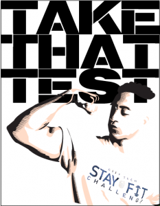
This weeks internship consisted of a continuation of last weeks project. I kept researching the memes and executed three ideas for Al to look at . We looked at all the ideas Id execute and Al said to give him some more poster ideas . I told him I wanted to try and execute an illustration with the images kind of resembling Russian constructivism . I wanted the poster to be strong so I transferred the image into photoshop and created a duplicate of the image , not to touch the original. The copy was the. Made into a black and white image, not permanently but with a filter so I don’t touch the original color . Then the copy image was give. A gradient map overlay with a black and clear color tint . What this did was create really strong black and whites . Once this was achieved and i was happy with the results i posterized and threshold the image . I then only made the image have three solid colors to compose the original and then transferred it over to adobe illustrator. I used the pen tool to trace over the shadows in black and created lines pointing to the right to give it a sleek appearance. Then I traced over the mid tones and gave it a slightly off white fill. I left the highlights completely blank . I haven’t done anything with typography yet because I’m still researching strong typography but I’m playing around with the fonts Impact and Stencil font.
Heres an example of the work I finished and then direction I wanted to take the poster:
Journal Entry 9- Latimel Rodriguez
This weeks internship was rather brief , I only went in for about four hours. Usually i’d finish eight hours on Wednesday and Thursday. I walked in and set up my laptop and sketch book. I was greeted by Richie, an illustrator who was also at the internship site with me . He had already started on the project Al had assigned him. Al called me to the back office and handed me the next assignment . It was a poster campaign for the fitness center at the school. The images he gave me were from the photoshoot we took about a week ago. His idea were for the images to be placed on a 8.5 x 11 sheet of paper with a sort of meme theme to it. Now this wasn’t the actual size of the poster, but for preflight purposes I created the concept on 8.5 x 11.
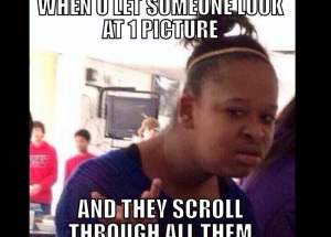
In case you didn’t know what a meme was, heres en example:
By the time I had finished researching good memes, which was a pretty entertaining task, it was time for me to head out for the day.


