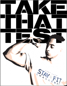
This weeks internship consisted of a continuation of last weeks project. I kept researching the memes and executed three ideas for Al to look at . We looked at all the ideas Id execute and Al said to give him some more poster ideas . I told him I wanted to try and execute an illustration with the images kind of resembling Russian constructivism . I wanted the poster to be strong so I transferred the image into photoshop and created a duplicate of the image , not to touch the original. The copy was the. Made into a black and white image, not permanently but with a filter so I don’t touch the original color . Then the copy image was give. A gradient map overlay with a black and clear color tint . What this did was create really strong black and whites . Once this was achieved and i was happy with the results i posterized and threshold the image . I then only made the image have three solid colors to compose the original and then transferred it over to adobe illustrator. I used the pen tool to trace over the shadows in black and created lines pointing to the right to give it a sleek appearance. Then I traced over the mid tones and gave it a slightly off white fill. I left the highlights completely blank . I haven’t done anything with typography yet because I’m still researching strong typography but I’m playing around with the fonts Impact and Stencil font.
Heres an example of the work I finished and then direction I wanted to take the poster:


