My visit at the Cooper Hewitt museum was an exciting and unexpected experience. I was excited to see a museum solely based on design and not fine art, unexpected because when I walked through the door they gave a wand and told me that I can save the work I like and look at them through the museum website. I’ve never heard of anything like this and while going around the museum looking at the illustrations, graphic designs, and industrial designs, it was amazing. I enjoyed being there and a lot of work I liked there were propaganda illustrations and minimalist graphic designs.

Category Archives: Coursework
Visual Quote Project


This is the illustration along with the quote that i’ve used for the visual quote project and it was a fun project to do because I got to make an illustration along with looking through the quotes that were memorable and find which were the best to use. The only challenge I would say I went through is deciding if to use color or not for the illustration along with what type of font should I use that would go well with the illustration but in the end I found the font and I chose not to use any color or light and shadow and decided to use the font called “Stixgeneral”.
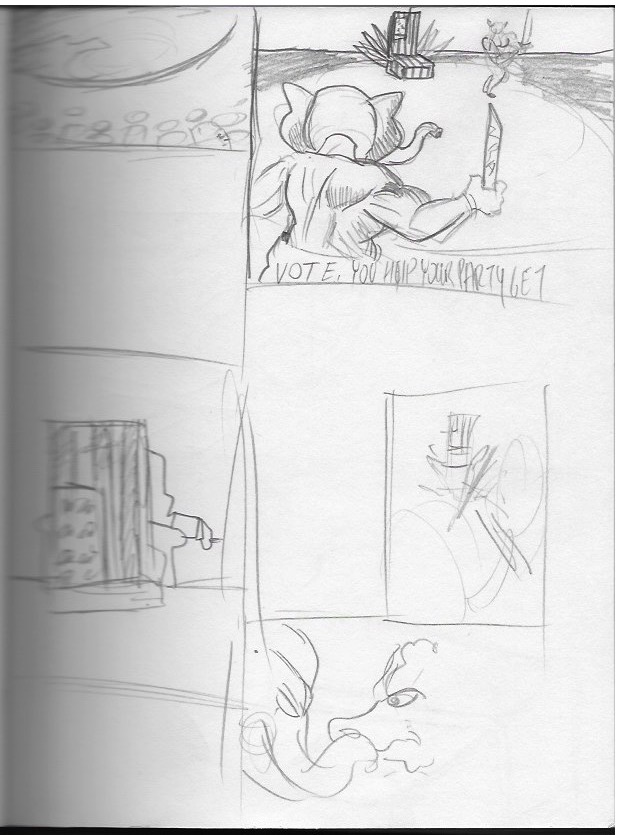
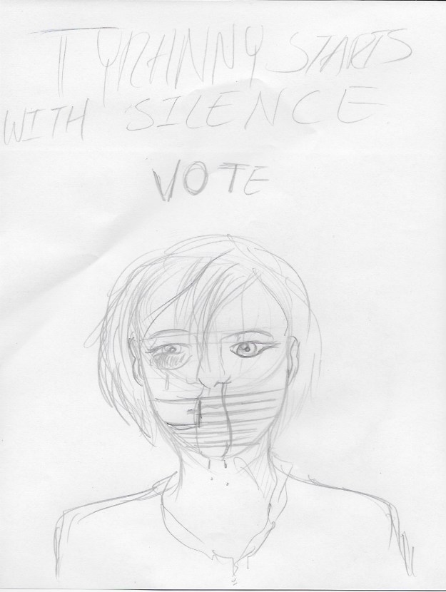
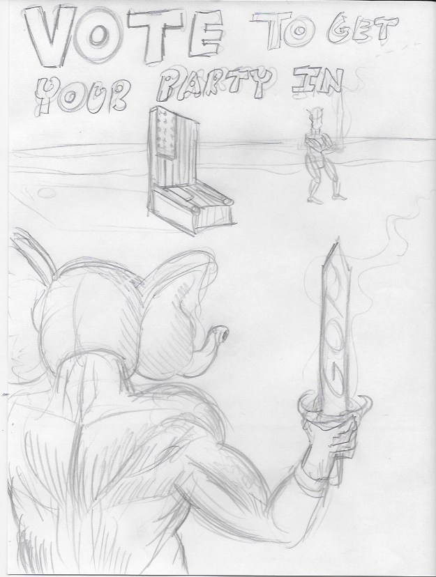
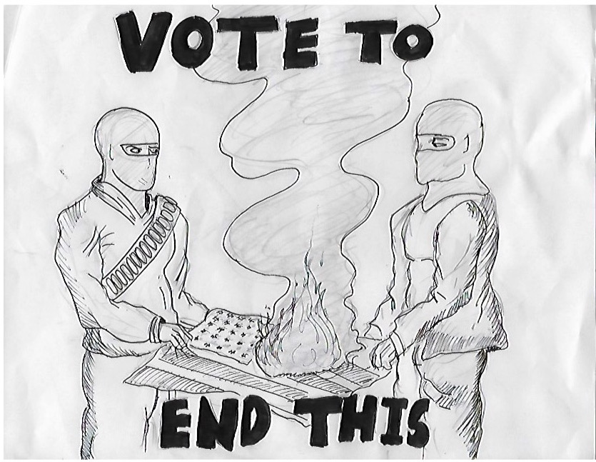
Project #2: Get out and Vote
Project #2 was an interesting assignment because I had a lot of ideas that I really wanted to put into this assignment but unfortunately some of those ideas had to be taken out due to the requirements of the project but it was interesting because I really had to think about what would be ‘good’ for the sake of the project, but also what would be good for me as well. Overall, it was fun but challenging project to do. 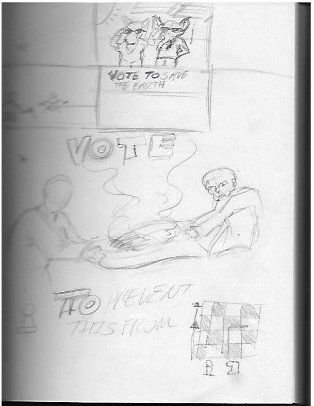

Finals for illustration project #1

CDMG 1111 Quotes Project (Refined Sketches)
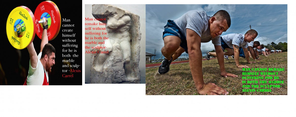
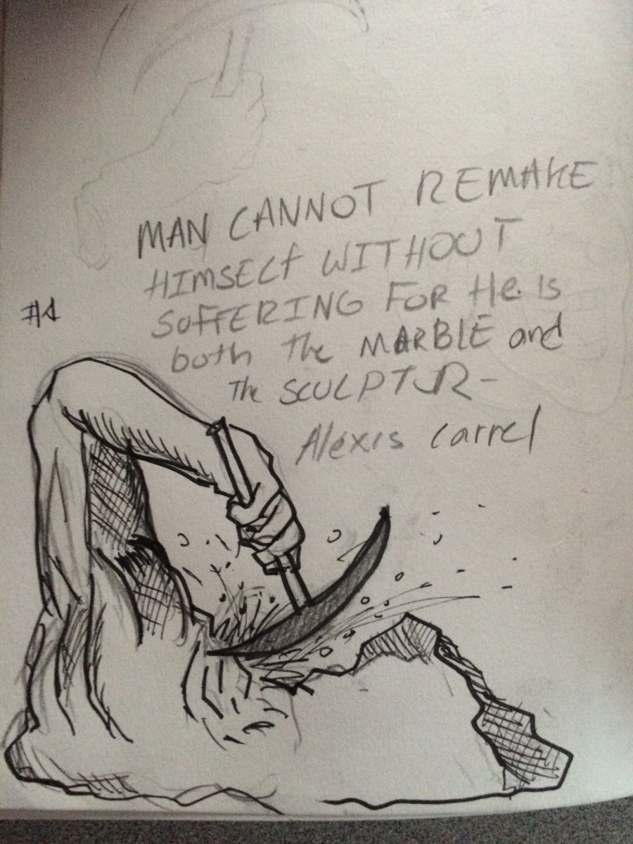
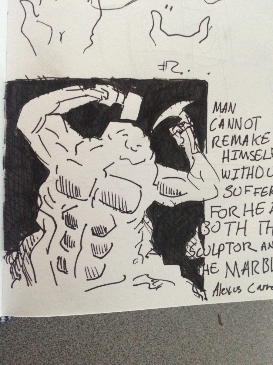
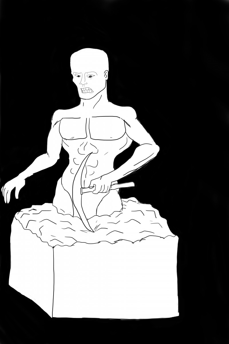
These are some of the few ideas that I’ve had relating to quote when I saw this quote the main thing I wanted to focus was man trying to improve himself but going through pain while doing so I looked up some photos of men doing physical exercise but looking in pain while doing it. I also did some small illustrations of a marble sculpting itself but looking as though it’s struggling while sculpting itself.
Rolling Stones Logo Essay
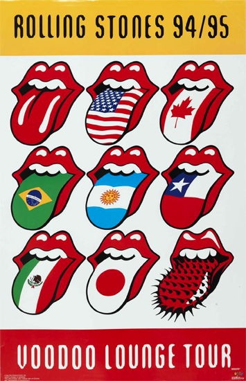
Throughout out our lifetime we see a wide variety of logos and/or symbols we either remember vaguely or remember distinctly. For example, the stop sign, we’ve all seen the sign before we automatically know what it means. Powerful symbols tend to that. In 1971 John Pasche created a symbol of a pair of lips and tongue. Little did John know those lips and that tongue would have the same reaction in hundreds of millions of people. In 2008, the red lips and tongue logo was ranked #1 on 50’s greatest band logo of all time on Gigwise.com through a This logo help represent arguably one of the greatest English rock bands of all time.
During the creation of the logo for the Rolling Stones 11th album “Sticky Fingers”, John said that the mouth was inspired by the mouth of Mick Jagger during the their first meeting also the Hindu goddess of death, Kali. John said that tongue and lips help suggest sexual connotations and an anti- authoritarian attitude which were popular themes in the Rolling Stones music.
![]()
The original is the one on the right and the new version is the one of the left. The new version is found on shirts, wallets and a wide variety of accessories. Throughout it’s existence there were only few adjustments that were made such as there are now two highlights on the tongue, the red is more saturated, the outline is complete on the end of lips, the corners of the lips are more sharp, there is a shadow on the tongue from the teeth. While there have been adjustments to the logo, there are those who made their own variations of the logo such as American contemporary artist Ron English, and another which was done by Mark Norton who made different variations of the logo for the rolling stones voodoo lounge tour. Powerful symbols tend cause a wide variety of reactions such as inspiration, fear sadness, happiness, anger, while symbols are just symbols in the end, it’s the powerful ones that are unforgettable.

Project #2 Thoughts
Project #2 was a mixed bag. it was mixed bag because while using music and design principles such as rhythm and contrast to create a wide variety of mock ups was fun and exciting, doing the final product was tedious and time consuming. 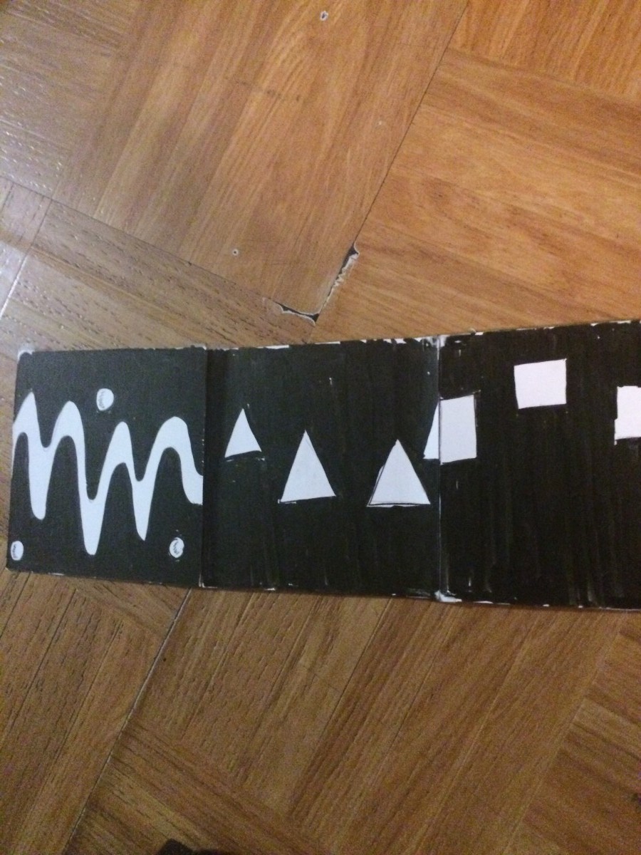
MUSIC INSPIRATION FOR PROJECT#2
Making Music Modern: Design for Ear and Eye

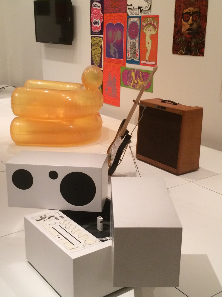
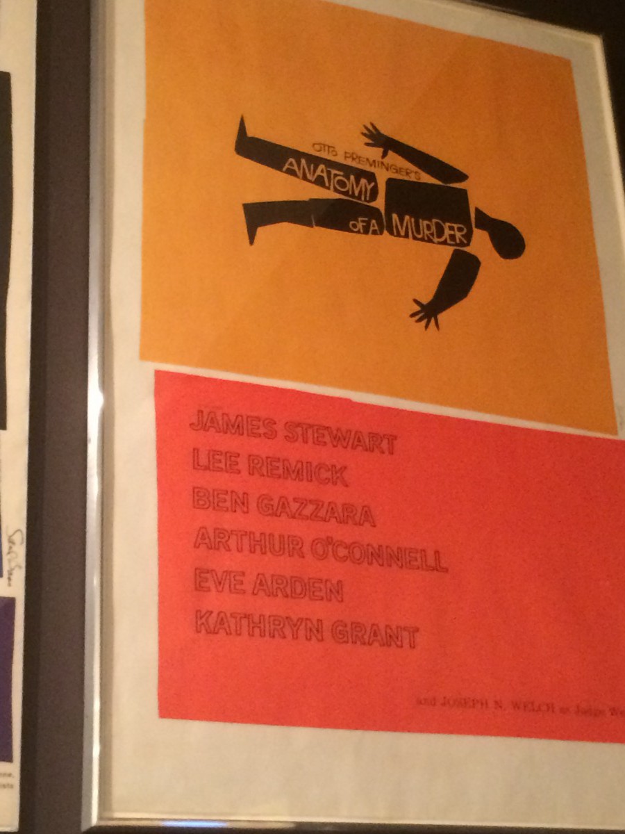


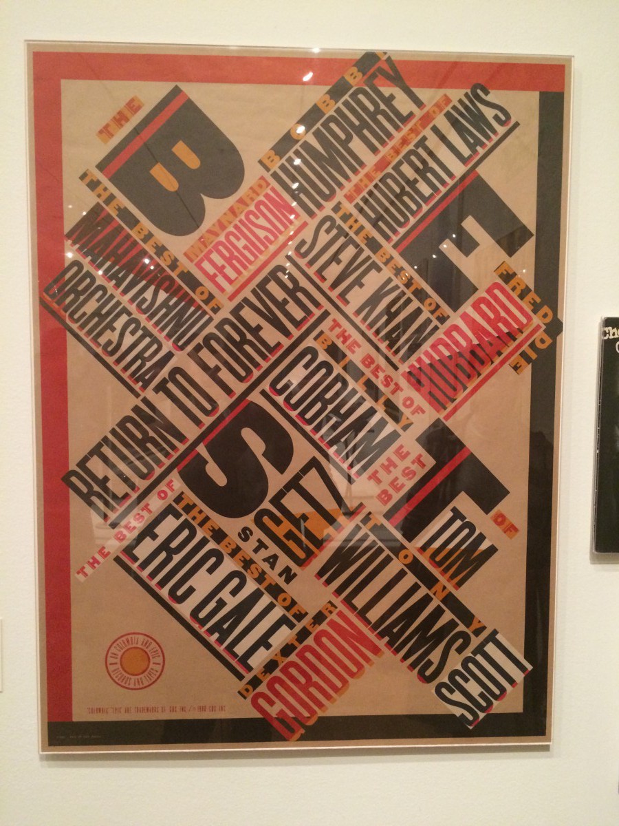
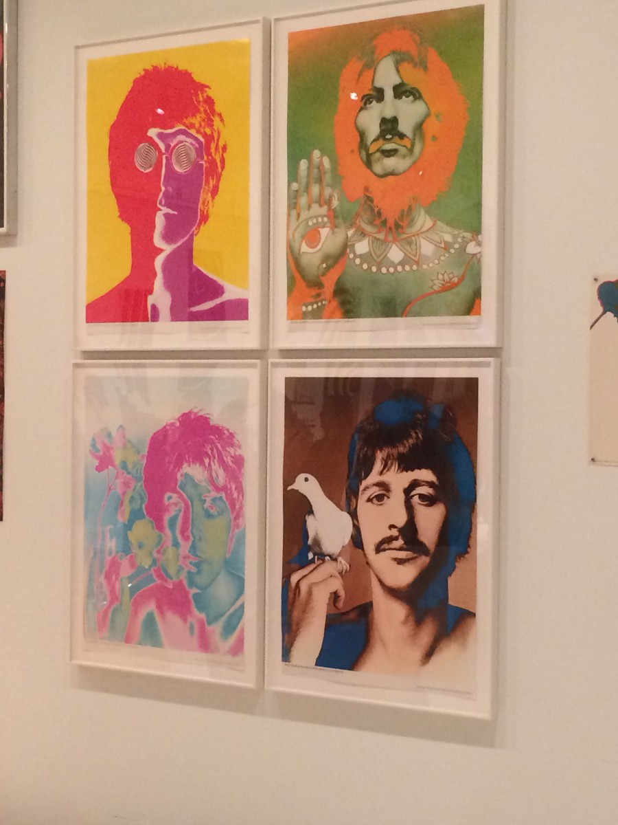
I visited the exhibition at Moma and as soon as I walk in 60’s pop music was playing. I saw posters of rock groups like The Beatles, Jimi Hendrix, Elvis Costello, and The Clash and seeing designs from famous designers like Saul Bass. The whole place was amazing, seeing the relationship between music and design certainly made me more appreciative of music and more appreciative of design, how design is essential is making objects that we enjoy using such as iPhone,radios,headphones. Apart from that, what certainly helped me with having some ideas related to my project was the design animation video of David Bowie’s song “Sound and Vision”. It helped me expand my understanding of rhythm and movement.
Texture Designs