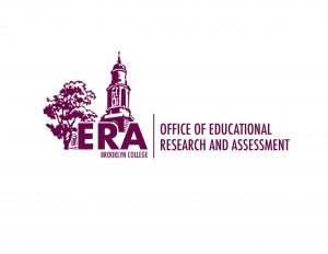
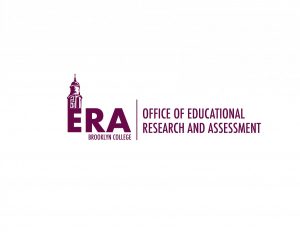
This is the first week to start working at home because of the Coronavirus disease and our supervisor Isana already sent us a mail about this issue and problem the day before. Isana also shared with us a Dropbox folder in order to let us upload all the drafts for our assignments that we did for today into this folder for review as a pdf version. After this, she send us the instructions for today’s assignments which we continue to work on AES Assessment Handbook covers that we did for the first week, but we also got a new assignment for our office which we need to design a logo and the full office name is: “Office of Educational Research and Assessment” or “ERA” for short. Our supervisor wanted to have two versions of the logo, one with the full name, one with the short acronym. In addition, she sent us a link for the City Tech Assessment website (AIRE) for an idea of the logo style they like and led us to look it up. So the difference between them was to use Brooklyn College imagery and colors as inspiration instead of City Tech. Finally, we needed to have five versions for the long name and short name logos should come in pairs, so five themes, ten logos total.

 So for these two logos that I design, the inspiration came from the logo at the City Tech Assessment website which gives an idea of the logo style that our supervisors like.
But I also tried and came up with a totally different style for this logo. Sometimes don’t be afraid to challenge ourselves, and to our best to provide as many opinions as we can for our clients was not bad because as a designer we should always provide the best experience for them in order to show them what other opinions and chances we can have, so we never know if they will make a difference for them or not.


