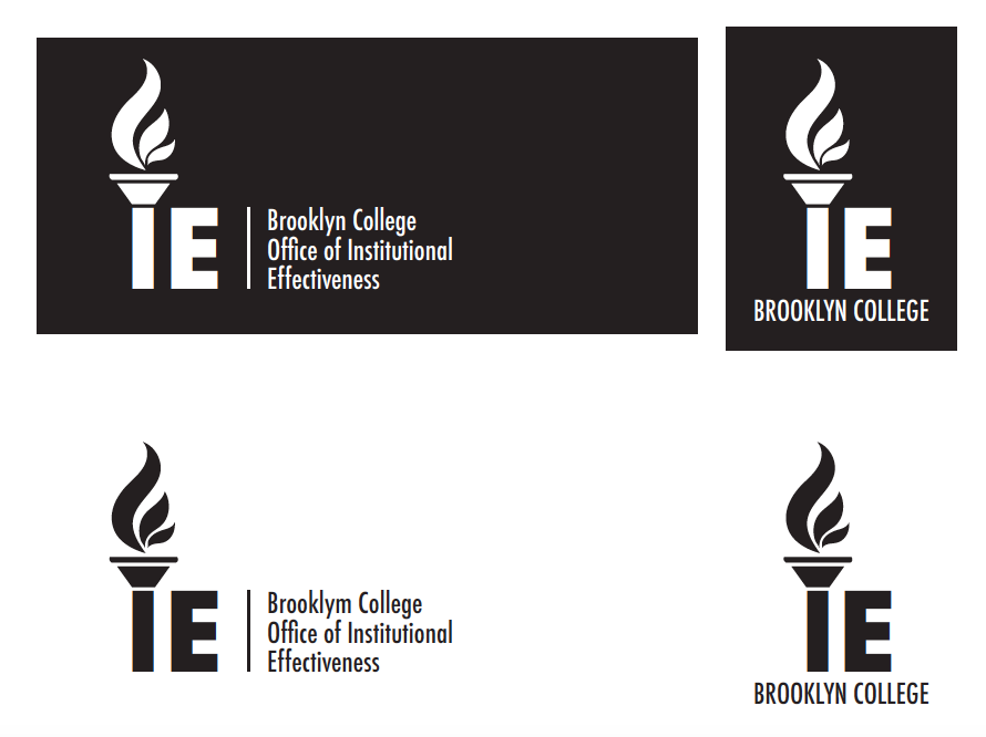
For this week, we got some feedback from different versions of the IRDA, IE, and ERA logos from the past few weeks. In addition, they did love the torch style for my IE logo and they would like to see this torch logo with different fonts and we needed to provide them unless 5 options. I also needed to make a version of this logo where the flames are in shades of gold by using “Brooklyn College Gold”.
![]()
![]()
![]()
![]()
![]()
![]()
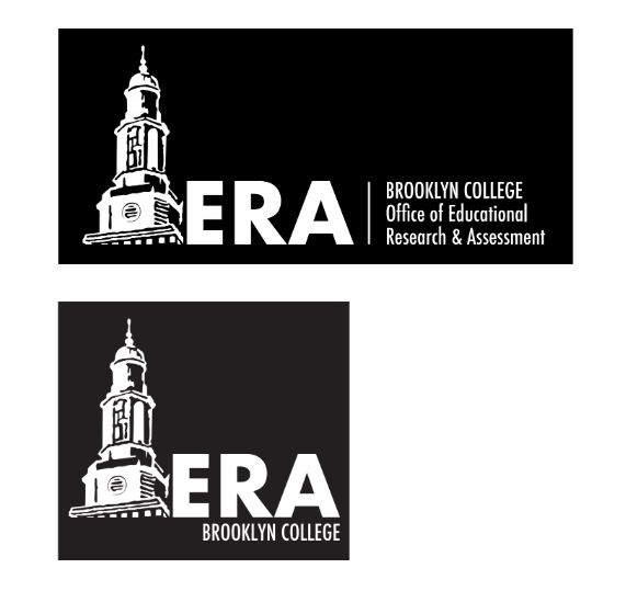
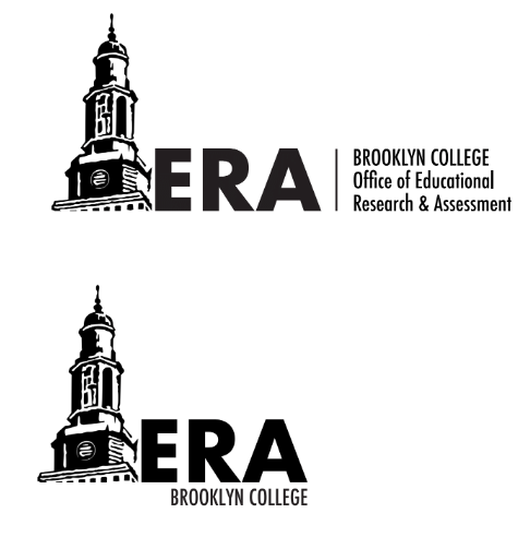
For the ERA logo, they did like these two versions from me. Additionally, they wanted me to remove the tree and move the tower into the spot where the tree was. For the second ERA one with the red letters and a white background, they wanted me to provide a short version.

![]()
![]()
![]()
![]()
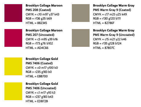
For all of the logos, first we needed to provide a black and white version which the black letters with a white background and the white letters with a black background. Second, we need to make Brooklyn College with the lowercase letters above the office’s name “Office of…” on the long logo version; BROOKLYN COLLEGE all uppercase letters below the letters on the short version. Third, we needed to provide the same font and they liked the font being used above for ERA and IRDA logos. Lastly, we needed to make sure the color red matched the Brooklyn College red.
In addition, we needed to make sure the yellow color should only be in the color version, not in the black and white versions for all the logos.
For the second assignment of this week, we needed to use the attached document that our supervisor Isana sent for us in order to create a format for a Microsoft Word document. Finally, we need to format the spacing, font, columns, a place holder for a picture, a place holder for a quote, a new cover, etc. with the Brooklyn College colors nicely. Additionally, there are two reports and we need to make two versions following the structure of the two reports. We also needed to delete the written content and the pictures, but we needed to make sure that there are place holders for the photos and the quotes.