https://drive.google.com/file/d/1bnLLYGIqcsCYwPG7P9DdrWcfzte5cvxn/view?usp=sharing
This is a response to Shepard Fairey Copyright Case and to the assigned AIFA Design Ethics chapters as they relate to my current internship. First the AIGA Design and Business Ethics is the professional association for design which outlines the critical ethical and professional issues encountered by designers and their clients. So as a designer, we have a responsibility to know and learn those professional ethical standards. In addition, there are four chapters from the AIGA Design and Business Ethics Handbook including the clients guide to design, use of illustrations, copyright, and the use of photography.

After reading the AIGA Design and Business Ethics, I learned a lot and there is a lot of knowledge related to my internship as well. First, we need to be clear what company is the right firm for us, such as their culture, direction, latitude, and etc. In addition, I think most have concrete answers already. For my internship, I found the Institutional Effectiveness Office in Brooklyn College that matched up with my goal very well, and I got comfortable with the honesty of the firms I am talking to. Also as a designer, it’s important for us to clarify what is design and the meaning in design, which it often has the properties of good looks, and it is about the underlying structure of communicating the idea, not merely the surface qualities. In addition, design is about the whole, not the parts, so in order to create great design, we should always communicate with the whole team of our company. During my internship, we did a lot of meetings and I got so many great feedbacks from my partner YanLin, clients, supervisors and other teammates as well which they all were great for me to improve my design to a higher level. So being a professional designer is very important in ensuring that companies communicate effectively.
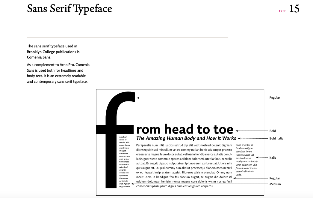
In addition, as a designer I should know the legal and moral issues for the use of fonts, illustration, software, copyright, photography, etc because they are often overlooked for many designers. First, fonts are creative, intellectual property, similar to designers’ creative work or to proprietary business products, and fonts are so easy to share among computer users, it will easily become a moral problem. For my internship, we needed to use many required fonts such as Arno Pro, Comenia Sans, Caecilia and other fonts from the Brooklyn College brand guidelines. They all needed an Adobe account to login in order to activate them. For me, I already pay my Adobe account every month and I got my license for the font use and softwares as well. For my internship, we always used Indesign, Illustrator, Adobe Acrobat and Microsoft Word as well, and they are all legal. Also, copyright is very important because it defines the ownership of work created by a designer, and it is what allows a designer to control whether or not a work may be copied. From one of our projects “the student experience survey” I used a photo in the background for a poster, and I tried to find the image from the Brooklyn College website in order to get over the copyright issue, that’s why I didn’t find the image online because I know it will become a problem. Finally, it is important to work with professional integrity. Respect for the rights of illustrators is a matter of practice, ethics and law because they invest substantially in the research and development of their technique and style. This in turn, is the basis of their business and reputation. So to ask a designer to mimic the style of another desigers is not considered ethical or, in some instances, even legal.
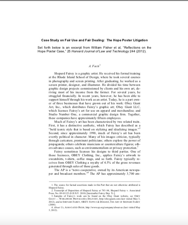
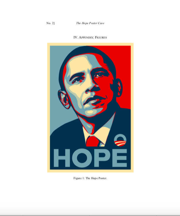
The Shepard Fairey Copyright Case: The AP image Used in the “Hope” Poster during the 2008 Presidential Campaign is a great example to show us about those issues in the design industry. The AP is a “news cooperative, owned by its American newspaper and broadcast members.”and it has about 3700 employees. In addition, Mannie Garcia is a professional photojournalist who was working for the AP in April 2006, and he is the one who took the “Garcia Obama” photograph. Later, Shepard Fairey used his photo to create the “Hope” poster during the 2008 presidential campaign. In addition, Fairey failed to give appropriate credit to the photographer. Additionally, AP thinks it was Fairey’s commercial motivation and he had earned large amounts of money from the poster. AP claimed by the Associated Press for compensation for the copyright, so based on the response Fairey sued for a declaratory judgment that his poster was a fair use of the original photograph. But AP said Fairey had falsely asserted that he had employed the Garcia Clooney photo, rather than the Garcia Obama photo, as his reference work, and had fabricated evidence in support of that assertion. As a result, the principal parties settled the dispute in mid-January of 2011. Finally, this is a great example to show us, as a designer we all should learn about the legal and moral issues in the design industry in order to make sure we are not making the same mistake and violate our law, and I always tried to avoid those issues during my internship.
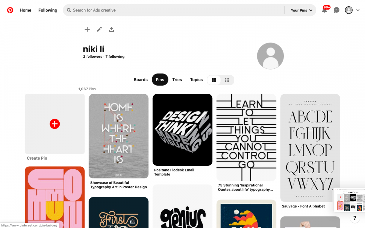
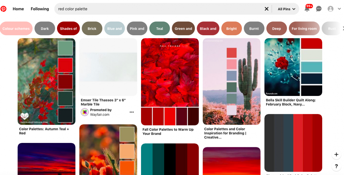
Pinterest is a social media web and a free app that requires registration to use and they also provided the website version which is very convenient for everyone to use. In addition, we can upload, save, sort, and manage images which are known as pins, and other media content through collections known as boards. So this is an app very simple to use, simply just need to pin any topic that we are interested in or any useful content into to our boards such as fashion, drawings, recipes, travels, nature and etc. So just create and name different categories of the board and then save our pins on it. Additionally, most of the images provide us with a very high quality and resolution which is great.
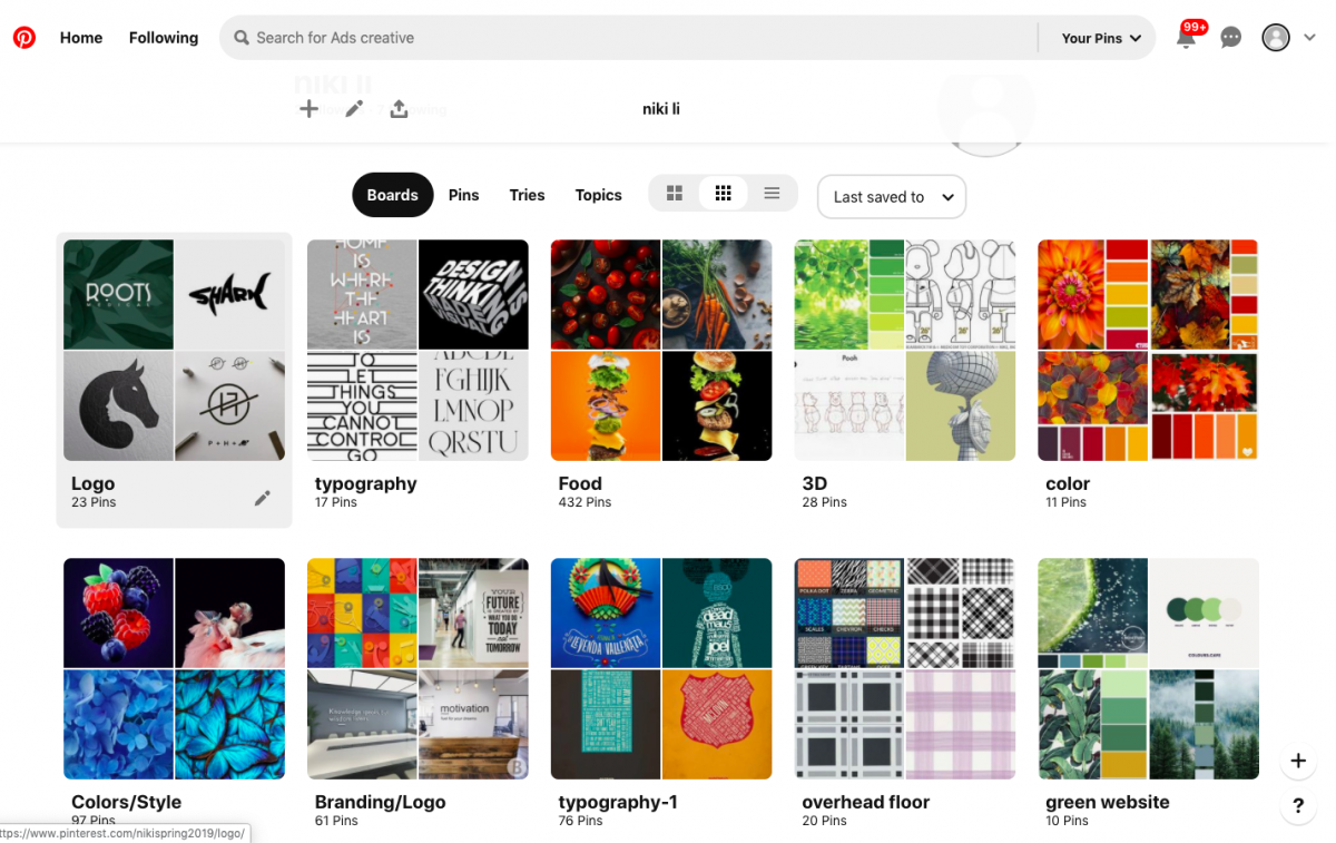
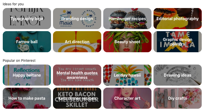
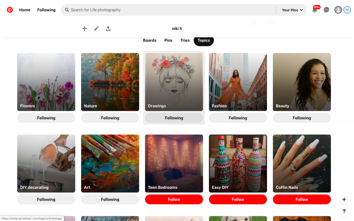
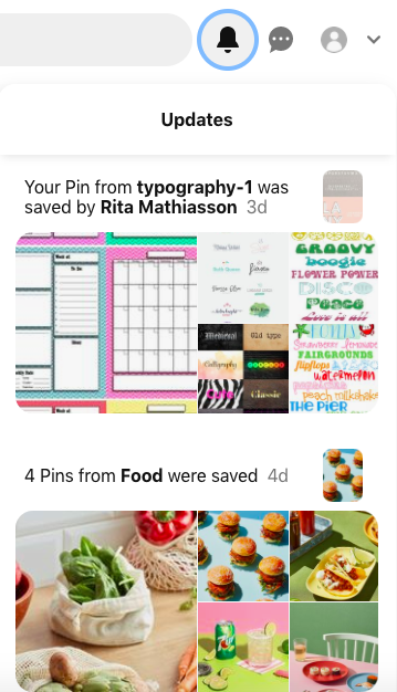
In addition, if we prefer a specific style or have a favorite piece from someone, we can follow them to get more ideas and news from them by clicking the follow button. Also there is a bell icon on the top right that will remind you of all the activities related to you. We can also share and message any ideas to our friends, families, classmates or others by searching their name or email.
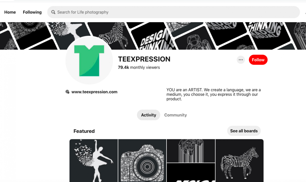


I think this is a pretty cool app and good place for every designer that can get different inspiration from. During my internship, I used this app a lot for the color palette and some of the interesting designs, it provided me with so many ideas and helped me to develop the process of my design, so I think they are very useful. That’s why I always collected, saved and organized different images on my board. In any case, I can find my favorite pieces very easily. Finally, this is a great app that I will strongly recommend for everybody.
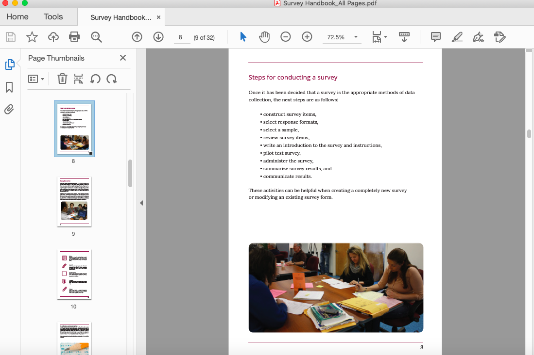
This was the collaborative project and teamwork about the Survey Handbook, me and Yan Lin worked together with another girl Angelica Torres who is the part time job designer in Brooklyn College and we already met her during the online meeting. In addition, the total pages of this handbook are 32 pages including the cover of the font and back. Before we started this project we already had a meeting twice, for the first time we didn’t get a chance to communicate with Angelica because of her personal schedule and she missed the meeting. So we started to meet her again in the morning of the second day, and everything was going very smooth. During the discussion, Angelica told us she had a very old version of InDesign, so there was a conflict with our new version InDesign 2020 in order to open the file. Finally, I came up with a solution and borrowed my Adobe account to Angelica to down the new InDesign version.
![]()
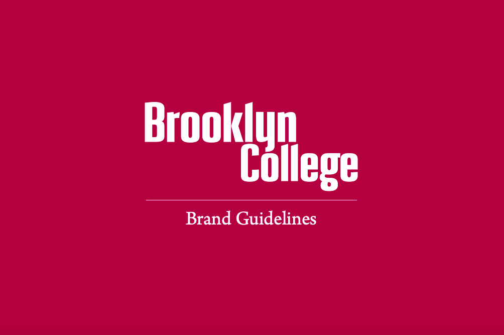
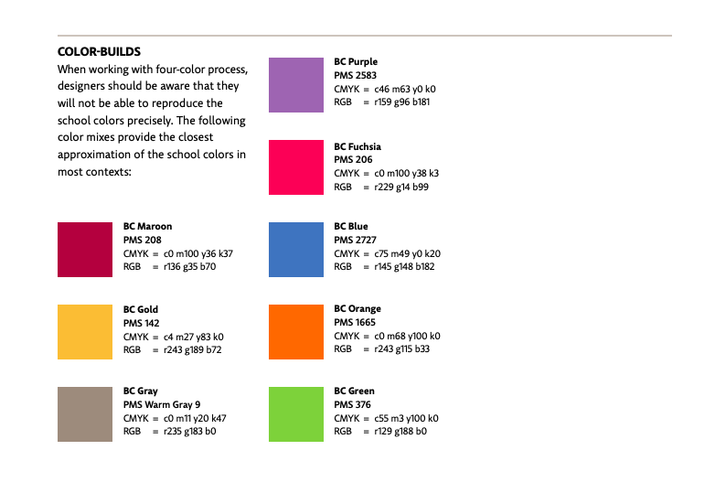
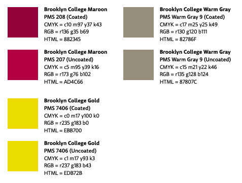
Me with my partner YanLin, we started recreating the little figures and icons in the handbook from pages 2, 10, 17, 18, 20, 24-26. The tables and charts will be something we work on next time. All of the work required to be Brooklyn College colors with dark red “Maroon“, and Brooklyn College actually has a guideline of what their Brand publications entail, including the official RGB and CMYK codes of their official colors. This can easily be found online, and our teammate Angelica also emailed us about this guideline which is great. https://www.brooklyn.cuny.edu/web/off_communications/Brand_Guidelines.pdf So me and YanLin, we started working on developing all of the other figures in the handbook including charts, graphs, questionnaires which are anything that isn’t in paragraph form.
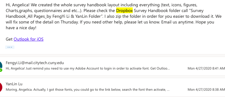
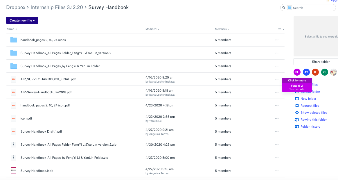
Later, we got the email from Angelica with an issue for the Brooklyn College font and they are not free online. In addition, my partner YanLin replied to this email and sent her a link https://fonts.adobe.com/fonts?purpose=desktop&referrer=dd01e5bd12 to search the font to activate by using my Adobe Account to login in. Later, me and my partner both created more than Isana let us to do, we created the whole survey handbook including the layout, text, icons, figures, charts, graphs, questionnaires etc. We uploaded the file including the zip file to dropbox which everyone can see and edit and we also email Angelica in order to let her know. Finally, we completed our first draft of the handbook, and I learned a lot from this project about how teamwork became a power and work together, so we should all help each other in order to come up with the best solution and design.

For this semester, we didn’t get a chance to go to an exhibit with the field trip. But we still got the opportunity to visit the exhibit online which is also cool. Today, I visited so many great works from the “Nassau County Museum of Art” on their website during the exhibit. This Museum has a very long history and the original year can be traced back to 1974. In addition, the Nassau County Museum of Art is dedicated to fostering a deeper understanding of art and culture through exhibition and education programs for people of all ages and backgrounds. In practice, the Museum pursues the mission by enhancing its permanent collections, sculpture park, historic property and natural setting. Additionally, I picked three different works that caught my eye the most in the exhibit.

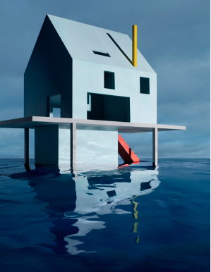
The first piece from the Nassau Museum of Art’s Virtual Exhibit “Blue” that caught my eye the most because it is a fantasy about the future was James Casebere’s architectural building called “Blue House on Water by”. Even though this is a building is not beautifully appointed, it might not have everything people’s need and is not decorated very well, but the structures of the building are pared down to the simplest forms and shapes with the geometric forms of these architectural constructions transforming into organic curves in the rippling water of the flooded structure. In addition, this photo shoot of the building is also very interesting which uses a two-point perspective, a system that creates the illusion of 3-dimension space on a flat surface and edges that go back in space are diagonal. In addition, there is one horizon line in this image and there are two vanishing points on the horizon line where our eyes level go. So all lines that are parallel that go in space go to the same vanishing point which is the point where all parallel lines that go back to space meet, and objects get smaller as they go back in space. Also the reflection of the building under the water creates vitality, it’s very peaceful and comfortable. In addition, the blue of the building works very well with the natural blue, everything is so bright and clean, and relaxed.
The second piece from the Nassau Museum of Art’s Virtual Exhibit “Blue” that caught my eye the most because it is a singular painting was Christopher Winter’s painting “The Huxley Guide to Switzerland”. This is art and magic emerged simultaneously, it is lifelike for peoples just standing on the top. Experiencing the uncanny, I find myself at once attracted with the illusion. In addition, the transition of different kinds of blue work very well together, it is attractive and vibrant in color. The reflection of the mountain under the water purifies my soul, and the two standing persons lets me believe they are the same person, just from different aspects of sexual fantasy. It is incredible, and sheer imagination produces fantastical.
I looked the artist up and found other pieces of his artworks from “MutualArt”, and many figurative paintings striking the similarity of vision, they contained the same energy and were very attractive.
The third piece from the Nassau Museum of Art’s Virtual Exhibit “Blue” that caught my eye the most because it is a singular painting was David Hockney’s illustration “The Blue Guitar” which had been inspired by Pablo Picasso’s painting “Man with the Blue Guitar”. This uses a set of colored etchings and combines with music, poetry and printmaking in a series that explores the space between reality and imagination. I can see the transformations with art, the relation between reality and the imagination. In addition, the man holding the guitar provide me a feeling of a fallen angel, and it might be associated with tranquility and calmness for the blue.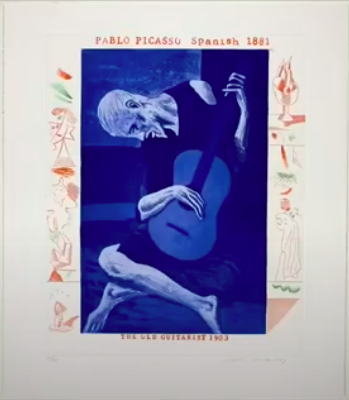
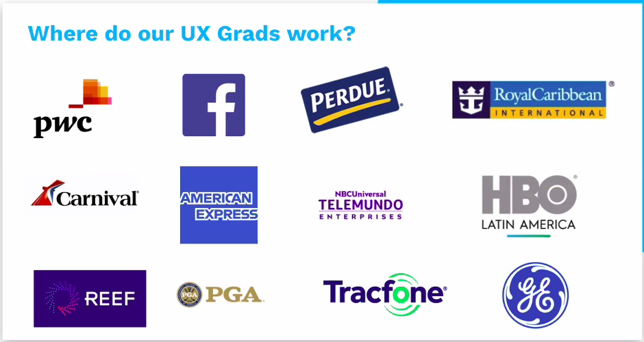
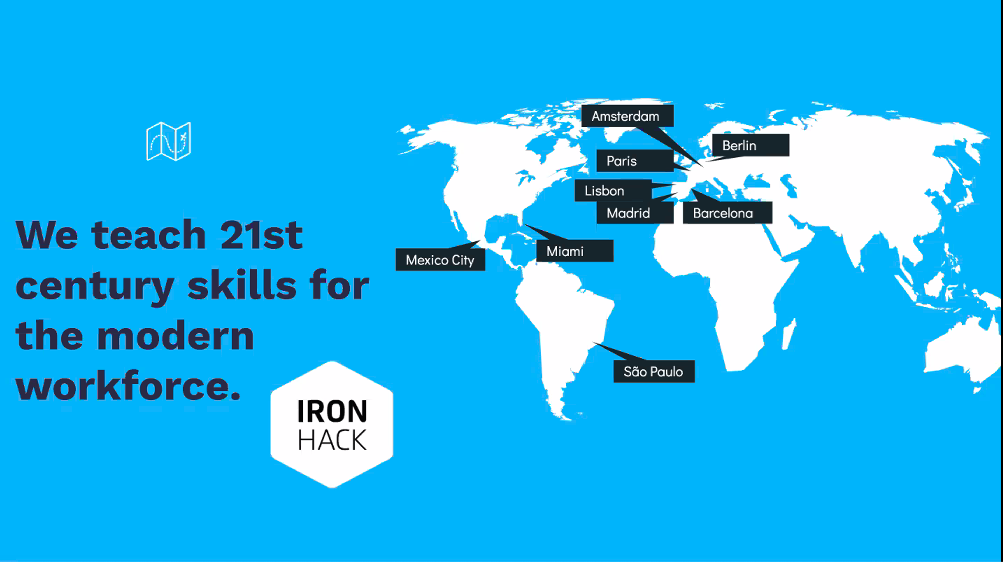
I registered a great webinar “Intro to User Experience” on eventbrite, and it was organized by Ironhack Miami from Ironhack. Ironhack is the number 2 ranked coding, UX/UI design and Data Analytics school in the world, and they provide intensive boot camp programs for the students. In addition, they already graduated more than 5000 students in Miami, Madrid, Paris, Mexico City, Barcelona, Amsterdam, Lisbon, São Paulo, and Berlin. Also, their UX grads work at different companies such as Facebook, RoyalCaribbean, American Express, HBO and etc.
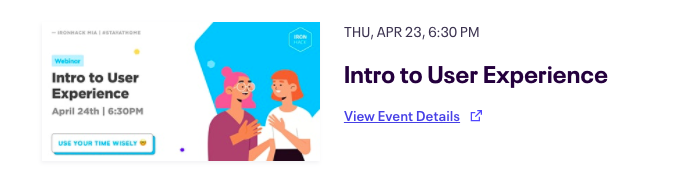
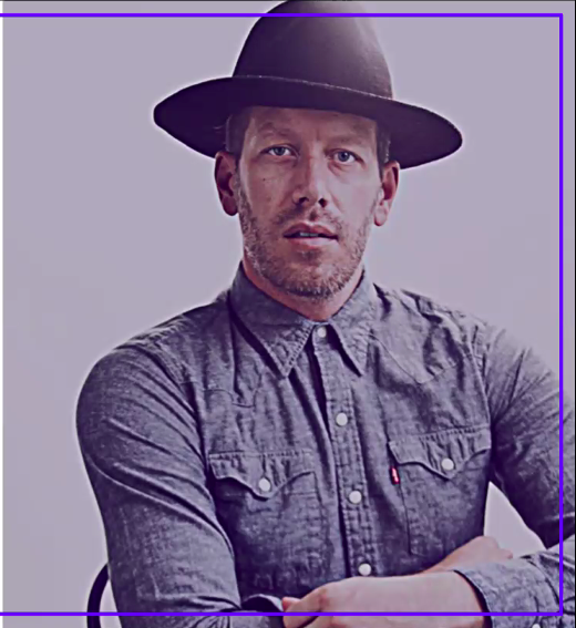
We started this webinar through zoom at 6:30 PM, I think this was a great opportunity to meet each other from different places throughout the USA and it was a pretty cool experience that we all had different backgrounds, but were interested in the same thing. Additionally, David Fast was the UX instructor for this webinar, and he is a UX/UI instructor at Ironhack in Miami who was focusing on human-centered design and user experience. In addition, he had over 12 years of professional experience leading design for global brands and startups in the US, Latin America, and Europe.

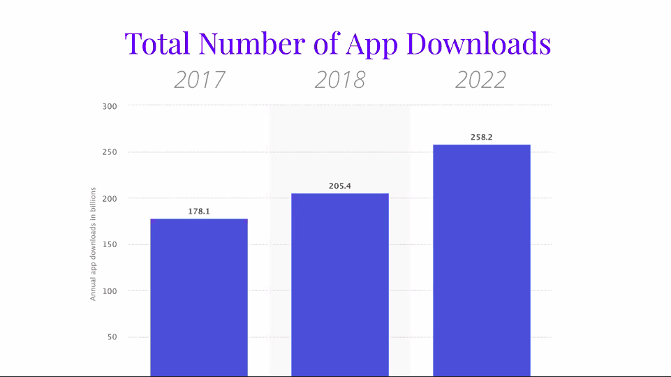
In addition, David Fast introduced the user experience into three parts: Why UX?, What is UX?, and UX Artifacts. UX provided a great opportunity in the future and we can see through the data for the total number of app downloads. The annual app downloads was 128.1 billions in 2017, it growed to 205.4 billions in 2018, and it will grow up to 258.2 billions in 2022. Also, the data of the total number of apps in Jan 2017 in Apple’s iOS app store was up to 2.2 Million. Additionally, the average number of apps used daily for each person was 9, and monthly was 30. So from different data of growth, I really saw there was a great chance increase in the UX business, how important the UX design in the industry right now. Through my experience, I knew many of our design students turned to UX/UI design in our Department of Communication Design.

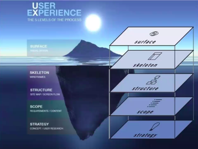
In addition, UX design is concerned with all aspects of the overall experience delivered to users including the user research, information architecture (IA), interaction Design (IxD), visual Design (UI), web development, and other disciplines. In addition, there were five plane models which are strategy, scope, structure, skeleton, and surface. First the strategy is where it all begins. For example: What do we want to get out of the site? What do our users want? Second, scope transforms strategy into requirements such as what features will the site need to include? Third, structure gives shape to scope, how will the pieces of the site fit together and behave? Fourth, skeleton makes structure concrete, what components will enable people to use the site? Lastly, the surface brings everything together visually, what will the finished product look like? For the user experience, there were five levels of the process including surface visual, skeleton wireframes, structure site map / screen flow, scope requirements / content, and strategy concept / user research.
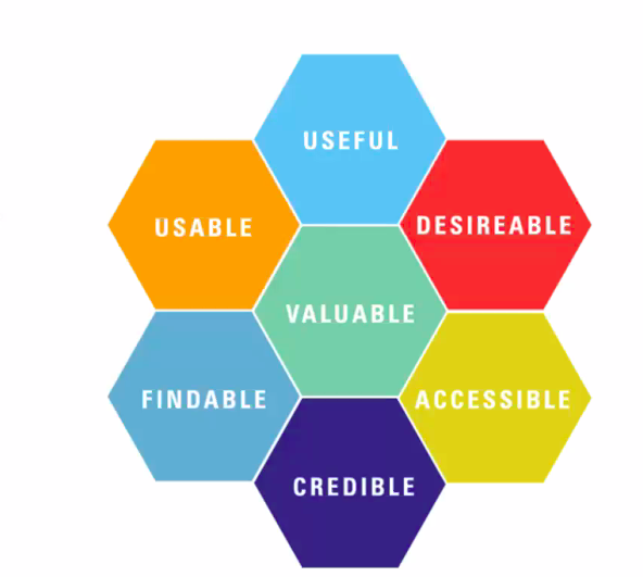
Also, UX is the way our experience the product, the service, the entire system, within the context of our life. So as a UX designer we should be business and development-minded, white their approaches should be user-centric. Additionally, we can use some of the professional words to explain the user experience to clients such as usable, useful, accessible, credible, findable, desirable, valuable, etc.
Finally, I learned a lot from this webinar about the user experience and how important it was and the future of UX design. Right now, there are many careers such as architecture, human factors and ergonomics, electrical engineering, sociology, cognitive science, and etc. They all need the UX/UI designer in order to provide a better user experience for their clients and users. So this webinar was a great experience for me to learn the process behind this UX design and how steps by steps to build up the final product from strategy to surface. It brings me the knowledge to another design perspective.
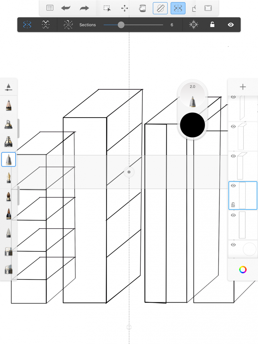
Autodesk SketchBook is an excellent painting and drawing app at its basic level, with in-app purchases of tools expanding it for pros. In addition, it is free and it has so many tools and features, and preset colors are really handy. It’s also very easy to use an edit, and when I have a great idea come up, I can quick conceptual sketches and then to fully finished artwork. So this is a great feature to further help with my drawing.
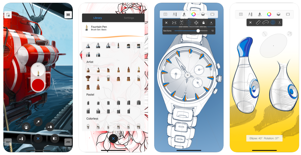
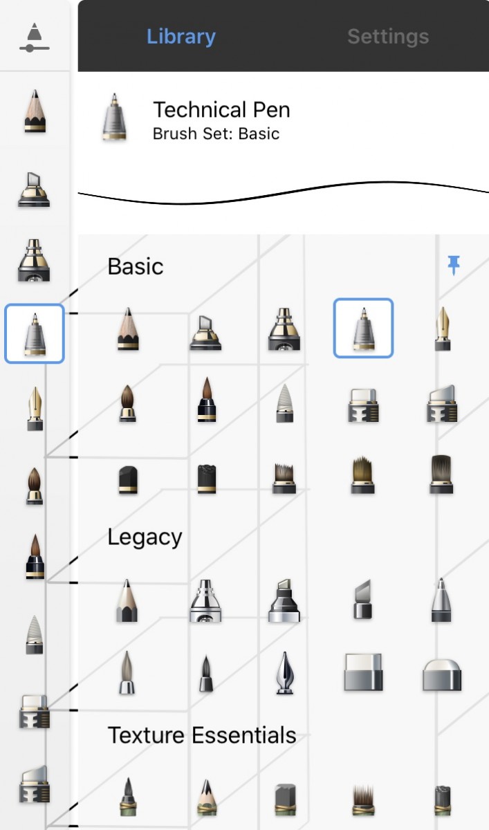
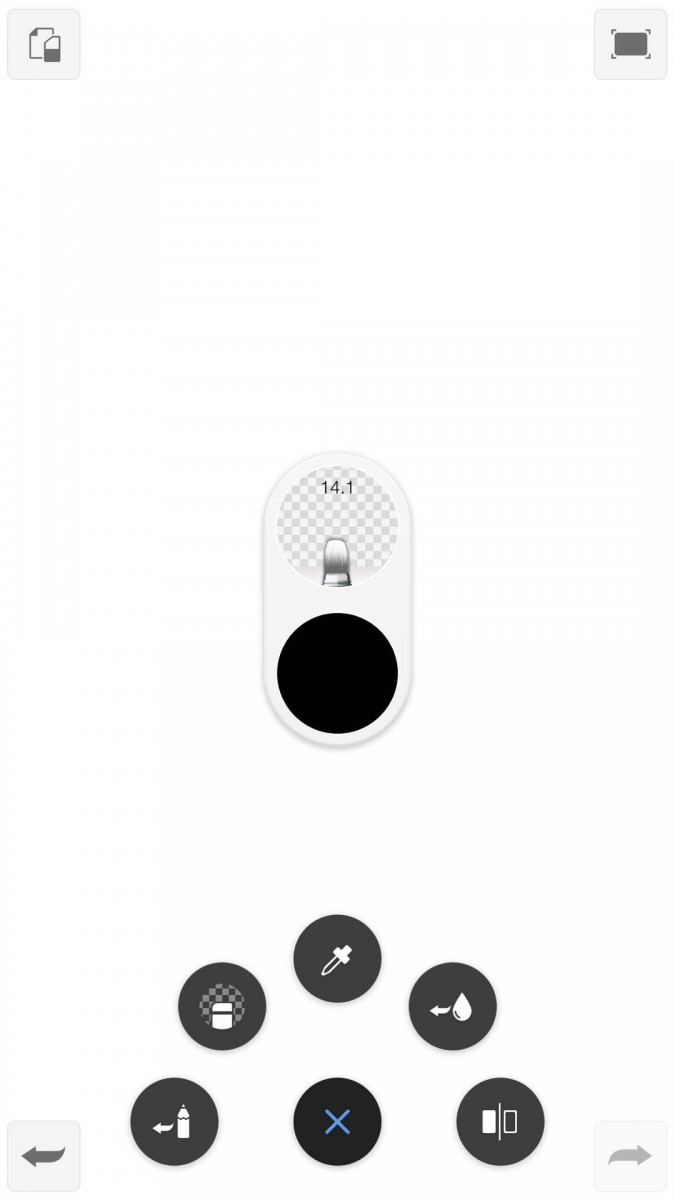
Additionally, there is the drawing toolbar that we can toggle it up and down and it also has a display of pencils, pens, erasers and brushes. On the top right corner of the toll bar is a grey scale for us to adjust the thickness of the stroke by toggling up and down. Also, there is another grey scale that adjusts the stroke for opacity which toggle down for lower opacity and up for higher opacity. In addition, this app provides many advanced tools such as different style brush heads including basic, legacy, texture essentials, copy, synthetic paint, traditional, fine art, half tone, texture, shape, splatter, glow, smudge, designer, artist, pastel, and colorless. So we can even paint textiles and textures which is really cool.
![]()
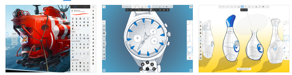
There is a toolbar at the top also, and we have an undo button, a redo button, crop tool, transformation button that allows us to change our cropped images, shape, or size anytime, paint function, rule function allows us to have a circular or straight ruler to drawing, so it is very easy to draw a perfect shape or straight line, reflector button allows us to reflect our joint vertically, horizontally, diagonally or in multiple sections, so it’s will be very easy to do the kaleidoscope effects with this reflector button, predictive stroke function can easy to smoothing out the lines that we draw. In addition, we can add pictures from a photo album, and add text from the type tool by typing in the text box, it also provides different font options for us.
![]()
![]()
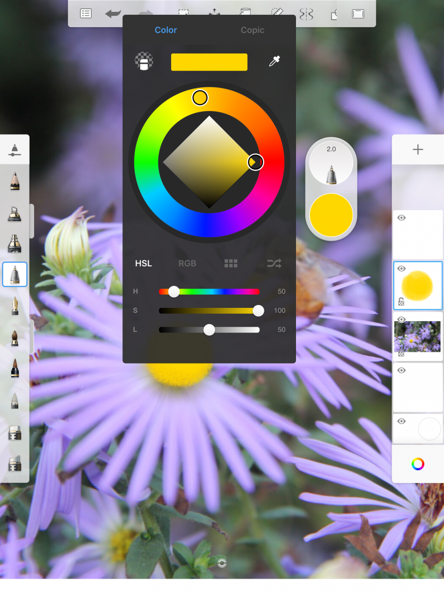
Also, there is a color palette that allows us to choose different colors from the circular ring or from the H horizontal line, the different tones in grey scale on the diamond area or the S&L lines. In addition, there is the color picker on the top right.
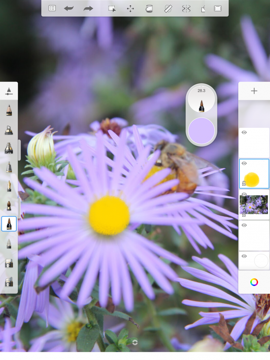
From the right column, there are some white squares which each square represent a layer, so we can draw on a different layer, so just like photoshop it can add, copy, paste, cut, duplicate, lock and clear the layer. Finally, it’s very easy to control and use.
![]()
![]()
In addition, I download both of the ipad version and iphone version, and they do view a little bit different. Compared to both versions, I will use the iphone version when I come up with an idea and I want to sketch my idea and concept down very quickly, and I will use the iPad version when I have more time for my drawing because its screen is larger and bigger, so it will be easier for me to control the drawing in more details.

Overall, this is a pretty cool app that allows me to draw, paint and sketch anywhere I want, and I don’t need to worry if I bring my sketchbook and pen or not. It really saves my time for any idea that I come up with. Finally, I would definitely recommend this app to anyone because it allows everyone to expressive their drawing and concept sketching.

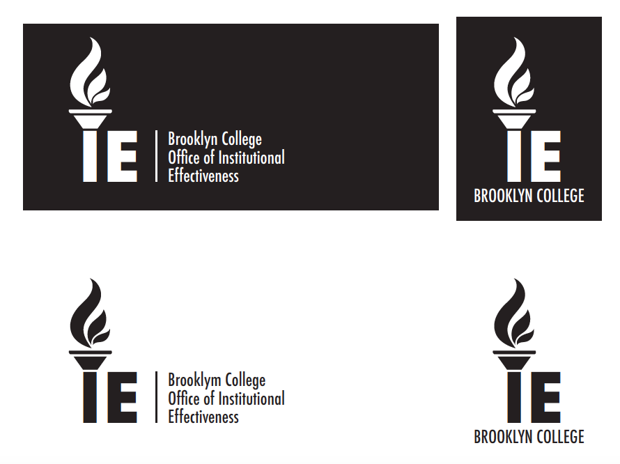
For this week, we got some feedback from different versions of the IRDA, IE, and ERA logos from the past few weeks. In addition, they did love the torch style for my IE logo and they would like to see this torch logo with different fonts and we needed to provide them unless 5 options. I also needed to make a version of this logo where the flames are in shades of gold by using “Brooklyn College Gold”.
![]()
![]()
![]()
![]()
![]()
![]()
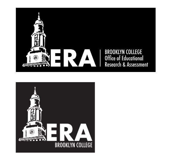
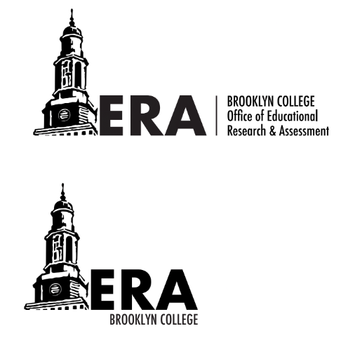
For the ERA logo, they did like these two versions from me. Additionally, they wanted me to remove the tree and move the tower into the spot where the tree was. For the second ERA one with the red letters and a white background, they wanted me to provide a short version.

![]()
![]()
![]()
![]()
For all of the logos, first we needed to provide a black and white version which the black letters with a white background and the white letters with a black background. Second, we need to make Brooklyn College with the lowercase letters above the office’s name “Office of…” on the long logo version; BROOKLYN COLLEGE all uppercase letters below the letters on the short version. Third, we needed to provide the same font and they liked the font being used above for ERA and IRDA logos. Lastly, we needed to make sure the color red matched the Brooklyn College red.
In addition, we needed to make sure the yellow color should only be in the color version, not in the black and white versions for all the logos.
For the second assignment of this week, we needed to use the attached document that our supervisor Isana sent for us in order to create a format for a Microsoft Word document. Finally, we need to format the spacing, font, columns, a place holder for a picture, a place holder for a quote, a new cover, etc. with the Brooklyn College colors nicely. Additionally, there are two reports and we need to make two versions following the structure of the two reports. We also needed to delete the written content and the pictures, but we needed to make sure that there are place holders for the photos and the quotes.

This week, we only worked for one day because we got spring break for one day off on Thursday. On Monday, we started to work around 10AM because our supervisor Isana had a busy morning by preparing the video meeting through Google Meet at 2 pm. So we received the instruction a little late, but everything is fine. Today, we needed to make some changes and provideI more options for the IRDA logo and ERA logo. In addition, we need to make sure that the words “Brooklyn College” with the lower case in the long logo, but upper case in the short one for all the ERA, IE and IRDA logos. Additionally, we needed to make “Brooklyn College” to be the same color as the office’s name, “Office of Institutional…” which all the letters should be white. Last time, I provided a lot of different font options for the IE logo, so my supervisor Isana also wanted to see different font options for the ERA and IRDA logos also in order to match with the IE options. Finally, we needed to complete this assignment and uploaded them to the dropbox folder before 1:30, so Isana can upload it for view by the rest of the team during our 2 pm video call meeting.
![]()
![]()
![]()
![]()
![]()
![]()
![]()
![]()
![]()
![]()
![]()
![]()
![]()
![]()
![]()
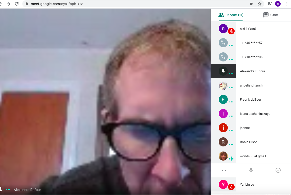
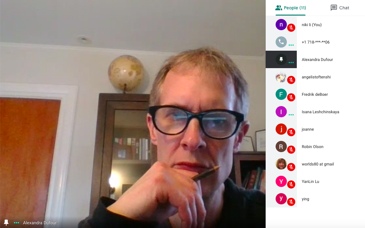
In addition, Isana did send us a link before the meeting and we also received a calendar invite from this weekend. So, we started the meeting online from 2 PM through 3 PM, and there were totally 13 people in the meeting including me and we all in the same department. Even though some people were the first time to meet such as Angelica Torres, Ying Zhu, etc; but they were all very nice and I think we had a very good conversation in this meeting. But there were also some difficulties from others with not having an internet or desktop at home, so they were using a phone call to join the meeting. But I think we all did a good job for the first time online meeting and everyone tried their own way to work, which is great.
Today I will be talking about an event I went to in New York, it was called “i3 Photo Lecture: Griselda San Martín”, and it was presented by MPS Digital Photography which images, ideas, inspiration lecture series features leading photographers and artists, hardware and software developers and industry experts.
Griselda San Martín is a Spanish documentary photographer who lives in New York City right now. In addition, throughout San Martín’s past six years, she has documented the U.S.–Mexico border, focusing on the issues of immigration, deportation, inequality and human rights abuses through an optic of identity and belonging. Also, you can see her photography and video projects have been exhibited internationally and featured in The Washington Post, The New York Times, The New Republic and The California Sunday Magazine among many others.
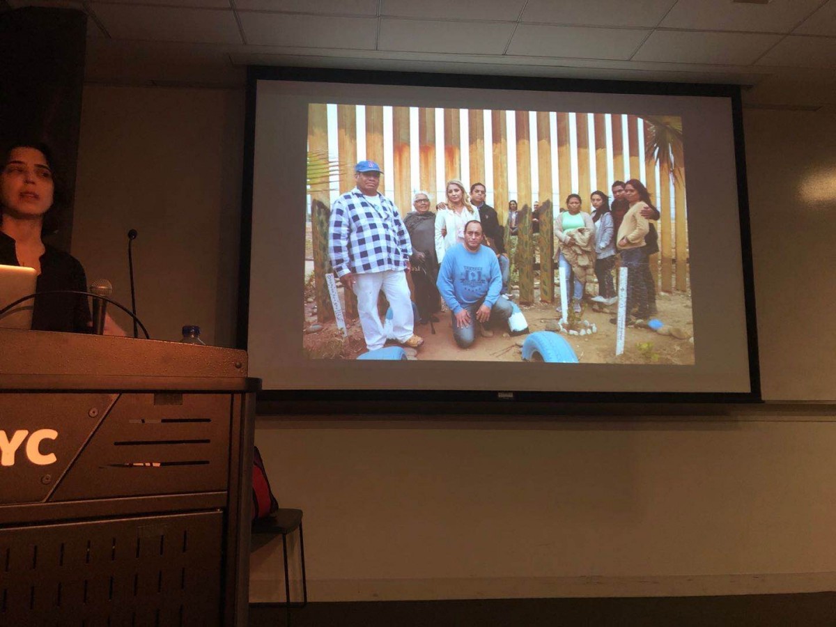
In this i3 photo lecture event, she talked a little bit about herself, the immigrants between the US and Mexico’s border, transnationalism, and collaborations. From this event, I learned the other side of the border wall for those Mexico immigrants between them and their older family which the young generation immigrants came from their country Mexico to the US who tired to live in freedom, to practice their religion freely, to escape poverty or oppression, and to make better lives, education, better job opportunities, etc for themselves and their children as well. But on the other hand, they have just separated from their old generation, and most of the Mexico grandmother and grandfather doesn’t even have the chance to meet with their sons, daughters and grandchildren. The only way is from the border wall between Mexico and the US, and some of the family only can meet a few times a year, some of the family haven’t met 20 to 30 years which they all miss their family members too much and the only way they can do is pray each other to be healthy and safe, so this was cost and issues for those immigration. In this event, Griselda San Martín not only showed us her photography, she also showed us a video that very inspired us, and what I learned from her is sometimes it doesn’t what language you are, what’s matter is the message you want to give and the stories you want to share. Also try to give different feedback from others because they might shape you for your next project, and don’t be afraid to try things you never do before because you never know what is the result you will get in the future.

The OpenLab is an open-source, digital platform designed to support teaching and learning at City Tech (New York City College of Technology), and to promote student and faculty engagement in the intellectual and social life of the college community.

