My first week at the IE Office at Brooklyn College had finally arrived. I walked in and instantly felt welcomed. In addition, when there were some other professors or officers from Brooklyn College who came to our IE office, Isana Leshchinskaya who is our supervisor introduced me and my partner YanLin who is also an intern and my classmate in my internship class as well to them. The first day of the IE Office, Isana Leshchinskaya tried to fill out the “Internship Agreement Form”, “Internship Hours Timesheet”, and “Supervisor Evaluation Form” for us.
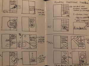
After that she finished all the form, she assigned me and YanLin for two books’s cover, one was the “Academic Assessment Handbook” cover related to register office, student office, school library, etc; and another one was the ”AES Academic Assessment Handbook” cover that related to 76 offices for Brooklyn College, such as learning center links to the budget events, etc. We needed to design six versions for each one which total was twelve versions of these two handbook covers. The requirement of the size was 8.5”x11” with front and back, and the fonts should be easy to read. The biggest challenge for this project was the color limit which they wanted both handbook covers to use Brooklyn College logo’s red “maroon”. The other limitation would be only using graphic design with shapes to design these two covers, no icon, illustration work, or any complicated design which both covers should be as simple as possible. So I and my partner YanLin both decided to draw different thumbnails on our sketchbook. Then we put them into InDesign work and the result of the design that I came up with was not what I expected it to be, which I need more improvement and come up with more ideas to make everything work.
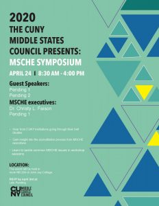
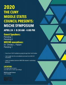
For the second day of the internship, I think we will continue to do the handbook covers, but I came up with a new project which is a poster for “2012 The Cuny Middle States Council Presents: Msche Symposium.” Isana didn’t know the size of this poster which I put the pdf that she gave to us and then put it into photoshop in order to check its size. Finally, we came up with 8.5”x11”. For this project, Isana provided us with some pdf of different colors for the same version for 2019, even though this poster also worked with graphics and shape, but it doesn’t have that many limitations for the colors compared to the first one. For this time, we directly skipped the step of the thumbnails because of Isana’s meeting, we needed to leave two hours and a half earlier than before. So we don’t have too much time to do every step in order to provide her with six versions for the same poster. In the end, she only picked three for each person. But I will say even though the time is very limited, we still do some great jobs.
Finally, my typical day began at 9AM through 3:30PM. I came in, I was working alongside YanLin throughout the whole process. After we finished, we would show it to Isana for critiques. If she felt our designs needed to be changed, we would edit the indesign files, then she picked the best versions in the end from what we did.
From this week’s internship, I learned we were always facing different challenges as a designer, but this is a point how we are here to help others to solve their problems in life. In addition, sometimes the result we come up with might not be what we expected it to be, but we should not be afraid of failure. Design is always learning from experience, and coming up totally different things in order to go to the next level. Finally, we are always growing, and learning by doing because we are not the only ones to do so.


