REVISED VERSION
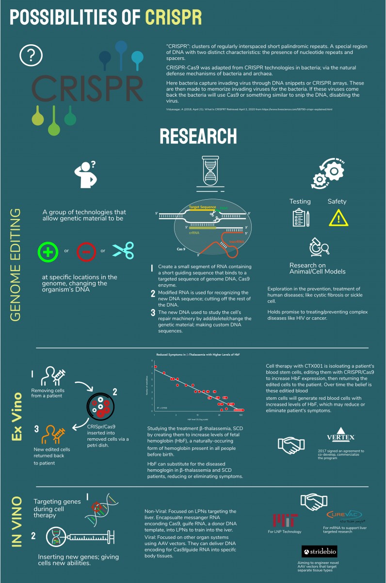
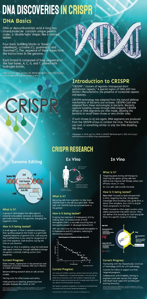
DNA is the core of what makes up who we are. Sometimes things happen where cells do not act the way we would like them to causing some genes to malfunction. A new discovery called CRISPR has allowed scientists to research ways to reduce the effects of genetic diseases; even finding a cure. However, with these new methods, there are chances of risk with trial and error.
 Rebecca_Nghi_DNA_Editing_Poster_v2
DNA is the core of what makes up who we are. Sometimes things happen where cells do not act the way we would like them to causing some genes to malfunction. There are new studies in DNA that allow for us to research ways we can minimize these conditions, even possibly leading to finding a cure. However, with these new methods, there are chances of risk with trial and error.


This poster looks really interesting! I like your choice of color and font. I also like the consistency with the sub titles and layout. My eyes know exactly where to go and that’s nice. There is a lot of copy – so much copy that at first I felt overwhelmed. After reading through it I understood what CRISPR is (at least, as much as I can understand it, you see science was never my best friend in school). I think something that can really help is focus on an aspect of CRISPR. This might allow you to reduce the copy. But I do see the importance of each aspect. Therefore, I would say if you can somehow make the charts easier to digest and emphasize the visualization of information (if that makes any sense) then this could be a really solid infographic.
Hey Rebecca,
I think that the overall design is great! The san-serif font works, and the contrasting colors are interesting. However, you can try to summarise some of the content, it is very elaborative for one poster. “DNA Basics” and “Introduction to CRISPR” can be both capitalised or first letter of each word capitalised. You did it in “DNA Basics” so there should be cohesiveness throughout. The second part of the poster “CRISPR RESEARCH”, was really hard to read and the pictures are too small. I believe you can find a better way to represent the data. Keep up the good work, I can’t wait to see your next draft.
Also!!!!!
Third paragraph of “Introduction to CRISPR”, where it says “If such viruses…” you are missing a character there
Also!!!!!
Third paragraph of “Introduction to CRISPR”, where it says “If such viruses…” you are missing a character there
Nice work Rebecca. I like the direction you are moving in and well done with your thorough research.
Excellent comments from Or and Hoa.
I love that your poster is so information rich. I think you might want to redistribute the space a little – you are very generous with the size of the DNA image and the headers at the top and then towards the bottom things feel a little squeezed. The header CRISPR twice also feels redundant. I also think Or’s comment about finding better ways to represent your data is spot on. I think it would be best to recreate your own in a style consistent with the rest of your poster. Looking forward to discussing tomorrow.
Hi Rebecca,
I like the overall design and concept of your project. The color scheme works well and is consistent throughout the poster. You provided a lot of information which is great, but i think you should shorten it and add more pictures and icons which will draw in the reader more.
Hi Rebecca,
This poster is well organized as it explains each detail what your topic is saying; also when you included a story for each topic you stated to go more in depth in what you were saying which gives the reader more information to understand. Also how the title is big enough to state what your topic is about and sub title which helps me understand what to look for when reading this.
I forgot to add maybe if you can to make the writing below a little bigger to read or making sure the questions for each topic your discussing to align or close to being aligned together but that’s just a little add
Hi Rebecca,
It’s coming along. I made comments on your PDF in the Google docs folder:
https://drive.google.com/drive/u/1/folders/1LZJziyeA5WpvIwg_lJ3qNcvbmtBsDiIL
I think you need to think about your audience a little. I think it might be more successful if you stick with an overview of what CRISPR is. Your poster does not seem like the right forum to get into the heavy science of it. I think it would be more successful if you provide an intro/overview blurb for each of your sections. Your diagrams and charts are too hard to read and not well explained – it is unclear why you are showing them. See my comments.
I also think you should increase your margins a little and give each section a clear header.
This example might be helpful for you to look at in terms of headers, margins and the general use of a grid to organize your space.
https://www.informationisbeautifulawards.com/showcase/3986-bat-benefits-infographic
Let me know if you have questions.