The OpenLab at City Tech:A place to learn, work, and share
The OpenLab is an open-source, digital platform designed to support teaching and learning at City Tech (New York City College of Technology), and to promote student and faculty engagement in the intellectual and social life of the college community.


top
Hello Li Yan,
I’m basing my feedback on what you placed in the Goolge Drive for the final comps.
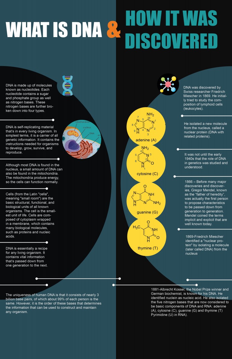
The subject of your two info graphs were clear: What is DNA? & What is the structure of DNA?
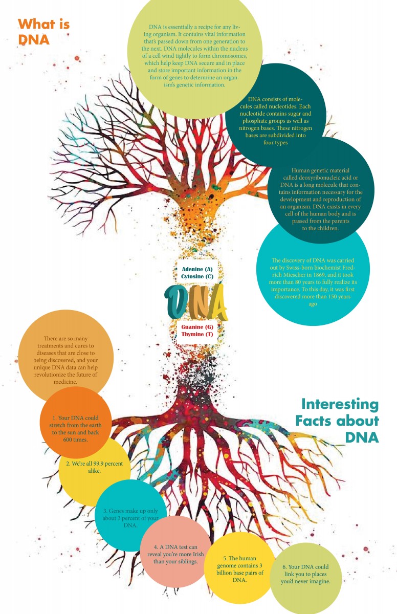
The focal point of your “What is DNA & How it was discovered” seems to be the 4 yellow circles representing the ACGT molecules and the diagram of a cell. You really utilized the gestalt principles, for this info graph I see you used the principle of similarity to group the 5 yellow circles together toward the center as the focal point. In the “DNA structure & function” info graph, the focal point is the black & blue circle in the center.
I really like the hierarchy in that info graph because you utilized the gestalt principle of connection. You eyes drift to the title and easily follow the lines down the info graph to the additional pieces of information grouped in a box at the bottom. It was easy to follow without any numbers or additional titles to indicate which goes first.
For the “How was DNA discovered?” info graph, I’d recommend having the exact date for each piece of factual information as a sort of header/title. It functions as a a timeline but it takes a minute to figure out what each block of text is discussing. Having it flow by date makes it easier for the reader . For the side about “What is DNA?” try having the first block of text larger than the rest, as a header/title.
The colors of the info graph work well and I love the addition of the swirling lines shown in the background of the “Dna structure & function” info graph.
Hi Yan,
Overall really great color palette; very soft, pleasing to the eye, and choice of graphics. Really like how the use of lines guides the reader’s eye to where you want it to go.
A Few things I’m picking up:
1. Your spacing across the board is looking uneven, especially when you are using lines to break up the sections of each time period copy.
2. You have a widow in your copy; the word ‘understood’ in your 1940 section.
3. Is there a way you can break the blocks of text to be more pictoral?
Also forgot to say my feedback was for your second revision not the first.
Hi Li,
Nice work. You are close!
For now my comments are for: ‘Final Comp1 Revised’
Here are my thoughts:
1. I would give a slight opacity to the dark green left bg circle. I think the red and the green are fighting a little with each other, and that should help to resolve.
2. On number 5 the red header should move down to be consistent with all other headers. It looks like it got nudged up by accident.
3. Watch your ‘widows.’ You have several paragraphs with them.
4. I think your icons feel a little large and floating. It’s not clear which blurb of text they belong to. I would either try to nudge them closer, or keep them very centered between paragraphs.
5. Could you add a header to the very bottom section for A,B and C?
Otherwise beautiful job. I think the overall flow of your design is very successful!