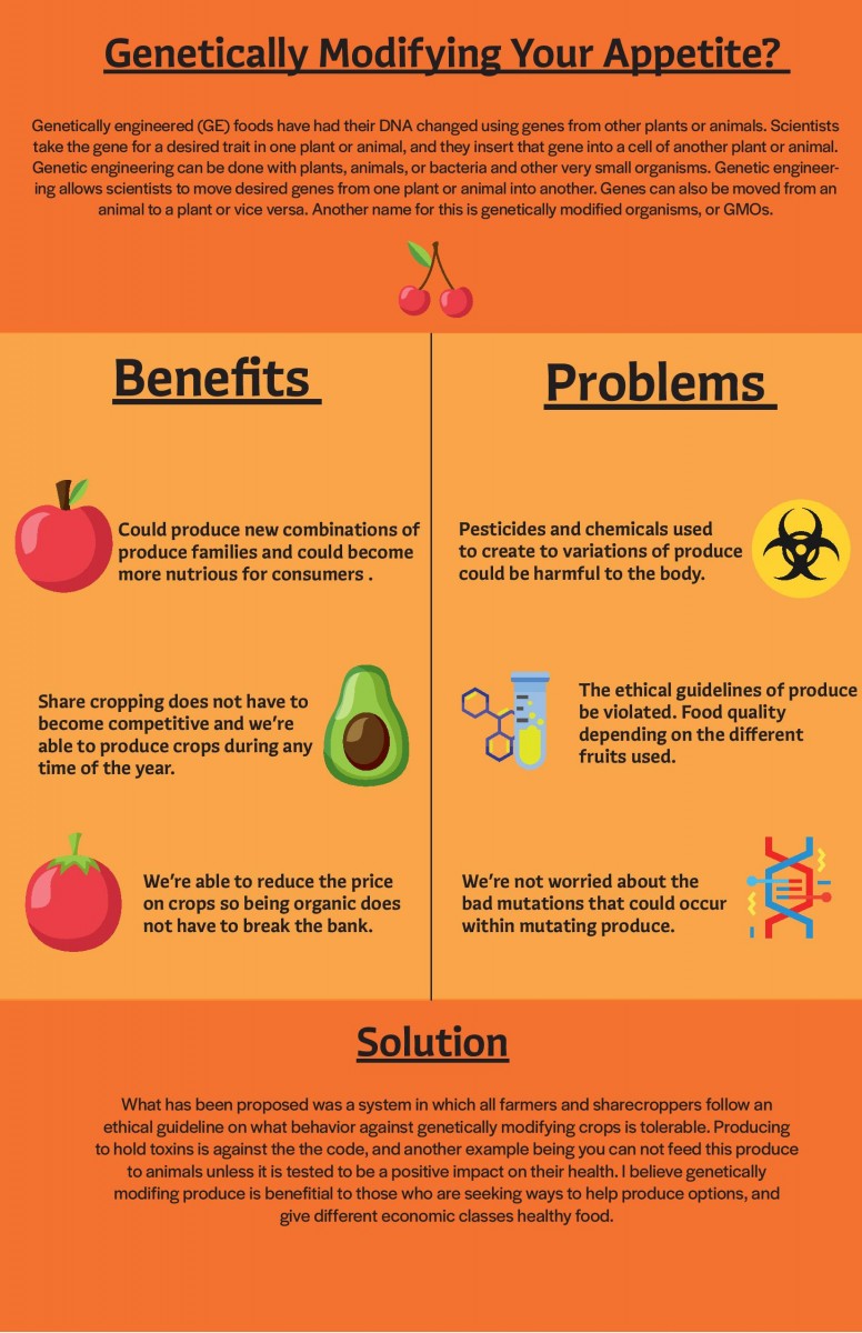
While I was developing this info graphic I wanted to bring up the discussion on whether or not genetically modifying food could be seen as a bad idea. Also I wanted to discuss the benefit of modification as well.
Exploring the theory and practice of designing with information
While I was developing this info graphic I wanted to bring up the discussion on whether or not genetically modifying food could be seen as a bad idea. Also I wanted to discuss the benefit of modification as well.
The OpenLab is an open-source, digital platform designed to support teaching and learning at City Tech (New York City College of Technology), and to promote student and faculty engagement in the intellectual and social life of the college community.


Hey Elijah,
I’m basing my feedback on what you placed on the final comps on the google drive.
Your topic is very clear: What are the benefits and potential issues with GMOs? And you propose potential solutions to that as well.
I think you could have included more statistical date. You mention being able to reduce the prices of foods. I am curious to exactly how much we would save if we switched to GMOs?
Also for share cropping, why not visualize what share cropping is? Some readers may not be aware of sharecropping. I also think an additional visual should be added to the solutions section.
The focal point is clear, your eye follows the title to the strategically placed cherry that splits into the two sides of the GMO argument. The visuals alternate with fruits on one side and symbolic scientific representations on the other. I suggest trying to add a headline/title to each block of type. So for example: the problem’s section could have PESTICIDES as the title and the text “pesticides & chemicals used to create variations of produce could be harmful to the body” underneath that.
As for grammar there seems to be have been a slight mistake in the type next to the DNA strand. It says “we’re not worried about the bad mutations that could occur”.
I like the font and orange color scheme you chose for this info graph!
Hi Elijah,
Based on what I saw in the google drive
Your topic is straight to the point. I think the header can be bigger so it’s different from others. Also, you can list your text #1, #2, #3 so people can follow along while reading it. The second column text seems a little unbalanced.
Hi Elijah,
Based on what I saw in the google drive
Your topic is straight to the point. I think the header can be bigger so it’s different from others. Also, you can list your text #1, #2, #3 so people can follow along while reading it. The second column text seems a little unbalanced.
Hi Elijah,
Based on what I saw in the google drive
Your topic is straight to the point. I think the header can be bigger so it’s different from others. Also, you can list your text #1, #2, #3 so people can follow along while reading it. The second column text seems a little unbalanced.
Hi Elijah,
The background colors do work well together and adding icons to indicate what you are talking about but I feel you should add a graph of some sort showing the research you want to display so the reader can understand the change or history overtime of the foods.
Elijah – It’s coming along nicely.
Some very good comments above. I think Kimberlee makes some excellent suggestions and agree.
I would add:
1. Get rid of the forced underline for all headers. If you want to create an underline of sort create that separately so that you can specify appropriate weight, color, length and placement.
2. Could the color of your type be a darker shade of the orange and/or yellow? You decide, but I think it would make the overall piece feel more cohesive than the current black type.
3. I think your cherry image is too centered – it might look better off to the side -? I think the red also gets a little lost on the orange bg color.
4. I also think for the headers “Benefits and Problems” you should specify more clearly of what…
5. Your text blurbs feel a little large and get too close to the margins on both sides, the space top to bottom also feels too empty. I think you should make they type a little smaller and the width of each blurb a little more narrow.
6. Your paragraphs need editing. There are a number of typos. Feel free to copy and paste them to me in an email and I will edit them.
7. Make sure your colors bleed off the page. I see a slither of white at the bottom.
8. Kimberlee’s suggestion of trying to add a headline/title to each block of type is a good one. I think that will help the flow and make things more clear.
8. And I also agree some sort of stat you can find related to GMO’s and food production would give you another visual to play with to help get attention, direct the eye and more effectively tell the story.