The OpenLab at City Tech:A place to learn, work, and share
The OpenLab is an open-source, digital platform designed to support teaching and learning at City Tech (New York City College of Technology), and to promote student and faculty engagement in the intellectual and social life of the college community.


top
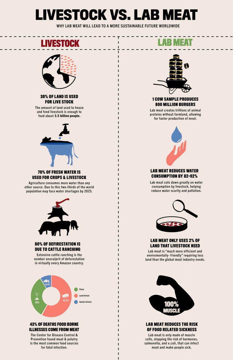
Really cool info graphic, it is very informative and your illustrations really pull the whole design together. I like the contrast between the bold and thin type. I think you could maybe try to reduce the boldness just a little bit since it makes the text a little hard to read.
I think your info-graphic is coming along beautifully!
The graphics combined with the story you are telling are excellent. I also think your type is much stronger than in the previous version. I was telling the class I regret asking everyone to upload JPEGs rather than PDFs. For the final draft due next Weds, I’ve asked everyone to go into your post for this week and add the updated and finalized PDF. If you could would you also add your PDF of this version to the google drive folder Week7? That way I can more easily read your content and see your type.
https://openlab.citytech.cuny.edu/comd3601-informationdesignoer/2020/03/24/week-07/
Is your poster 11×17”? It looks much longer. Should be fine if it is, the main question would be can a printer print it without having to trim?
Here are a few additional thoughts:
1. I think you should include a header of sorts for each section, the headers could go at the bottom of each image, by the dotted line.
i.e. Agricultural Land Use, Water, Deforestation, Food Poisoning
2. I love your splashes of color. Could you add a little more. For example if you use orange on one side can you apply it to the other? i.e maybe there is a thin line of orange for cheeseburgers rather than burgers. And the bottom section, maybe the tree has red rings to match the color in the pitri-dish.
3. I wonder if you should add Worldwide to your subhead. “Why Lab Meat Will Lead to a More Sustainable Future Worldwide’
4. The chart at the very bottom for food born illness seems unusually colorful compared to the rest of the poster, maybe it should have a little more black? I do love the colors you have used, can you use them elsewhere a little more? Maybe in the type?- the headers (see #1)?
I think you are very close. Well done!
Well done Kimberlee! It’s looking great.
Two final thoughts:
1. I would tweak the dashed line. Can you make it dotted? I think the part where they intersect feels awkward. Another option to avoid the awkward intersection is to have one of the lines dashed and one solid -?
2. Make sure the headers Livestock and Lab Meat are perfectly centered top to bottom.
Nice piece!