Hoa_P1-Final-Comp – PDF
Hoa_P1-Revised-Comp1 -PDF
–(4/20) Final is up on Google Drive–
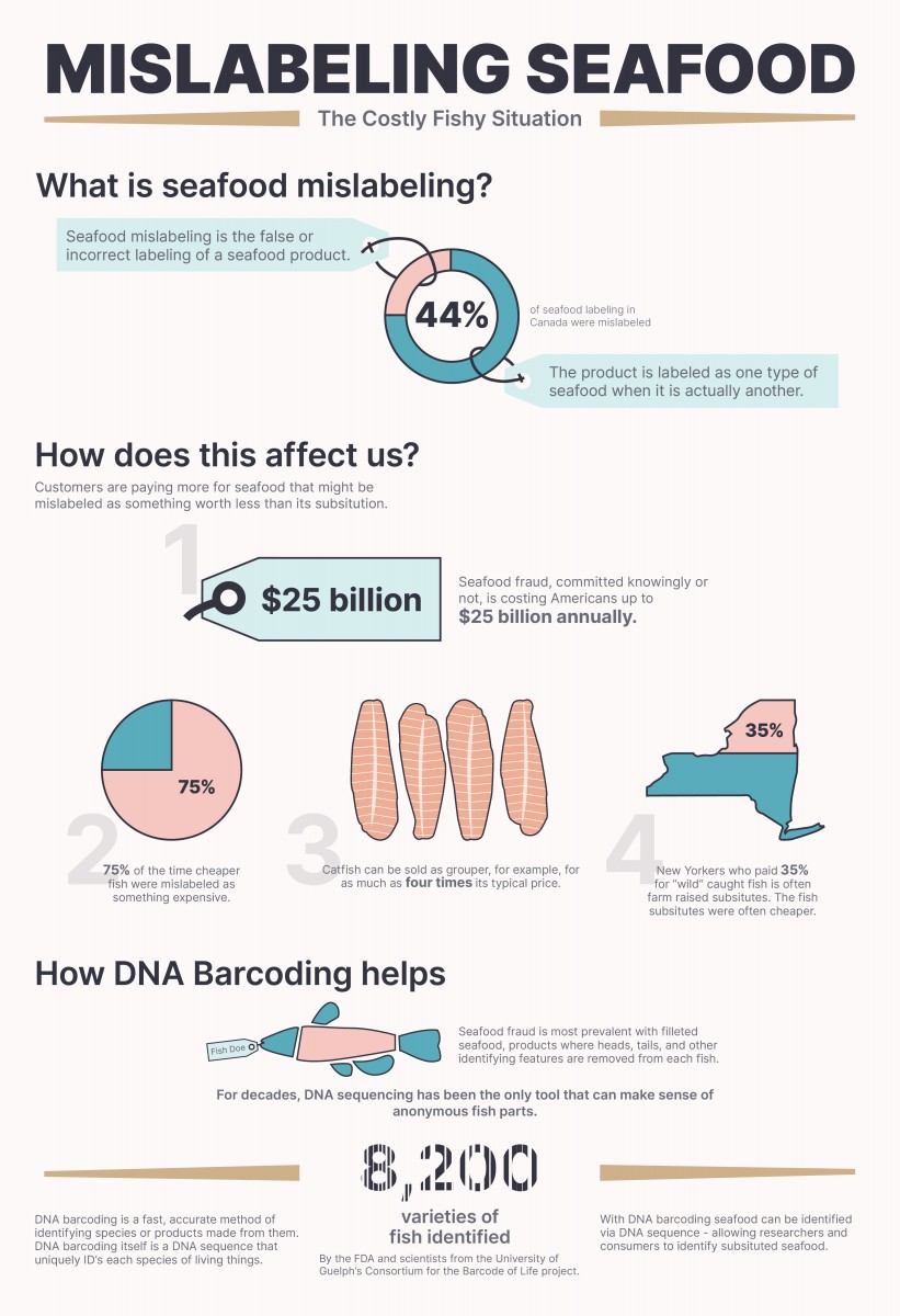
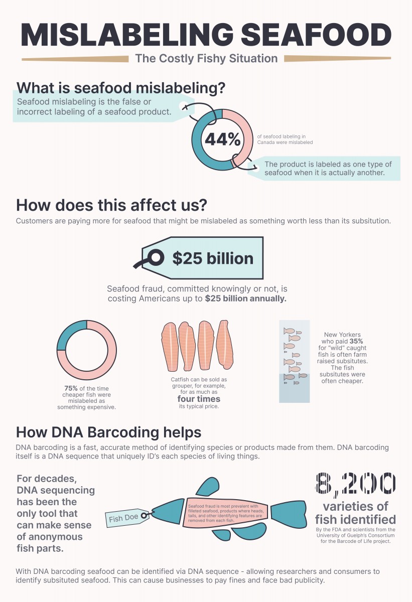
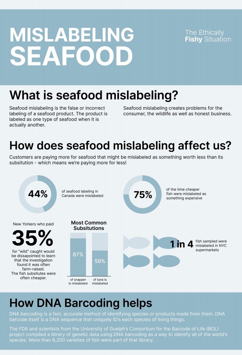
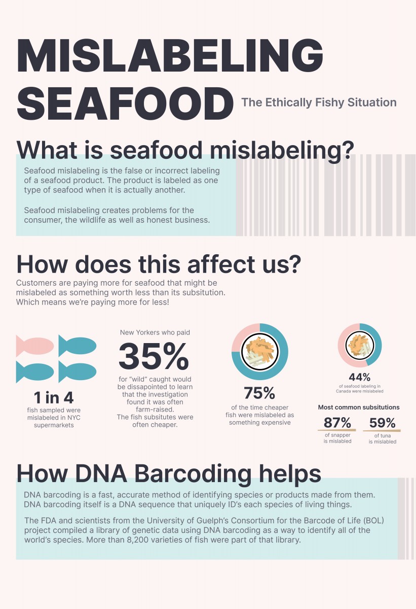
The infographic is meant to inform and educate the general population of seafood mislabeling and its ethical impacts. It shows how DNA barcoding can help identify mislabeled seafood.


Hey How,
the first poster is very well designed and the information is very interesting. I had read the poster in few minutes and understood the problem of mislabeling fish, how it effect our pocket as the consumers, and the benefits of having DNA barcoding. I think the design works well but I do have some some suggestions.
“WHAT IS SEA FOOD LABELLING”- I see that the two tickets are not the same size, but I wish the text was. It threw me off a little.
I’d give a even spacing between the “Customers are..”, “$25 million” and the blurb “Seafood fraud..”
And lastly, the text inside the fish is a great design choice, but I couldn’t read it at all.
Hope I made sense. I truly loved all of your posters, and the flow of the information works really well. The first poster would be my first choice to go with.
***********Hey Hoa!!!!!!!!!!!(Sorry autocorrect is doing me wrong)
Great work Hoa! Really coming along beautifully.
Nice comments Or. I agree! Looking forward to the conversation tomorrow.
Hey Hoa,
I am commenting again on your project because I was really look forward to see what solutions you would come up with, so this opinion is purely on what I see on the Google Drive.
I think your poster is very successful! Title is clear, design is interesting, great choice of color scheme, and your content gives me enough information to understand what you are trying to portrait. I love what you did with the fish, how you wrapped the text around the illustration instead of what it was before. The numbering works well as a design choice, but I personally don’t event think they are necessary. The hierarchy and contrast are set well on the page that my eyes actually follow your design. Either way it is a nice addition to your overall design.
In terms of text:
a) “Catfish can be sold as grouper, for example, for as much…” – I don’t think you should mention “for example” – maybe you can shorten to something like “Catfish can be sold as grouper for 4 times as much”
b) “Wild” Caught fish vs. “Wild caught fish” (I think it is one term), in general I am alittle confuse about this section. Do you mean “35% of New Yorkers who pay for wild-caught fish are actually getting farm-raised fish, which is cheaper substitute “?
Other than that, again, I think you did a phenomenal job! Your topic is interesting, your poster drawn my attention right away, it feels inviting, legible, there are clear sections, and great content.
Nice Hoa, I really like the color palette you chose and it gets the information across nicely.
Excellent comments above!
Hoa you have done a fantastic job. Well done! Or has some insightful feedback that I agree with.
I have a few very minor things I would add:
1. For the graphic about ’$25 billion’ can you add some color there? All black seems inconsistent with the rest the icons.
2. In the section where you have #1-#4 I wonder if you can rearrange them so that #1 and #2 appear side by side and #3 and #4 would go underneath. I think this would read better and feel more balanced.
3. In general I think, if you made the strokes and the text of your graphics a darker shade of the green and the pink you are currently using rather than black, it would make for a stronger overall info-graphic. I like your use of black for the headers, but I would tone the use of it down elsewhere a little. But you make the final decision about that.
Well done!