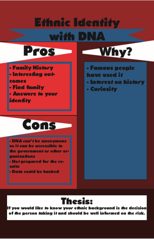
I wanted to focus more on the reasoning why people take it and the curiosity behind it. I wanted to discuss the pros and cons for the use of their DNA.
Exploring the theory and practice of designing with information
I wanted to focus more on the reasoning why people take it and the curiosity behind it. I wanted to discuss the pros and cons for the use of their DNA.
The OpenLab is an open-source, digital platform designed to support teaching and learning at City Tech (New York City College of Technology), and to promote student and faculty engagement in the intellectual and social life of the college community.


Hi Tyler,
Based on what I saw in the google drive
I think your type is a little hard to read, I look too bold. Maybe change to a more readable type. A san serif font maybe? You also can make your type box bigger so the text can fit in it.
Hey Tyler,
I really like your topic I felt like I learned something new about ethnic identity and DNA. I feel like you have such a interesting topic and approach to this design, I like your diagram in the middle of the design and how it connects to the text. Its easy to read and understand. However I think some changes to your design would make your info graphic a lot stronger. Here are some suggestions Tyler.
– The font you chose for your text seems to be too bold, I feel like it works better for a headline or title rather then a full body of text. I would choose a separate font specifically just for your text that way you have a better hierarchy in your design and your information is displayed a lot more clearly.
– I think your title could use some kerning some letters feel too close to each other. The underline on your title doesn’t really seem necessary since its already so bold. If you do keep it though I would watch out for the Y in identity since the bottom part of it is touching the underline.
Some of your text is being cut off by hyphens so I would watch out for those especially since its giving a lot of your text widows.
– I feel like the red and blue colors are strong but I would maybe add a third color just for more clarity on some of the information you have. Like the how section could be a different color so it stands out as something important. I do however really like that section its my favorite part of your design since you are visually showing me how something is done. So good job on that! your info graphic overall is a really strong.