Final:
Exploring the theory and practice of designing with information
The OpenLab is an open-source, digital platform designed to support teaching and learning at City Tech (New York City College of Technology), and to promote student and faculty engagement in the intellectual and social life of the college community.


Alicia,
Nice work! The structure and overall flow of your info-graphic read very well.
Here are my thoughts:
1. What typeface did you use? I think your overall layout would benefit from a little variation in your type, maybe just a two word bold header (same point size and same leading) for each little blurb of text.
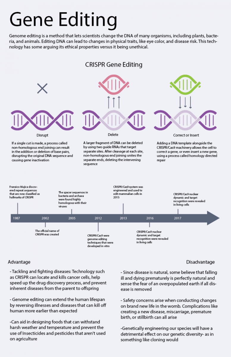
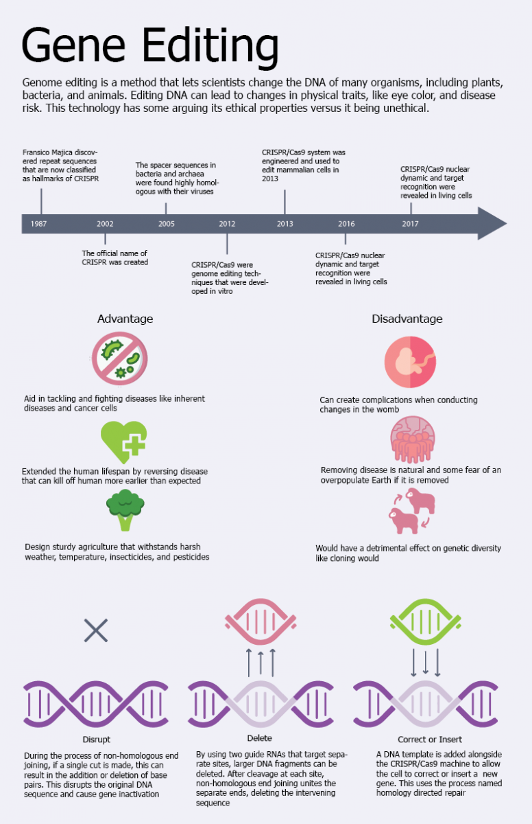
2. Last sentence in the intro paragraph should read: “This technology has some arguing its ethical use.”
3. Clean up any awkward hyphens and widows.
4. I think the space between the two columns in the middle section (Advantage and Disadvantage) is too far apart. I would make your page margins wider and reduce the space between these two columns.
5. I also think the headers for both columns should specify Advantage and Disadvantage of what… (Genome Editing)
6. Love your icons! Maybe add a little space between the bottom and top of text in between.