Author Archives: Jessica Pareja

Final Project Proposal

For my final project, I decided to do a campaign about first generation going to college. My target audience is usually both male and female of all ages. However, the primary target audience would be between the ages 16 and above. The reason why is because people at the age 16 is in high school. Both cuny students and my family inspired my idea. Like most cuny students, I’m the first generation in my family to be attending college. When I was in high school and was applying for college, I didn’t know who to ask. I would spend my time researching and asking questions to a teacher. I didn’t have parents or any family member that went to college. I was all on my own, now that four years have passed and my younger sister is entering college. She now knows something about how to apply, what to do,  because of me. I think it’s important to get to know this first generation, students. The version I will be using is the dark background to make models show confident. The lighting will shine in their face, might go for a split light.


Gregory Heisler

Gregory Heisler has fantastic portraits; his photographs range from black and white to color. Each of his pictures is powerful, and he’s able to capture the feeling of his theme. It doesn’t matter if its black and white or color each photo has an emotion that stands out.  The close-ups on his models make the audience see the feelings. Each of his images has a story; it’s not merely a photo.  The black and white photos from Quiet shows precisely how lonely and quiet one can feel. His picture of Hugh Grant shows loneliness and sadness. The expression on his face and the background of an empty place. The model not looking directly at the camera makes it a quiet world. The lighting I believe is a broad lighting is being used. It captures the dramatic expression.

Richard Foster

After looking up on Richard Foster, I found out that he specializes in still life photography and moving images.  Richard Foster’s work displays clear and beautiful retouched images on objects. He has a very elegantly and classicly look. Foster uses different lighting styles; he doesn’t stick to one method of lighting. He uses a different background to change the mood. He also uses color gels to make the image more dramatic. One of my favorite photos is the Ballantine’s bottle. The color gel and shadows make the bottle stand out.  You see a clean and elegantly bottle calling for you. Foster is a great still life photographer. I never liked still objects because I have trouble making still objects look good.  His images encourage me to continue trying to work with still objects.

Michael Paul Smith

Michael Paul Smith’s photographs are interesting, it’s amazing how he was able to photograph toy cars that represent the 1950s and recreate the car’s environment. When I first saw the photographs, I thought they were your avenge images from the 1950s. I later came to reason that they weren’t just photographs from that time period. It was a recreation of the time using props. Michael Paul Smith photographs show that he got an extreme close to get each shot.  Each of his images is retouched to look like that era.  Making each photograph look visually stunning. He uses different angles and with a shallow depth of field. His perspective makes the cars look in a natural environment. I like his shots, he makes the objects come to life.

Marcel Christ and Greg Shapps

The first photograph we see is Marcel Christ photograph. Marcel Christ is a short film director and still life photographer.  The image that is shown is the one where milk is being poured into glass milk. The inside of the glass has milk in the form of a tree. The image is clean and interesting. The photographer used photoshopped to create that tree inside the glass. There is no way the photographer was able to develop that on the spot. The photographer tells the audience that milk is our life. To grow, we need healthy organic milk.

The second photograph is Gregg Shapps. He a Chicago Product, medical & Healthcare photographer.The image we see a hand, most likely a woman due to long thin fingers. She is dropping Rubik’s cubes inside full glass water.  What makes the shot interesting is that we can see clear blue water, almost like an ocean wave. The photographer uses photoshop as well to have a more vibrant color. Both photographers have different lighting used. Gregg Shapps image creates a shadow. Both images have a solid color background and use photoshop to create a better picture.

Chelsea Galleries

Chelsea Galleries has many exhibitions, and all of them were interesting. There were many photographs each having their only style. I enjoyed the photos, but three exhibitions captured my attention.

Prison Nation

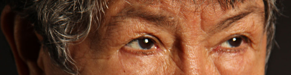
Lucas Foglia, Vanessa and Lauren watering, GreenHouse Program, 2014; © the artist and courtesy Fredericks & Freiser Gallery, New York

Prison Nation was one of the exhibitions that I found interesting. The reason why I find this exhibition interesting is that there are many photographs of life in prison, The photographed I liked is the image above. In media, there aren’t many happy or positive images in prison shown, and in this image, we get to see the prisoner experience. Yes, life is hard in prison. However, prison does steal their smiles or happiness; there are moments where they are happy and having fun.

Leaning Out – Jeffrey Milstein

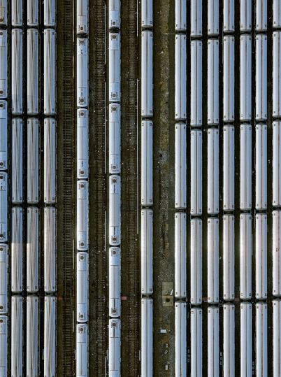
Coney Island Subway Yard 3,2017- Jeffrey Milstein

The second exhibition I enjoyed was leaning out by Jeffrey Milstein. The exhibition had interesting photo style. Each image was taken from a bird’s eye view; each had different locations. The image I liked was Coney Island Subway Yard 3 when I first saw this photograph I did not notice it was the subway until I saw the tracks. I like its composition, its all about the lines and straight images from a bird’s eye view. The subways and tracks look like a flat image and the use of patterns. It is interesting, it is not what you usually see, or I see in photography.

Facades – Grand Tour 

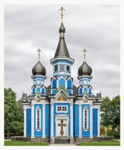
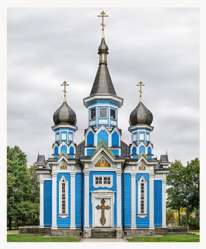
Markus Brunetti’s Facades – Grand Tour at the Yossi Milo Gallery

The three exhibition I liked was Facades – Grand Tour by Markus Brunetti located at the Yossi Milo Gallery. This exhibition had photographs of historical European architecture for examples images on cathedrals, churches, and cloisters.  Each of the buildings in the photographs popped out,  The picture I liked is shown above, the church captures the structures and admires the craftsmen ship. The colors on this images make the church feel unrealistic and feels like it was photoshopped. The saturation on the church makes the image eye-catching and makes sure the background is not the focus.  Overall, I liked the trip and all the different exhibition. Each had different photographer amazing photographs, and I learn that I still have a long way to go.

Inspiration- Philip Lorca-Dicorcia

Philip Lorca- Dicorcia has fantastic photographs, in his Hustler’s series, there are numerous of photos that caught my attention. However, the image I chose from his series is where a man probably in his 20s, is standing topless in the center, and it seems that he’s about to exit the door. The young man is touching the wall with his left hand. He seems to have his jeans ripped and its a bit dirty.  The reason why I like the photograph is that the man isn’t looking at the camera and you don’t need someone looking directly at the camera to have an impressive shot. The man is standing with his back faced from the camera. We see shadows created on his back, its a well reflective. There is also a shadow formed on the wall. I like how the shadow on the wall contrast with the light coming from the door. The lighting coming from the door is intense, and the shadow is also sharp, however, it seems to dissolve when it’s near him. I believe there was a diffuser involved to create this photo. I like the composition and the shadows it makes the man look there something out there.

Inspiration: Annie Lebowitz and Awol Erizku

In this assignment, we had to compare and contrast Demi Moore by Annie Lebowitz 1991 and Beyonce by Awol Erizku 2017 photographs. Before analyzing and distinguish both works, I wanted to know more about the photographers and their style of work. While researching them, it was interesting to see how they applied their technique to the pregnant celebrities photographs. Each of the photographs has a different unique style. Annie Leibovitz and Awol Erizku have different styles of lighting. However, they both portray pregnant celebrities looking beautiful. Annie Leibovitz is an American portrait photographer one of her well known and discussed portraits was of Demi Moore pregnancy. The famous photograph was taken in 1991, during this time this image was controversial and many people didn’t react well.  There are two lighting being used. Annie Annie Leibovitz uses a dark background, and the light is placed one to the right side, the other on the left top.  The lighting makes Demi Moore stand out and have a strong confident.

Awol Erizku has a different style in portraying pregnancy. As you can see in Awol Erizku’s Beyonce’s pregnancy portrait, one can guess he’s using natural lighting. In my opinion, the background is stronger. It overshadows Beyonce’s pregnancy.  Beyonce sitting doesn’t make her a strong and confident like Demi Moore. Overall, Erizku uses color to make Beyonce look like a caring mother.

Inspiration-Dawoud Bey

After seeing Dawoud Bey class pictures, I have noticed some robust features in his work that have stood out to me. The way Dawoud Bey uses the lighting and foreground-background to make the subject stand out. In his portrait, the subject is the primary focus, and each subject has a different expression. For example in one of his photographer, he uses the young girl (Lauren) to portrait as someone who is hopeful and thankful. Her appearance matches well with the captions; it captures a girl whose grateful to her parents and who has a bright future. Bey’s Shalanta portraits capture a young girl whose strong and confident. The reason why Shalanta portraits this way is because of her facial expressions, her smile. Her hands crossed under her chin, and the smile shows someone whose willing to take on the world. It portrays someone who knows what she wants in life. Bey’s portraits have different subjects, each subject posing differently. The facial expression on his subject plays a significant role you get to feel and see the theme each subject is feeling. The subject expression defines who they are; you feel their hope and ideas. Their pose expresses their thoughts and emotions.  In Bey’s portraits, the background plays a role as well.  We see that they are students and they’re the future. The lighting used on the subjects make each subject proud and confident. When it comes to portraits photography, I lack in that area. I don’t often show my ideas. The ideas I got from Bey’s photography is to use lighting and foreground-background.

Richard Avedon and Jonathan Mannion

Richard Avedon was an American fashion and portrait photographer. In Avedon’s photography, he uses lighting, composition, contrast and having the subject create emotion. Richard Avedon portraits were in black and white photographs. His photographs had the subjects expression or body movement stand out.

After seeing, Richard Avedon work you can see how Jonathan Mannion was inspired by. There is a clear similarity between the two photographers, the use of black and white, the lighting and composition. The difference between the two is that Jonathan Mannion has adopted a more modern version. Mannion has adopted and improved on Avedon’s style; he’s able to make the artist have an interaction with the audience. For example, in the Jay-z photo, he has a great expression as well as strong lighting which makes he a strongly determined artist. He was able to make Avedon’s style into his own and improved on it. It’s something that everyone should do.