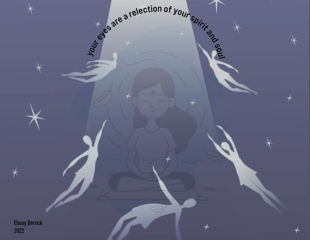
I took inspiration from the book “The Medium is the Message” by Marshall McLuhan. While reading and looking at the designs, I noticed that there were lots of eyes being used through both McLuhan and Fiore’s pieces. I decided to create this design using eyes, but more in a visual way than in a literal sense. I tried to keep it consistent with the dark colors. I created the design with the phrase “Your eyes are a reflection of your spirit and soul” because it goes well with the inspiration with the inspiration I took from the reading. I also decided to add the third eye since it refers to self reflection and spiritual viewings.
Author: Ebony Derrick (Page 2 of 3)
According to Jan Tschichold, one should design with clarity or clarification. It also gives the ability for someone or the viewer to look at designs and fully comprehend the meaning or reasoning behind them through the designs being aesthetically pleasing and clear. The beauty of the design is also important, created to grab the attention of its viewers, but not overwhelming that one wouldn’t have a second look at it. Jan Tschichold believes that with clarification, then there will be successful designs.
According to Karl Gerstner, the use of the grid is and should be something to use each time when programming or designing. Through it is annoying to use the grid, it’s helpful and a wonderful solution for many problems or issues. I personally didn’t like using the grid, but have found it very helpful and useful when I had trouble with placements of images and texts when designing. The use of the typographic grid solves many problems and makes it easier to create templates and makes designing easier.
Josef Muller-Brockmann explains that the grid is an ordering system and that math is important when designing. The grid is used to clarify the placement of where everything will fit into place. The mathematical thinking comes in more with the sizings, making sure there’s correct measurements for placements, and the size proportion needed to creating the final product or finished designs.
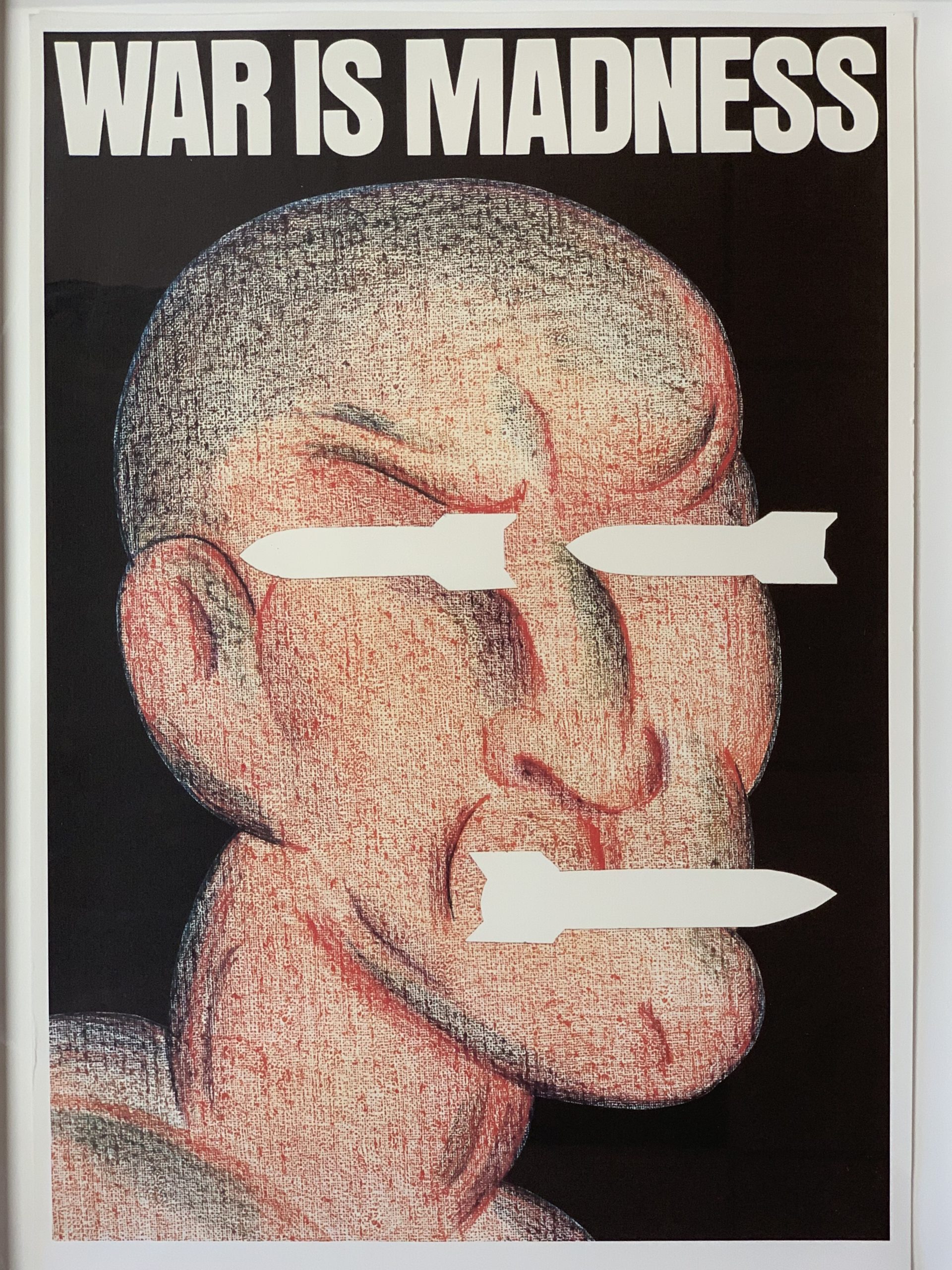
The art piece that I chose to write my paper on is “War is Madness”, it was created in 1986 by Seymour Chwast.
Medium: Offset Poster, crayon on canvas
Dimension: 23.5″ by 36″
In “The Theory and Organization of Bauhaus by Walter Gropius, Gropius states “with the development of the academies genuine folk art died away. What remained was a drawing-room of art detached from life.” With art and education, it only consisted of specific art history and information. In the art rooms, the art pieces that were designed had no creativity or personality added to them. Gropius believed that the creation of art should come from within and have meaning instead of being forced and meaningless. Just education can’t create art that have their own personality, talent and practice is also something that one needs to create “successful” art.
Typography have two main purposes in art, to make sure there’s legibility and to help set the tone. It also help to create the aesthetics to the art pieces. Photography helps the viewers experience and see emotions visually. It creates a positive way of viewing the change in traditional and modern art. Most people are visual learners, so a lot of art that are clean and easy on the eyes will catch more attention. If a piece is too busy, hard on the eyes or confusing, the viewers will look away without giving or taking a second look at it.
Language and communication are how artists represent themselves, their feelings, ideas, etc. as a way of self-expression. In art and design processes, information needs to be communicated in each piece in order for them to be successful. Without language or communication added to each piece, then the viewers would end up confused on the reason behind it.
Artists should approach the creation of future art forms with open minds if they want to experience the future art forms. But it’s not required since all forms of art are accepted and appreciated. Despite how recent or old an art form is, all types of art is used to illustrate and demonstrate something while giving the viewers information in any creative way.
The academy should teach artists different types of art movements. It could cause a spark of different interests from each person but it’ll be a way to inspire them. Any art movement might be something that anyone that went to the academy had interest in but didn’t have the information on how to proceed with their ideas because they weren’t taught or didn’t have knowledge about it. The students at the academy knowing their strong points will also help them become motivated and create pieces that have meanings to them.
A manifesto is a statement of perspectives, motives, and intentions within the artist’s piece that’s sometimes written as a political achievement goal.
- Painting a vision
When creating a manifesto, it should be creative and simple. With simplicity, it’s easier for the viewers to look at, receive the information, and can imagine the purpose and outcome of the manifesto, which allow the viewers to imagine the creators view.
- Use unquestionable statements
When using unquestionable statements, there won’t be any questions that would be asked about the artists point of view. For example, if a manifesto says “A note given to someone about how much they’re appreciated, it’ll make that person’s day better” the viewer would agree with the statement while thinking of how they’d feel in the same situation.
- Have good intentions
Having a way to connect with the viewers is critical. Connecting with the viewers spiritually, mentally, or emotionally can help the viewer understand the purpose easier. It’s a way for the viewer to look the manifesto, gather information, and relate to it on a more personal level.
Filipo Marinetti, Aleksandr Rodchenko, and El Lissitzky mentioned how important it is to adapt to the change that occurs in the world. Without the ability to adapt, it prevents people from evolving and learning the new changes that occur around them. The problem is that technology improves a lot, constantly changes, and have new types of technology. It causes a designer to think more of what needs to be implied in their art pieces, it takes away their artistic flow. In some cases, some may expect to see a current topic or situation to be included in many of the new design pieces that come out. Each designer have to adapt to many changes that occur, which is why design will continue to be an important aspect of society. In the reading “Who We Are” by Aleksandr Rodchenko, Rodchenko wrote “Previously-Engineers relaxed with art. Now- Artists relax with technology.” Technology is something that a lot of artists and designers rely on for more precise, clearer, and neater pieces. Engineers would find comfort in art, creating blueprints for buildings, furniture, etc. Technology has improved to the point that though it’s hard to constantly keep up and adapt to new types of technology. After adapting to technology, creating designs and pieces is something that artists and designers can relax and work on their creativity. I found it interesting that despite how stressful it can be to keep up with the constant change in technology and new devices, artists continue to find the comfort in creating new pieces using the new and updated technology.
The advertisement I chose was “Pringles I Stuck in :30.” The advertisement used a comedy and childish take on someone getting their hand stuck in a Pringles can. The childish take on getting the hand stuck in the can is something that a toddler would do since everyone above a certain age tilts the can to shake the chips out instead of putting their hand in it. The song “Stuck on You” by Lionel Richie playing in the background help to give the feeling that when you first try Pringles, you’ll be attached to it. The text at the end “Get Stuck In” is grabbing the attention of the viewers which also give the message that Pringles is addicting once you first try it.
- To me design is when something is original that give the the information that the designer wants the viewer to see.
- Design is important because it’s something that we all take in inspiration and information. It’s also something that sets each designer and company apart from each other, each design and logo help to represent something different and unique so it’s easier to tell companies and designers apart.
- Good design is useful, eye-catching, informative, and easy to understand. The thought process of the entire design from the font to the type to the colors being used is what help to create a good design. Bad design is when there’s little to no information given and when there’s distractions from the purpose of the design.


Recent Comments