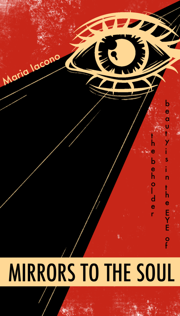
So for my design I decided to take inspiration from the reading provided and took it upon myself to search for more of his work. I found a design with an eyeball and felt very inspired by that and so I started creating. For my design I took inspiration from the black and white brochure styled poster. It had a grungy almost paper look to it and I wanted to implement that into my design as well. As for the colors I wanted to stick with black, yellow, and red because those were really striking in his eye poster. His work almost looks slapped together but in a very intentional way and I wanted to continue that with my design.


Leave a Reply