Here is my final presentation!
https://drive.google.com/file/d/1E-Z5jUg5HfO_99Ct8ju7QZvgxvPJJSsI/view?usp=sharing
COMD3504 - Section OL69 - Spring 2022
Here is my final presentation!
https://drive.google.com/file/d/1E-Z5jUg5HfO_99Ct8ju7QZvgxvPJJSsI/view?usp=sharing
Here is my final presentation and bibliography.
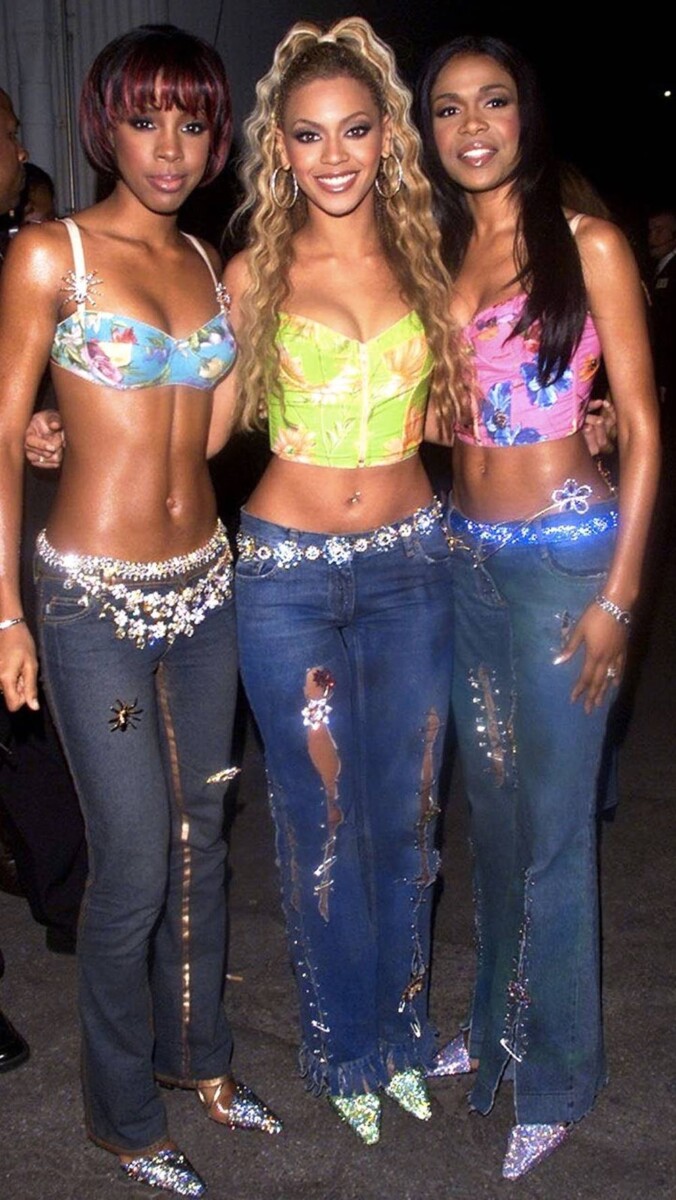
Y2K fashion originated in the early 2000s and it was extremely trendy to wear certain items of clothing like low-rise jeans, flare jeans, and lots of Juicy Couture. It started losing traction around 2014-2016 and it became extremely unpopular and hated to even be seen wearing low-rise jeans. Mainly because high rise jeans were very popular. Living through this fashion transition, at the time I was still very attached to my low-rise boot cut jeans but eventually they had to go. Y2K fashion became underground for quite a while until it resurfaced in 2021-2022! Destiny’s Child was a huge influence on Y2K fashion and they had a big role in the fashion trend. Many people today do not credit properly as to how the fashion trend began and the imitators will usually get away with it. Fashion trends will always resurface and I bet eventually we will see another era brought into the light.
Here is a pdf of what ive been working on! It is still a work in progress.
https://ebookcentral.proquest.com/lib/citytech-ebooks/reader.action?docID=3011034
Heller speaks on the concept of the mainstream vs the underground and it directly relates to contemporary design. This is because whatever was considered underground at the time almost always got morphed into the mainstream. In the reading Graphic Design Theory it says, “Rebellion of any kind breeds followers, and many followers become a demographic…All it takes is the followers of followers to cut a clear path to the mainstream. Indeed the mainstream embraces almost anything “edgy,” although once the label is applied it is no longer on the edge.” Trends are exactly what they are, they’re trendy and popular. During a time the reading mentioned that the psychedelic era was very threatening to the mainstream because of its aesthetics and what it focused on. It was shocking to those in the mainstream and it was looked down upon, that’s why it was underground to begin with. But overtime this era became popular and trendy amongst the youth, it lost its edge. This allowed the mainstream to embrace something they previously rejected. That’s the name of the trend and eventually things that are trendy blow up in the mainstream and it becomes contemporary design.
Essentially I am addressing a whole industry for my final project. The industry of floral design is, as it says in the book Floral Designing by Ronald King, “Arguably as old as mankind. Culture of ancient Egypt refined floristry.” This sort of art form has been around for so long that it was never recognized as underground or mainstream. Although it is one of those careers that is not promoted as often and the art of floral design is often forgotten about but always remembered. So it’s sort of underground in that type of way.
There aren’t really any underground designs influenced in floral design. Color might be an inspiration like let’s say colors from the psychedelic era, but it is not directly influenced by anything underground. There are different styles in which you can create floral designs, those being the classical style, the European style, the American style, and the oriental style. Those have directly influenced the art form but design does come into play when arranging flowers. Balance and unity are key principles in floral design and it is often recognized in graphic design as well. In the book Floral Designing it states, “Sometimes a design will be in perfect proportion and stand as a total unit but will look flat or boring. What it needs is a visual focal point, a center of interest or the use of an accent.” The same principles can be represented in design. Balance, unity, and focal point are the basics in floral designing and can be seen in graphic design as well. Although nothing needs to ever strictly follow those rules, it’s the basic principles that connect the two forms of design.
Today floral design is often seen in more of a European, natural sort of style. It has become the mainstream in floral design to embrace the natural flower and foliage rather than force it your way. In the future there will definitely be more of this style because it’s currently the most trendy in the industry right now. But if let’s say the classical or American style become popular the European style can be seen as the underground in this situation.
Sources: The reading provided in this weeks assignment and Floral Designing by Ronald King https://ebookcentral.proquest.com/lib/citytech-ebooks/reader.action?docID=3011034
P.S. Below are the texts I wanted to use from the library but was unable to access them or find them as ebooks online. Here are the links I wanted to use for this assignment but was not able to because I did not have access. There were also not many books in the CUNY library addressing my topic so it was difficult to find sources unless I was looking in the wrong place. Essentially these were the only 3 books pertaining to what I was talking about and 2/3 I did not have access to.
Here is my second essay along with the advertisement that I analyzed!
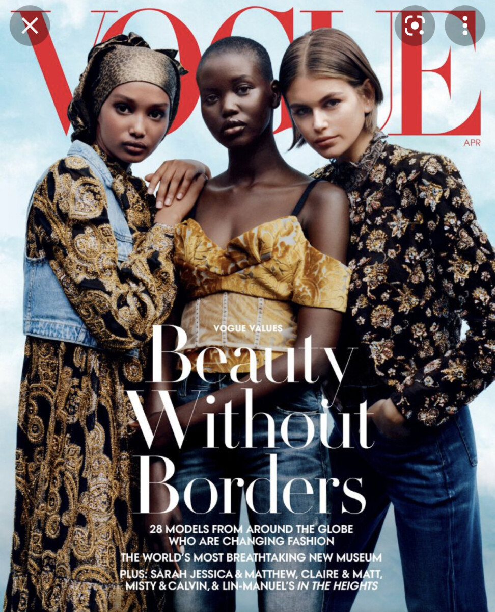
The ad I decided to choose was from fellow classmate Shayne Coley. In this ad it showcases 3 different women of 3 different races. Like Shayne Coley said it sends a positive message about women of color. Meaning that beauty exists everywhere and that there is no standard or stereotype for beauty. It doesn’t showcase one race being superior than the other. It shows the beauty and the unique features of each women showcased on the cover of vogue.
From what I’ve seen throughout Vogue their beginning covers were heavily filled with white models. There was barely any representation of women of color at the time and it was rare for a women of color to be showcased on the cover of Vogue. As the brand evolved it recognized that beauty isn’t just white. Beauty is every race and every color. We see them include many different celebrities and models all of different races and backgrounds.
We can see over the years and evolution of Vogue the internalized racism even if it was intentional or not. They heavily focused their covers in the 1960s and so on, on white women whether they realize it or not. Luckily they have grown and recognize that beauty comes from every walk of life and we can see that in this cover.
Thanks Shayne Coley for providing this great image!
Recently I saw this ad for Shea Moisture and it really embraces the history and the culture of black hair! https://youtu.be/vTdwHRf28zY

I’ve seen this google commercial on TV advertising for women’s history month!
And lastly this advertisement from Fenty Beauty. Rihanna and her brand Fenty Beauty had the most inclusive shade range in makeup. This was a big deal because she was one of the first to make this major breakthrough and be able to represent everyone’s beauty.


© 2024 Communication Design Theory
Theme by Anders Noren — Up ↑
The OpenLab is an open-source, digital platform designed to support teaching and learning at City Tech (New York City College of Technology), and to promote student and faculty engagement in the intellectual and social life of the college community.


Recent Comments