COMD3330_D039_SP22

Professor Michals

Page 4 of 16

HW 8 – Photographic Style – Guen Fung

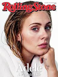
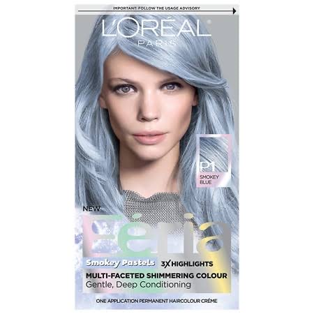
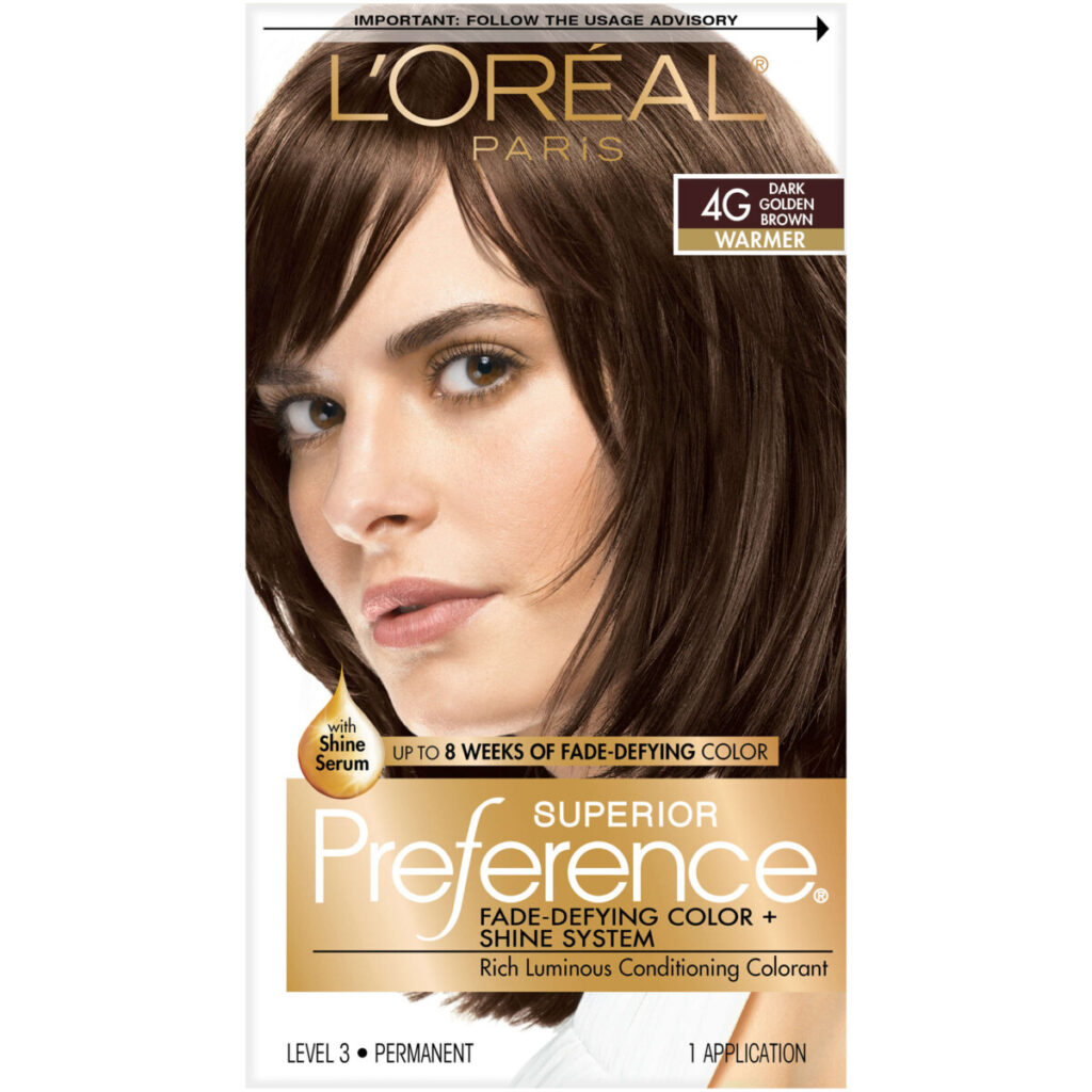
Identify the lighting style used including the angle of view, lighting pattern: Rembrandt, split, butterfly light, broad or shot light. How much fill is used to brighten the shadows? How is a background light used to separate the subject from the background? What is the palette? How tight is the framing? What is the angle of view?

  • Lighting Pattern: Rembrandt Light
  • How much fill is used to brighten the shadows? – The fill is a soft gentle fill that helps brighten some shadows, but other example like on Leo’s, the shadow is a lot harsher.
  • How is a background light used to separate the subject from the background? – The background light is allowing the hair in the back to show their colors, opposed to a darker color of the hair.
  • What is the palette? – Gray to white colors.
  • How tight is the framing? – Medium close up.
  • What is the angle of view? – Eye level to the models.
Hw 8: Photographic Style

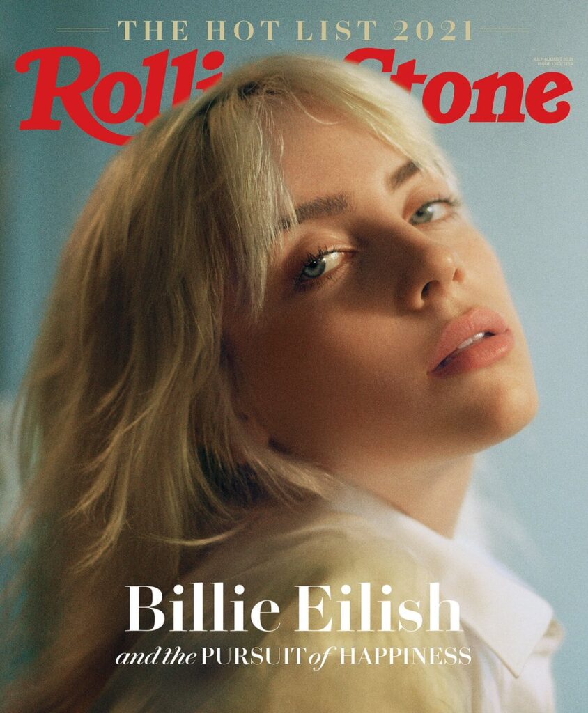
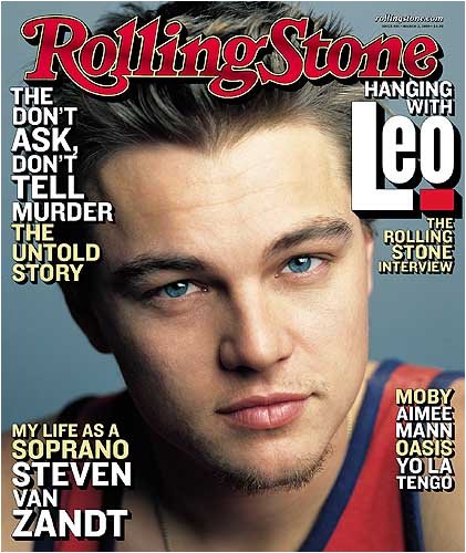
Identify the lighting style used including the angle of view, lighting pattern: Rembrandt, split, butterfly light, broad or shot light. How much fill is used to brighten the shadows? How is a background light used to separate the subject from the background? What is the palette? How tight is the framing? What is the angle of view?

Lighting Pattern: Butterfly and Broad lighting

How much fill is used to brighten the shadows? There is some light fill light for some of the portraits.

How is a background light used to separate the subject from the background? There doesn’t to be any lighting in the background. The background is either plain white and for one it is grey.

How tight is the framing? The framing is really tight so that you mostly see the face and parts of the neck. You can see some shoulder, but that is mostly covered up by the headlines.

What is the angle of view? The angle of view is eye level.

week 11 portraits

the photogrpahy that i am interested in is street photogrpahy becuase i believe that streets are very interesting and gives me a sense what is going on in life in our environment purpose that will serve in my portfolio is that it will give me the ability to understand what street photogrpahy i want to be able highlight different lights with lighting i will use daylight point of view is daily life of nyc https://www.google.com/url?sa=i&url=https%3A%2F%2Fwww.moma.org%2Fcollection%2Fterms%2Fstreet-photography&psig=AOvVaw0tU4Hw-TZkA6V2ycPiMuyQ&ust=1651668718937000&source=images&cd=vfe&ved=0CA0QjhxqFwoTCOjdss2vw_cCFQAAAAAdAAAAABAD i chose this photo becuase this a street of nyc highlightinh life

Week 5, Tuesday, Nov 17

  • Topic: Magazine cover and Portrait Re-Touching

Header text

56789

and description

Week 5, Tuesday, Nov 17

  • Topic: Magazine cover and Portrait Re-Touching

Week 5, Tuesday, Nov 17

  • Topic: Magazine cover and Portrait Re-Touching

Image title

Your subtitle here

Joshua Smith – The Final Project Statement

Topic: What is it about?

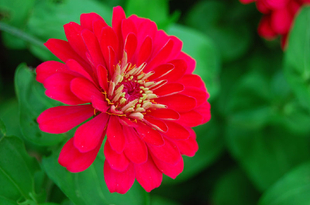
My topic is going to be nature photography and I will be focusing on taking pictures of different flowers outside

Subject Matter: Literally, what will you shoot?

I will be taking pictures of flowers outside in their natural environments

Style: What will it look like?

I will be doing close-up shots of different flowers using the techniques I have learned in class such as depth of field in order to create interesting moods and patterns.

Example:

Lighting:

I will be shooting with natural lighting from outside

Milanote
: https://app.milanote.com/1NLRIc16lKFH6t?p=wQgPUg1mjRx

Natalie Soto: HW 8 – Photographic Style

The magazine brand that I chose is Oyster Magazine. The kind of lighting style they tend to use is Rembrandt, broad and short light; they don’t use the same lighting style for every cover they’re different from one another. Oyster magazine uses a fair amount of fill to brighten the shadows, to me it looks like they used three point lighting for most of their covers. Apart from using a background light, Oyster magazine uses a different color for their background. Rather than stick to the same white background it changes and the subject stands out and doesn’t blend in as much. The palette includes an assortment of colors that often tend to be dark rather than light; they rarely use bright colors such as pink, yellow or orange. The framing isn’t that tight if anything it’s the opposite and they almost never make it tight in their covers. The angle of view is taken from the eye level.

« Older posts Newer posts »

© 2024 COMD3330_D039_SP22

Theme by Anders NorenUp ↑