Robin Michals | COMD 1340 Photography 1

Category: Student Posts (Page 3 of 4)

HW 1

“Cloud and Two Buildings” was shot by UK photographer named Michael Kenna in 1976. This was taken in New York but an exact location wasn’t given. Known for his black and white photograpghy, I was intrigued by this shot. It’s an abstract photo gives an illusion of a cloud that resembles the face of an elderly man reading the daily paper. The contrasts of the tones between both buildings may be percieved differently depending on the viewer. My interpretation was the building on the right looks like a piece of clothing such as a trenchcoat and the building on the left looks like a large paper close to a newspaper. From my pov, I think this image gives a sense of peace but can be debatable

The photographer uses Figure to Ground to show the constrast between the buildings to the cloud creates an intersting shapes in relation to the dark sky as the background. The bricks on both building have a similar patterns and repetition for the layout and look of it. Lastly the lines create diagonals that leadings our eyes to the cloud.

Link: https://www.michaelkenna.net/gallery.php?id=14
HW_1 COMPOSITION

Waiting for dinner – The lams of Ludlow street 2 by Thomas Holton

The picture depicts one of the boys in the Lam household studying while his younger sister waits for dinner to be prepared. The picture shows that although they were in one room, the curtain placed between the bed and desk separated the children. A hint to what their life outside of this picture actually was like: while the younger daughter lived with their mother, the boys lived separately with their father. The picture also shows that 5 years after the original album, the children are now in different stages of life, with the older brother in a more tumultuous period of life in regard to his schooling and studying while waiting for dinner. The younger sister was, however, just lying on the bed, waiting, unaware of the stress to come, as shown by the separation through a curtain. The lighting in this picture also helps match this theme and further personify it. The darker, blue tones on the brother’s side show the more stressed and tiring life he leads, while the brighter, orange light on the sister’s side shows the happy, innocent life she leads.

The two main techniques employed in this photo are the rule of thirds and diagonal lines. The positioning of the sister is such that the first thing you notice is her looking at the camera. The placement is at the intersection of the line on the curtain and the beam behind her. Although the photo does not use the center dominant eye method, it does use a variation in which the sister’s eye is placed near the intersection point of the rule of thirds, which creates the illusion that she is looking at you and draws you in further. The diagonal line created by the curtain with respect to the direction of the beams in the background creates depth in the picture. This is aided by the angle of the bed, which is parallel to the curtain but perpendicular to the beams in the back.

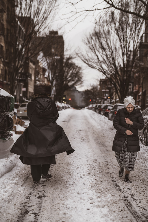
HW 1- COMPOSITION

The image I chose doesn’t have a name, but it is by Suzanne Stein from New York Street Two. Two women, each dressed in the dark armor of black puffer jackets, stand in the middle of a wintry cityscape, within the silent layer of snow that shrouds the streets. One moves in the viewer’s direction, while the other turns away, creating a scene in which she and her silhouette gradually disappear into the snow and the buildings. The image tends to hint at their separate journeys and diverging paths, thus telling an untold story. The cold in the air reflects the icy nature of their interaction, but under the surface of winter, there’s more going on than meets the eye—a brief moment of mutual isolation in the middle of a lonely street in the city. This scene is like a snapshot of two different journeys happening simultaneously in a snowy city. Both are wearing black jackets, which adds to the contrast. It makes you think about where they’re going and what they might be feeling. The snowy streets and quiet surroundings make it feel peaceful, and they embrace the winter while going on with their life. But there’s also a sense of something deeper that we can’t see just by looking. It’s like a moment frozen in time, waiting for us to imagine the stories behind it.

For the formal elements from the Steve McCurry video, we can see that there is a “Figure to ground”. There is a contrast between the subject and the background which can be noticed clearly. The subjects wear Black puffer jackets while the streets are white and covered with snow. It contrasts both warm and cool tones which creates a visual interest and draws attraction of the viewers. The next compositional principle here I believe is “Diagonals”. The image creates a visual interest, that leads the viewer’s eyes through the image guiding them from one point to another. Lastly, I believe it has to be “symmetry”. It is because the image is providing a pleasing visual experience. It is aesthetically pleasing and impactful since there is a sense of balance in the image.

HW1- Composition

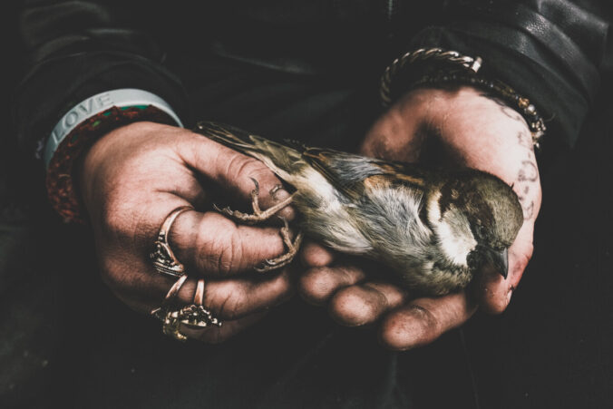
Unnamed, taken by Suzanne Stein

Through her many categories, I found a photograph in her collection under New York Street Two that really caught my attention. In this photograph it is a close up of a small bird being carried in the hands of a man. His hands, although dirty, are gentle with the bird as it is laid across one hand and the with other his fingers lightly hold the bird’s feet. Interestingly, I cannot tell if the bird is alive, by the way it is laid and his eyes, although open, look empty and lifeless I may even be inclined to say it may be dead. Two words came to mind when looking upon this photograph which are compassion and empathy. I believe the photographer was trying to show this through this photograph. The way this bird is held so gently with an open palm, not being squeezed or shown to be held roughly but with a touch of kindness. The man’s hand has rings and bracelets; with one having the word LOVE on it. The purpose of this image shows living beings being treated with care and respect. Understanding and showing compassion no matter who you may be or who the other may be. In this case a small bird. This photograph, although beautifully captured, I can’t help but feel like there is a bit of sadness to it.

This photo is a good example of using the compositional principle, fill the frame. The way the image is a close up of the small bird in the big hands of a man it is all we see. That is the main focus and it is so close you can see the different patterns on its feathers, the dirt on the man’s hands, his ring and bracelet all great with details. Stein also managed to use figure to ground, the bright colors of the man’s hands and the bird, contrasting against the man’s dark clothing. This is why this image is very eye catching, you notice more the bird and hands because of the background. Without the man’s face to give us an expression we can sense emotion through his body language, and this man’s hands are expressing enough to show his care of this small bird.

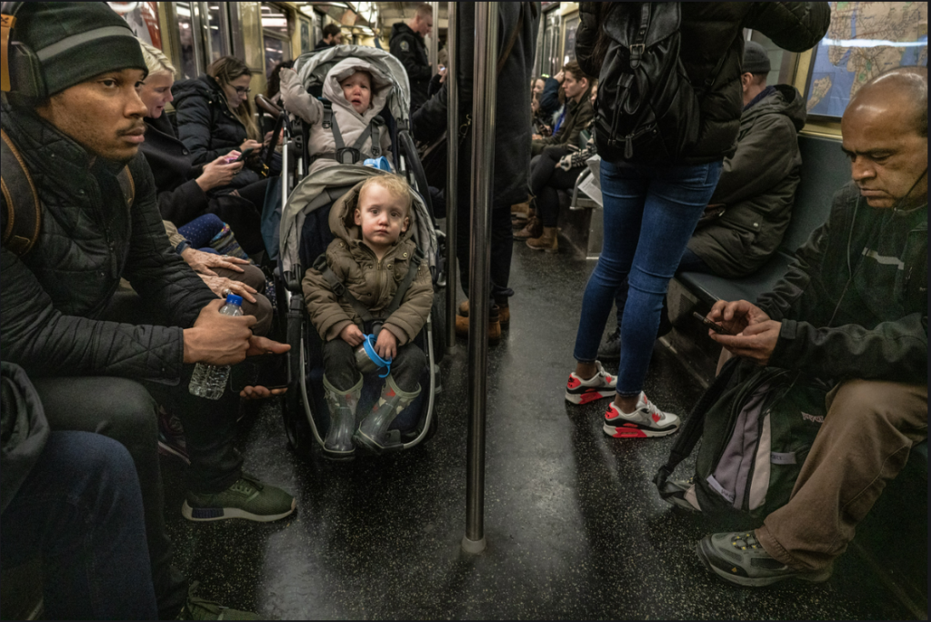
Homework_1

This photograph has no particular name to it but It was taken by the photographer named Suzanna Stein. In this photograph you can see that this is taking place in a New York City subway. Thousands of new yorkers take the subway everyday to get to where they need to be, that could be work, hanging out with friends in the city , or even special events that are taking place around the state. In this photo you can see babies crying/making noise, a few people on their phone, and some people just listening to music. I believe the purpose of this photo is just showing how day to day life is for a new yorker and what we do in our travels to work or to anywhere we go to around the 5 boroughs of New York. The mood in this picture is people looking tired and looking ready to head home after a long day of work .Seems like the people in the picture don’t really want to be bothered by anyone as they try to block out the noise with headphones in. The picture also gives a very dull and depressing mood because of its colors all the colors are very dead and don’t really pop like the expressions on peoples faces. I believe that in this photo the 2 formal elements that they are using are Leading Lines, Figure To Ground. The front of this train seems like the beginning of the leading line as you can see it leads out into the back of the train. The figure to ground really pops up in the front of the image as the back starts to blur a bit when you look towards it. The front of the image is where the photographer wants you to look the most.

« Older posts Newer posts »

© 2024 COMD1340WedSpr24

Theme by Anders NorenUp ↑