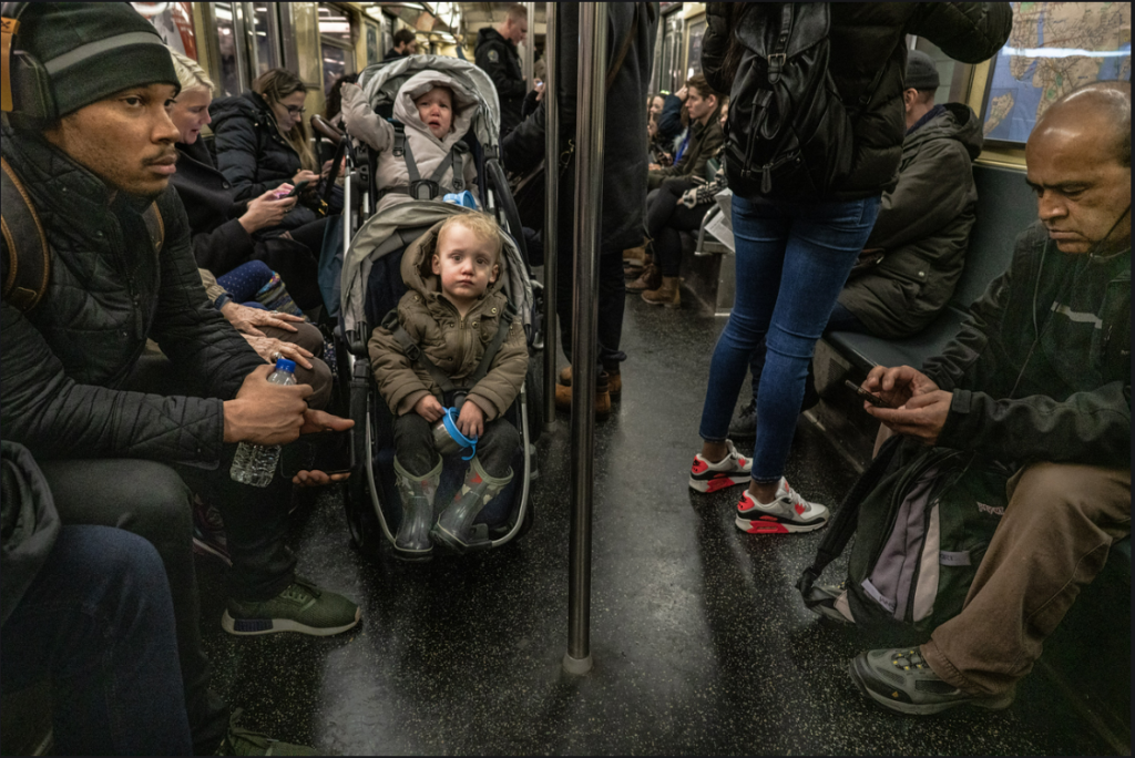
This photograph has no particular name to it but It was taken by the photographer named Suzanna Stein. In this photograph you can see that this is taking place in a New York City subway. Thousands of new yorkers take the subway everyday to get to where they need to be, that could be work, hanging out with friends in the city , or even special events that are taking place around the state. In this photo you can see babies crying/making noise, a few people on their phone, and some people just listening to music. I believe the purpose of this photo is just showing how day to day life is for a new yorker and what we do in our travels to work or to anywhere we go to around the 5 boroughs of New York. The mood in this picture is people looking tired and looking ready to head home after a long day of work .Seems like the people in the picture don’t really want to be bothered by anyone as they try to block out the noise with headphones in. The picture also gives a very dull and depressing mood because of its colors all the colors are very dead and don’t really pop like the expressions on peoples faces. I believe that in this photo the 2 formal elements that they are using are Leading Lines, Figure To Ground. The front of this train seems like the beginning of the leading line as you can see it leads out into the back of the train. The figure to ground really pops up in the front of the image as the back starts to blur a bit when you look towards it. The front of the image is where the photographer wants you to look the most.
Category: HW1_Composition (Page 2 of 3)
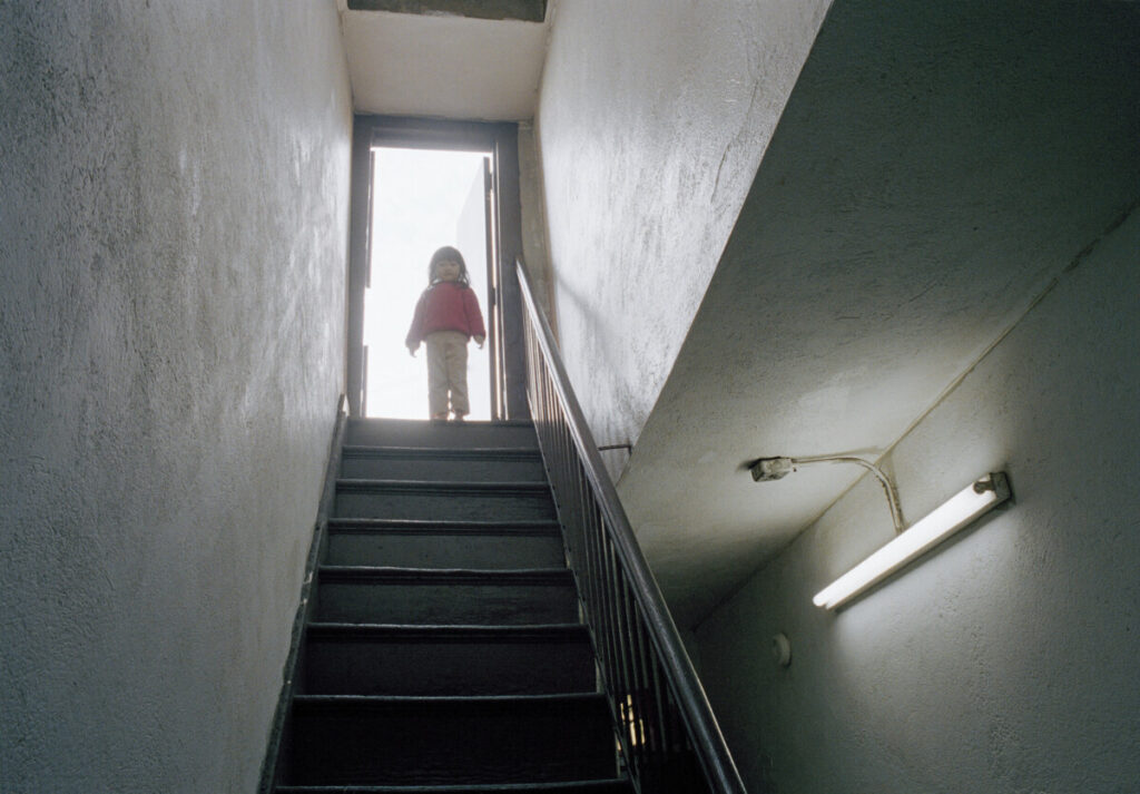
The image I chose is called “Playing on the Roof” by Thomas Holton from The Lams of Ludlow Street. The collection of photos depicts what it is like for a Chinese family to live and grow up in New York City’s Chinatown. Not just a novelty, a tourist attraction, or a place on a postcard. But a multicultural style of living. As a half-Chinese photographer, Mr. Holton never felt like he fit in with the neighborhood or the culture of Chinatown, just a mere visitor. By having his “subject matter” focus on the Lams’ family in Chinatown, he feels more emotionally connected to the culture and understands more about the Chinatown family. Looking at this picture makes me nostalgic for a carefree weekend spent playing with the kids next door. The bright white background behind the girls makes it seem like only this hallway and staircase existed, just a fragment of a childhood memory.
The most important elements of compositions that I can see from Steve McCurry’s video are the diagonal, figure to ground, and leading line. The diagonal line from the staircase leads the viewer’s eyes from the bottom left of the picture toward the top and ends at the focal point of the picture with a bright white background, contrasted by the silhouette of the girl. The bright pink jacket that the girl wears also stands out against the monotone color palette of whites, grays, and dark blues. Creates a nice figure-to-ground relationship. The contrast pulls the viewer’s attention to the focal point of the picture and enhances its visual impact. The prominent and sharp leading line from the ceiling of the hallway cast by the long fluorescent lights also meets the diagonal lines from the staircase. This leading line, almost perpendicular to the diagonal lines of the staircase, adds a layer to the visual of the composition.
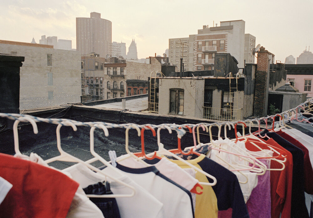
“Drying Laundry” -Thomas Holton
Thomas Holton captured a look into a family living in Chinatown, New York. In this photograph, you can see a line of clothes being hung to dry in what seems to be the summer of New York. The weather looks like a nice July evening. You can see buildings and apartments in the background as well. I think Thomas Holton’s intention for this photograph was to capture the essence of this family living in Chinatown. He started taking photos of this family when the kids were just kids and now, they have grown into adults. I like the idea of capturing a family overtime because you get to see the change over the years and with each photograph in these series, I feel so much emotion through the subject’s faces, eyes and actions. With this photograph, it reminds me of how my family is and it brings me clarity to understand that other families like this exist. The purpose of this image is to show you a daily activity that this family does. It shows you how they incorporate their living spaces as a way to dry their clothes. Now it may seem funny to some on why they choose to dry their clothes on their roof, but to me I think it is a cultural thing, but it is also about having something as luxury as a washing machine or dryer machine. To me, this image supports the idea of the old fashion ways and how simple life used to be. The feeling I have for this photograph is warm and nostalgic. I feel this way because it reminds me of how my family was. It reminds me of childhood memories where I would help my mother with the laundry. It reminds of how the clean clothes would smell and how the cool summer air would soothe my face.
In this photograph the first compositional principle that Thomas Holton uses is leading lines. He uses this principle with the clothesline. The clothesline takes up the majority of the lower half of the photo. It drives eyes from left to right. The second compositional principle is patterns. He uses patterns with hangers with most of them being light colors like red and pink. The third compositional principle is figure to ground. I believe Mr. Holton accomplishes this with the relation between the background of various building that are tan color with the main subject being the clotheslines with radiant colors. With all these elements combined, it shows balance, familiarity, hardships, and reality.
Winter Break by Thomas Holton.
The photo immediately pulls you in with its crowded, tight space. It feels like you’ve stumbled upon a private moment, like walking into a room where people are deep in conversation, yet you’re not part of it. The room appears crowded, with each person hunched over their computer, creating a sense of busyness and activity. Yet, despite the apparent focus on their screens, there’s an underlying energy that suggests conversation and interaction. This image was taken during day time because it is still bright outside.The presence of daylight implies a sense of openness and visibility, contrasting with the cozy, confined space depicted in the room. Overall, the daytime ambiance captured in the image adds a layer of realism and vitality to the scene.The cramped space adds to the feeling of closeness and intimacy. The walls seem to encroach upon the individuals, emphasizing their shared environment. It’s almost as if the room itself is a silent participant in their exchange, shaping the dynamics of their interaction. Heir attire and the modest surroundings hint at a humble background, perhaps indicating they come from a financially challenged family.his photo shows a typical moment from everyday life. It’s like peeking into someone’s day-to-day routine. The setting seems to be their home, making it feel cozy and relatable. The brother and sister in the photo are just doing what they usually do. They’re probably used to being together like this, working or relaxing side by side. It’s nothing fancy, just the ordinary stuff we all do. Even though it might seem like nothing special, this photo captures the essence of life. It reminds us that even the simplest moments have their own importance. It’s a snapshot of the little things that make up our lives, and it’s those little things that really matter.
The guy looking at himself in the mirror forms a frame within the picture. Plus, his head, with the back facing the camera, acts like a frame for the entire scene. It’s a clever way to draw attention to the main elements and make the photo more engaging.There are two people sitting with laptops, creating a pattern of similar actions. Additionally, the wardrobe behind the man has a repeating design or arrangement of items. In this image, the girl’s eye is right in the center, making it the main focus. This dominant eye position grabs your attention instantly and holds it, emphasizing the importance of her gaze in the picture
6th Avenue Subway which this photograph was taken at. This photography was taken by Suzanne Stein. There looks like a distressed person I assume, just sitting down on a subway bench. The train passing by is the background behind the person. Seems it is not busy at that station, if it were then it would be packed with people. I think Suzanne Stein took this picture because of how nobody would be courteous towards that person and help him. This mood shows some sad things if that person is alone. But it is also relaxed because it is one person that is in this photograph.
The image shows from the Steven McCurry video shows Fill the Frame. The object is close towards the frame. Another one would be diagonals because of the subway platform and bench facing the same angle straight at each other. Lastly, symmetry, the object is centered and it is facing towards the camera with the eye of the camera.
Recent Comments