Robin Michals | COMD 1340 Photography 1

Author: Rifat Ahmed

Final Project Statement

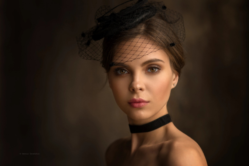
For my final project, I decided to do a series of portraits and take 10 pictures of 10 people. My theme will be finding beauty in the ordinary moments of everyday life. I will take pictures of people going about their daily lives or in ordinary environments to show the beauty and importance as it’s easy to lose sight of the beauty all around us in everyday moments of daily life in a world where the exceptional is frequently the focus. My goal with this series of portraits is to draw attention to the seemingly ordinary while highlighting the depth and importance that surround regular everyday life. 

The assignment I most enjoyed was window light portraits. Using diffused light from windows or the outdoors enables the making of portraits that capture the beauty of daylight. Natural light, as compared to artificial lighting arrangements, has a gentle, attractive mood that may bring out the subject’s features and produce a cozy, welcoming atmosphere in the pictures. I found this assignment interesting because working with natural light was exciting and challenging as you need to be creative about it. To obtain the right lighting effects, you must adjust and experiment with various angles and positions because you have no control over the light source itself. This challenge pushes you to think outside the box and try new approaches. 

For this assignment, I will consider asking friends and family members to be my subjects. They will be comfortable being photographed and can spend some time with me near a window during the day or even with proper room lighting. I will be shooting both indoors and outdoors just to experiment and at the end decide which pictures look better with my techniques. I believe that to get excellent pictures, I have to help my subjects express themselves honestly and freely. I need to talk to them to gain real emotions and expressions and let them express themselves without restriction. Remain calm and be prepared to capture candid moments.

I will be experimenting with different framing techniques, but close-up shots, medium shots, and eye-level will be my main techniques.
HW 1- COMPOSITION

The image I chose doesn’t have a name, but it is by Suzanne Stein from New York Street Two. Two women, each dressed in the dark armor of black puffer jackets, stand in the middle of a wintry cityscape, within the silent layer of snow that shrouds the streets. One moves in the viewer’s direction, while the other turns away, creating a scene in which she and her silhouette gradually disappear into the snow and the buildings. The image tends to hint at their separate journeys and diverging paths, thus telling an untold story. The cold in the air reflects the icy nature of their interaction, but under the surface of winter, there’s more going on than meets the eye—a brief moment of mutual isolation in the middle of a lonely street in the city. This scene is like a snapshot of two different journeys happening simultaneously in a snowy city. Both are wearing black jackets, which adds to the contrast. It makes you think about where they’re going and what they might be feeling. The snowy streets and quiet surroundings make it feel peaceful, and they embrace the winter while going on with their life. But there’s also a sense of something deeper that we can’t see just by looking. It’s like a moment frozen in time, waiting for us to imagine the stories behind it.

For the formal elements from the Steve McCurry video, we can see that there is a “Figure to ground”. There is a contrast between the subject and the background which can be noticed clearly. The subjects wear Black puffer jackets while the streets are white and covered with snow. It contrasts both warm and cool tones which creates a visual interest and draws attraction of the viewers. The next compositional principle here I believe is “Diagonals”. The image creates a visual interest, that leads the viewer’s eyes through the image guiding them from one point to another. Lastly, I believe it has to be “symmetry”. It is because the image is providing a pleasing visual experience. It is aesthetically pleasing and impactful since there is a sense of balance in the image.

© 2024 COMD1340WedSpr24

Theme by Anders NorenUp ↑